Alison Brooks Architects channels Ruskin and Morris in a playful craft-inspired new building for Exeter College, writes Ben Flatman
The University of Oxford and its colleges have expanded their estates massively in recent decades. A big driver has been the desire to accommodate all students in college owned housing. As potential plots within the colleges themselves have run out, there have been more and more new buildings appearing along the edges of sports fields and on far-flung suburban sites.
Sadly, many of these annexes have failed to capture the character of an Oxford college. Student bedrooms clustered around a poorly utilised common room and desultory landscaping is commonplace, often with little to animate the internal spaces or create a sense of connection with the wider university and city.
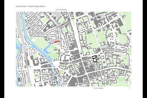
It’s therefore gratifying to see how Alison Brooks Architects (ABA) have managed to capture the true essence of an Oxford college with their new Cohen Quad building for Exeter College. Although a nine-minute walk from Exeter’s historic home on Turl Street, the Cohen Quad avoids the pitfalls of the remote college annex.
The Cohen Quad building is envisaged very much as an extension to Exeter’s main site on Turl Street, rather than a forlorn residential outpost. This is a project that manages to recreate the atmosphere of a college in miniature, through an enriching mix of uses, detailed research into historic precedents, and careful consideration of how its occupants interact.
The concept of legacy runs deep in Oxford
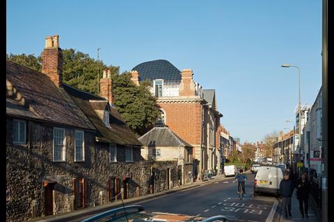
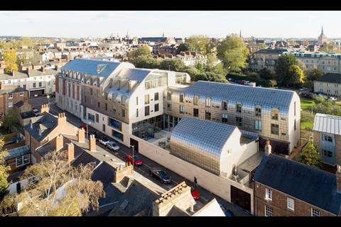
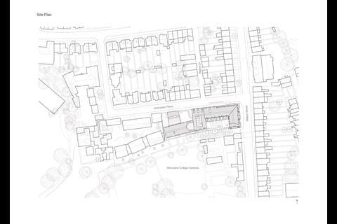
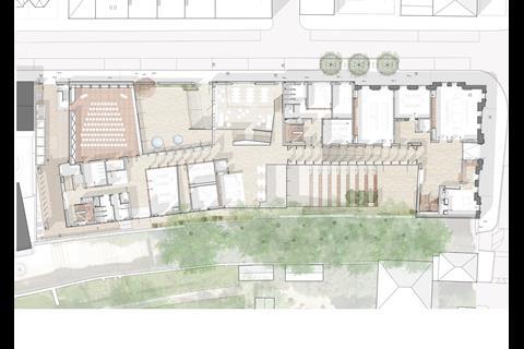
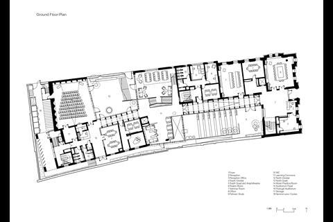
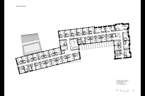
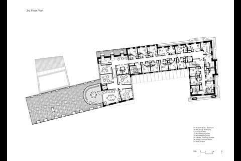
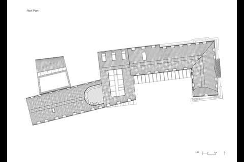
Two c-shaped courtyards are linked to create an s-shaped plan along a narrow plot facing Walton Street and Worcester Place. The building retains an existing façade along these two elevations, but everything behind is entirely new build.
As she walks me through the building, I ask Alison Brooks whether an Oxbridge commission had been one of her ambitions for the practice. “Of course!” she tells me. “You can’t really hope for a better client than Exeter College. They understand the importance of heritage and longevity.”
The concept of legacy runs deep in Oxford, where colleges think in terms of centuries, not just years or decades. Exeter wanted a building that would last at least 200 years. For some, the weight of history at such an institution is stultifying. Brooks is not one of those people – she is clearly energised by the context and the opportunities that it’s offered. “I believe there is something that’s future heritage. We should be designing it now”, she tells me.
Exeter counts William Morris and Edward Burne-Jones amongst its alumni, and Brooks has happily tapped into this inheritance, seeking to channel their arts and crafts ethos, as well as her own well-articulated design philosophy.
In her new book Ideals then Ideas, she sets out her four guiding principles: “Authenticity, Generosity, Civicness and Beauty”. It’s a clear echo of Ruskin’s own Seven Lamps, and links neatly back to the values-based design ethos of those that Ruskin inspired.
It’s refreshing that Brooks talks unashamedly about beauty in architecture
With the Cohen Quad, Brooks has been given the opportunity to put these ideas into practice, and she hasn’t shied away from controversy. “Beauty” for example is a concept often sniggered at in the architectural mainstream – too “subjective” or nebulous for traditional modernists to waste their time with.
Treated as the weird preoccupation of right-wingers like Roger Scruton for decades, it’s refreshing that Brooks talks unashamedly about beauty in architecture. She clearly wants to reclaim the word. Like those arts and crafts precursors, there’s an implication in her theoretical stance that architects who aren’t aspiring to beauty are perhaps not aspiring to create true architecture at all.
Exeter College was founded in 1314 and is the fourth oldest in the university. It’s been located on its prime central location since 1315, with little room for further significant expansion since the 16th century. In 2008 it put in place its first ever strategic plan, identifying the need for more student accommodation as well as teaching and conference facilities.
The Cohen Quad site was originally occupied by Ruskin College, which has since decamped entirely to its Old Headington campus. In 2010 Ruskin College put its central Oxford site up for auction. “New properties come up very rarely”, says Rick Trainor, Exeter’s rector.
Having acquired the site against stiff competition from other colleges, Exeter launched an architectural competition in 2011. The college wanted the new site to link back to the original buildings, with the intention that students and academics living on the site would mix more freely.
Brooks says the competition brief was essentially “How to reimagine the collegiate ideal for the 21st century.” The practice undertook extensive research into the college typology to understand its origins in what Brooks describes as a “defensive monastic community”.
She tells me “there’s something very wonderful about the Oxford quad. The principle of a community that lives and studies together and socialises together was fascinating to me”, she says. “It’s a pedagogical model that expresses itself with the quad form”.
Brooks describes the primary design challenge as being “how to evoke this in a long and narrow site”. She also notes that: “Traditional Oxford buildings tend to be very thin. It’s very important to be able to see right through the building.” The practice’s solution was the three-sided open quad, duplicated and rotated to create the s-shaped plan, with a primary circulation route running the length of the building’s spine.
ABA were also interested in how to encourage activity and interaction within the building. “We wanted to explore how the building could entice people out to use the spaces,” says Brooks. “Freedom and choice help make people feel part of a community.” In the Cohen Quad building this is achieved through fluid spatial and visual connections.
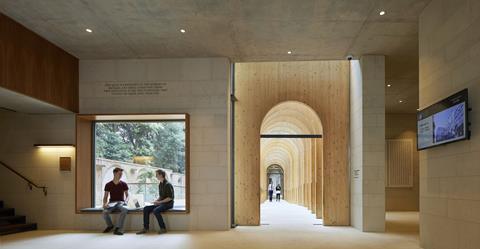
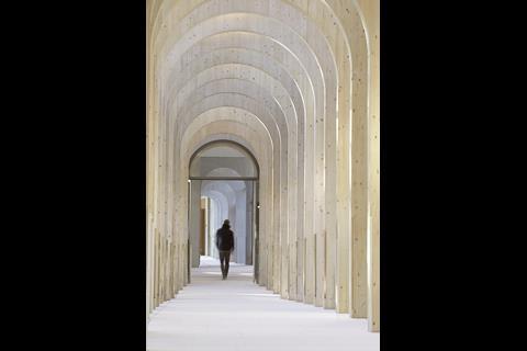
It’s at ground floor and basement level that ABA have really explored the organisational opportunities presented by the long, sloping site. These are expressed through split-levels and playful shifts in perspective. At ground level the central circulation morphs along its length. Where it runs along the side of the two “quads”, it becomes what Brooks describes as a “cloister”.
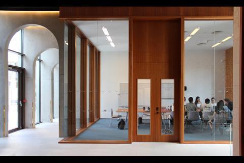
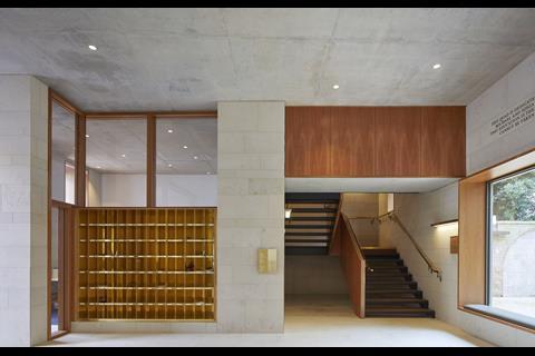
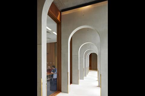
Each of these two glazed cloisters is given a distinct architectural treatment. The first has a series of spruce CLT archways and the second has concrete arches. But both subtly play with perspective, through the constantly changing width and height of the archways, as well as the gently sloping floor. It’s a highly seductive way of drawing the visitor deeper into the building.
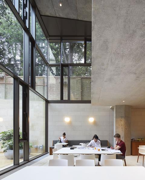
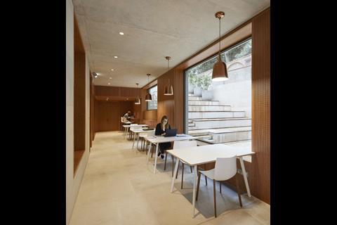
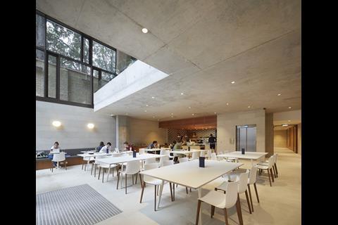
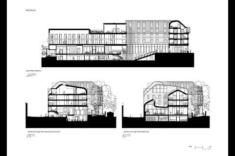
Brooks describes the central communal split-level space as the “learning commons”. Again, one of the most successful aspects of the project is the way in which it recreates that mix of academic and domestic spaces that characterises so many Oxbridge colleges. Brooks describes it as her ideal university building, a place that isn’t just somewhere to sleep but somewhere where you can spend all your time, a ”scholarly home.”
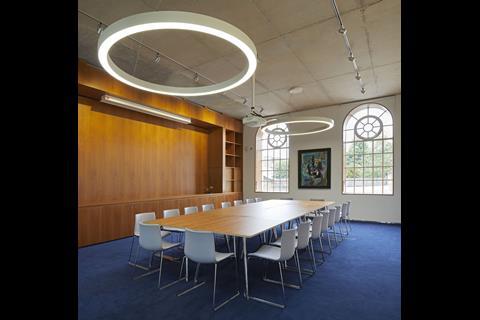
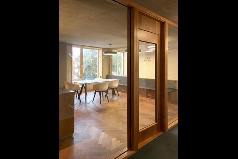
All of the ground floor teaching rooms have fully glazed partitions facing onto the circulation areas. Brooks says that this was an aspect of the design that she felt very strongly about, as it enables women in particular to see and gauge what’s going on in a room before entering.
Visibility and transparency has been prioritised throughout the communal areas. “As a woman, when you enter a room you feel very self-conscious”, says Brooks. “The principal of cellular rooms is that you’re either in or out. I felt this needed to be challenged by removing boundaries and blurring spaces.”
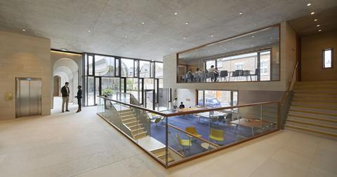
This ability to see and understand what is happening around you is further enhanced by the split-levels in the “learning commons”, which flit across four different layers. “You can see what’s going on. It feels welcoming and informal and relaxed. Everyone loves the playfulness of split levels,” Brooks says.
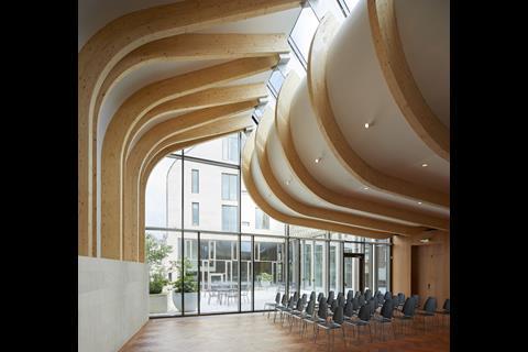
The journey through the ground floor terminates at the Fitzhugh Auditorium, a generous multipurpose space with a sweeping sculptural glulam roof structure. Brooks describes the auditorium as echoing the role of the chapel in the main college. The roof is cut and folded, allowing it to lift up and bring light down into the space. The auditorium is entirely column free, with flitch plates connecting the two sides of the timber roof.
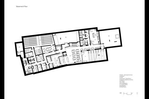
Voids in the ground floor slab lead down into the basement level, where there’s a café, special archive store, and various administrative and service spaces. The basement student common room feels like a bit of an afterthought, but is perhaps superfluous anyway, given the generosity and popularity of the other communal spaces.
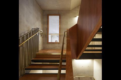
The Neil Blair special collections room in the basement is lit by a simple oculus and lined with cherry wood. Cherry is used extensively throughout the building. Brooks says “There’s a lot of oak in Oxford but I find it a bit cold and green. Cherry is from my youth. I grew up in a house full of cherry wood. My mum waxed lyrical about it. I love it.” Harder Jatoba wood (Brazilian cherry) has been used elsewhere for flooring and staircases.
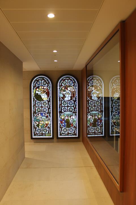
The college recently acquired two stained glass windows by Edward Burne Jones, which had been discovered in a church in Kentish Town and put up for auction. They sit rather forlornly at the end of a basement corridor, with artificial back lighting. The acquisition apparently came after the building’s design was completed. It’s a shame these relics haven’t been more wholeheartedly integrated into the building. Hopefully time will allow the college to find them a more appropriate setting.
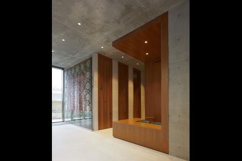
Upstairs, a William Morris rug, previously on the floor of the rector’s lodge, is rather more successfully hung on a four-by-four metre wall. Again though, it feels a missed opportunity not to have found a more integral role for this link back to the college’s past, especially within a building that seeks to celebrate the arts and craft tradition.
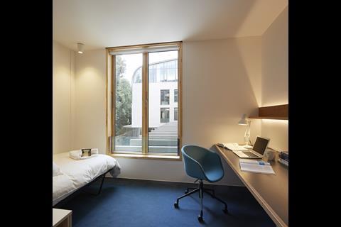
On the upper residential floors, the character of the building changes to a much more conventional cellular layout. The student rooms I saw were simple and functional, with letterbox windows adjacent to desks. Bathrooms are preassembled pods. Cherry doors and frames are used in abundance and naval luminaires above each student’s door add a quirky touch. “Family kitchens” with island units on each floor offer additional warm and convivial spaces for students to socialise.
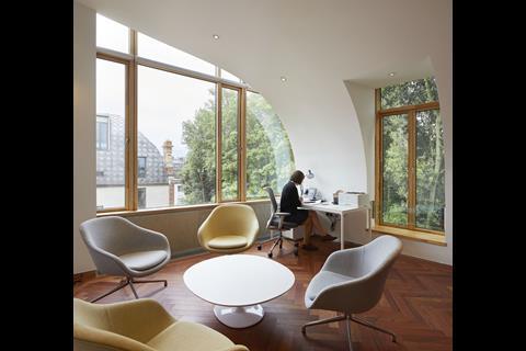
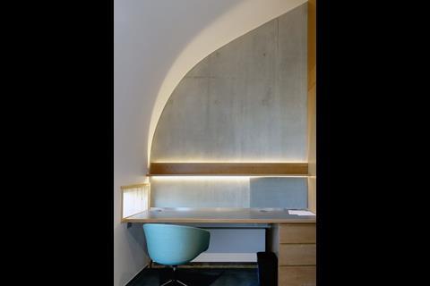
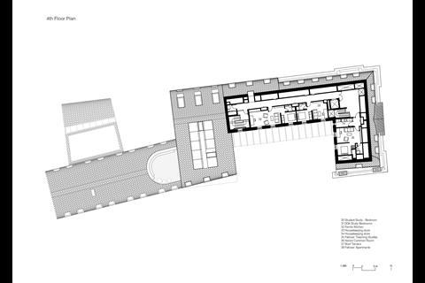
Six of the college’s thirty teaching fellows are accommodated on site, adding to the sense of this being a true college in miniature. The fellows’ teaching sets are on the top floor within the roof and have tall, curved ceilings reminiscent of Aalto or Utzon. Each includes a study, bedroom and bathroom. A beautiful top floor senior common room with an enticing roof terrace is apparently only very rarely used because staff prefer to use the café downstairs.
The building is naturally ventilated with sensors triggering windows to open to ensure fresh air. On the day that I visited however (even prior to the recent heatwaves), the top floors were stiflingly hot. As Brooks points out, “When you have a naturally ventilated building it has to be actively managed. The temperature in the spaces with the window actuators is perfect but where you need people to open the windows it’s hotter.” This seems set to become an increasingly important issue in all buildings, and one which will require the education of occupants in active thermal control management.
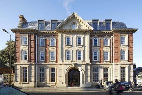
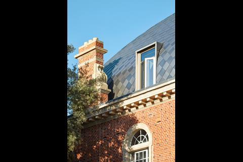
Brooks describes a number of planning challenges along the way to getting approval. It’s a sensitive site, with Worcester College on one side and the small, terraced streets of traditionally working-class and industrial Jericho to the other. Retention of the existing 1913 Ruskin College façade was a planning requirement. “And the planners said the roof looked too French,” she tells me, although final planning approval went through in 2014 with a majority of 5 to 4.
The roof itself is characteristically Brooksian
Brook’s original competition entry had proposed that the entire 1913 building be retained. But after extensive modelling, ABA decided that the existing warren of structures, with countless steps and 22 staircases, was not suitable for refurbishment. The decision was therefore made to retain the Walton Street and Worcester Place facades but demolish the rest.
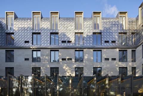
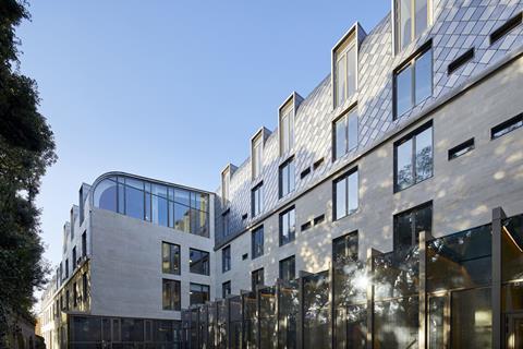
The roof itself is characteristically Brooksian. Chequered white and grey stainless steel roof shingles by Rimex are oxidised to capture different wavelengths of light. “I believe expressive roofs are a really fundamental element in architecture, neglected since the advent of modernism,” Brooks tells me. “A city’s image comes from its roofscape.”
The mansard roof contains two floors of the building and Brooks sees it as “a type of soft and enveloping cloak”. The diamond pattern in the mansard’s cladding comes from the original college chapel’s spire. Brooks asserts that the form of the roof connects the building to the domestic. ”Craft that speaks of home,” she says.
Brooks insists that Paris was not on the practice’s mind when the roof was conceived and makes a reasonably case for being able to use a mansard roof outside French soil. “I don’t think mansard roofs can only be used in Paris”, she says. But the Parisian connotations are inescapable.
The majority of the building is constructed from post-tensioned concrete slabs, with the thermal mass of the concrete and the exterior Bath and Clipsham stonework helping to manage internal temperatures. Ground source heat pumps and hot water solar panels also form part of the building’s overall environmental strategy.
Cohen Quad is a living manifestation of what the contemporary, inclusive, Oxford college has become
ABA explored making the whole structure from CLT but found this would have required extra layers of studwork and plasterboard either side of the CLT for fire and acoustic insulation. Brooks describes this as a learning journey that led to the realisation that CLT is not always the best.
The only thing noticeably lacking from the Cohen Quad building is a student bar. This was apparently a deliberate decision to ensure that the Turl Street site retained its social primacy within the college. Despite this, the Cohen Quad is hugely popular. Rick Trainor, the college’s rector, says “Many of our students who don’t even live here also use the building.”
Trainor joined the college after the Cohen Quad was already on site. Initially unsure about the project, he says “I’ve been thoroughly won over by this building. Students want to live here because they say ‘it’s so beautiful’. I went from being a sceptic to a true believer.” Trainor describes it as a “very functional building in the best way, combining informality and adaptability.”
This building feels like a genuine evolution of the collegiate tradition, imbued with a profound empathy for the Oxford college typology, and a fascination with what makes these institutions unique. Cohen Quad is a living manifestation of what the contemporary, inclusive, Oxford college has become.
Although this is only ABA’s first Oxbridge commission, this project demonstrates a deep understanding of what makes such college environments a success, and why the collegiate tradition remains relevant in the 21st century. It will be fascinating to see how the practice’s work develops with its forthcoming porters’ lodge and library project at Homerton College in Cambridge.






No comments yet