The residents of Preston took to Twitter in droves to denounce Preston Railway Station’s new entrance
Preston’s grade II listed railway station was designed by Cooper and Tullis and completed in 1880.
In the 1980s an entrance building was added to the Butler Street side of the station. A pastiche of the station’s Victorian style, this was designed to blend into the background.
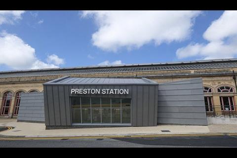
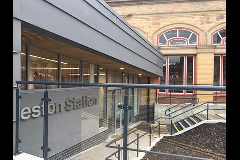
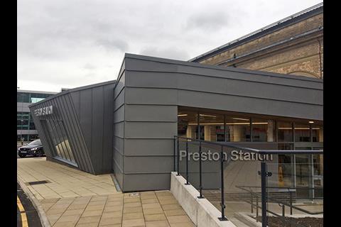
Operator Virgin Trains decided to replace this with a “contrasting structure to create a more modern and passenger friendly environment”. The residents of Preston clearly preferred the former entrance variously describing the new building as an “eyesore”, “hideous”, “a joke” and “planning gone mad”.
Nominator Steve Webberley described it as a “deadening cake tin slapped on its side”. He said: “This fractured geometric lean-to would seem out of date 10 years ago. It isn’t even that well-planned inside. The relationship with the window line of the brick station is laughable. We’ve come a long way from Brunel. A very long way…”
Postscript
Please keep sending your Carbuncle Cup nominations in to the editor at Thomas.Lane@ubm.com. Include a short citation explaining why it deserves to win architecture’s wooden spoon and a few publishable photographs taken by you to illustrate your case.







22 Readers' comments