This light, agile new building for the Rothschild banking dynasty is a model of discretion when contrasted with its attention-seeking City neighbours
For students of architecture, nowhere is the complete history of changing tastes better exhibited than in the City of London. From the baroque spires of Hawksmoor and Wren to the heavy classicism of Soane and Lutyens, from the fruity pomo of Stirling and Foggo to the slick ubiquity of the Fosterian supremacy. The density of architectural ambition — if not necessarily quality — is perhaps nowhere higher than within the Square Mile.
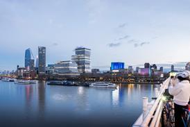
But the architects who build here, and the clients who commission them, are often all too conscious of the history they must live up to. With Pritzker winners jostling for position, the City has become a compressed playground of architectural rivalry, company headquarters vying for attention with speculative office developments, each shouting louder than the next. The Gherkin set the bar for formal novelty, and will soon be joined by its eccentric friends the Cheesegrater, Pinnacle and Walkie-talkie — with the Shard across the river, looming over this bizarre shapeist gaggle.
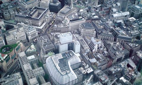
Standing back, aloof from the riotous din, there is one institution in the City, above all others, that has no need to shout. It is a banking dynasty of such financial might that it has bailed out governments across Europe, funded both sides of many wars, and in whose premises the international price of gold is still set twice a day — despite the fact it no longer trades in it. With such power comes discretion: for the past 200 years, the Rothschild bank has been tucked out of sight, down the narrow St Swithin’s Lane. It is a location that astonished the urbane German Prince Pückler-Muskau, who described New Court as “a poor obscure-looking place” when he came to visit the world’s most powerful banker in 1826. Since then, the institution has swelled to take over most of the street, but it has remained largely invisible. Now it has a new tower, a 21,000sq m headquarters by OMA — and yet, somehow, it is still barely there at all.
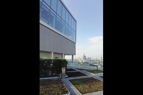
“We have become a little bit worried about the constant pressure to outperform and to outrage and to make more and more exceptional buildings,” says Rem Koolhaas, as we stand in the Sky Pavilion of his first permanent building in London, 75m up in the air, looking down on the topiary roof garden of No 1 Poultry. “I felt that, here, it would be more exceptional to make something like a palazzo — inserting a huge floor-plate into an almost medieval area.”
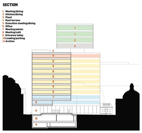
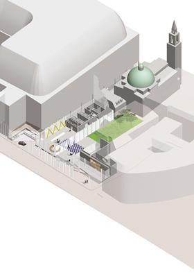
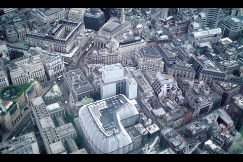
The original diagram for the project could not have been more literal. An early collage depicts an old-fashioned bank safe sitting on a piazza, raised on little legs, with appendages of bookshelves and auditoriums tacked on to its sides, the whole thing capped by the turret of the Palazzo Vecchio, sticking out of the top at a jaunty angle. And so the building now stands: a central 30 x 30m cube of banking offices is held aloft above an open foyer, clamped between three ancillary annexe buildings — which house circulation, meeting rooms, staff canteen and gym — and topped by a boxy protrusion that appears to lean unnervingly out, as if looking down on the Bank of England, which it used to control.
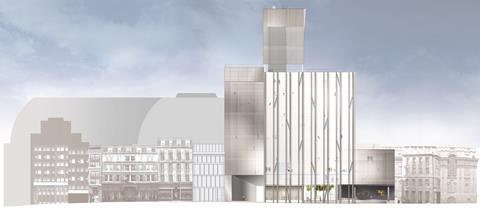
Disaggregated into lumps, the building fills the irregularT-shaped footprint left by the five premises that Rothschild had accrued over time, dissembling its bulk across the site, the separate pieces clad in different clothing. The primary cube, which presents its frontage to St Swithin’s Lane, is dressed in a confident pin-stripe, chunky aluminium-profiled columns running down its facade in pairs — alternately load-bearing and decorative. But this is no ordinary City weave: each pair of columns is tied together by a diagonal strut, interspersed at different points across the elevation, strongly reminiscent of Yamasaki’s converging mullions at the base of the World Trade Centre towers. Ellen van Loon, partner in charge, is keen to distance such associations. “It was more inspired by the cross-bracing of the City’s Elizabethan half-timbered buildings,” she claims.
For the past 200 years the Rothschild bank has been tucked out of sight
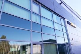
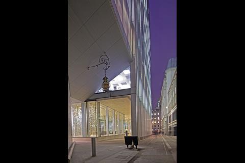
The annexe buildings sport an altogether more muted garb, expressed in blank planes of what appears to be milky white glass. It is in fact a sandwich of expanded metal mesh that gives the surface a ghostly, ethereal quality, changing its appearance throughout the day — although somewhat misting the view out from inside.
Crowning this hybrid assembly of cube and annexes is the grandly named Sky Pavilion, three double-height storeys of plant, meeting rooms and a panoramic chamber, all floating above a roof terrace. The chance for a bit of swagger, the crown at the summit, it is in fact another simple box, reading like an extruded plant room on the City skyline.
“Minimum is the ultimate ornament… the contemporary baroque,” wrote Koolhaas in 2001, in his essay Junkspace. “It is the maximum in drag, a stealth repression of luxury.” These are certainly the tenets at work here, and it seems appropriate for our chastened times — prudent, seeing as the building was designed in 2005. It is all the more interesting, given OMA’s unbuilt proposals for similarly “generic” buildings in the Gulf, that it takes an ancient banking family at the heart of the financial capital for Rem to realise his Calvinist roots.
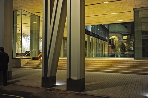
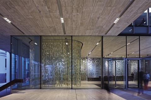
But austerity architecture this is most definitely not. From the moment of entry, every material oozes its undisclosed price tag. A ceiling of travertine — articulated as a thick slab — lines the entrance undercroft, mirroring a floor of the same, both of which run into the building in an opulent sandwich to frame a voluminous lobby to the left, an archive of sturdy oak shelves to the right.
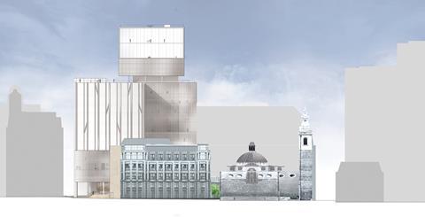
It is here, at street level, that the building makes an urban concession unusual in the City. The key move has been to lift up the bulk of the office cube to provide a new view through from St Swithin’s Lane to Wren’s St Stephen Walbrook church, formerly obscured by the 1960s Rothschild office building. In plan, the idea is for the churchyard to encroach on the new raised plinth, with textured “gravestone” shapes milled into the travertine platform. It is a mischievous conceptual blurring of the domains of God and Mammon — but a blurring that is brought sharply into focus by the reality of a glass fence between the two, opened only for Rothschild employees by attendant guards. There is no public route through.
At least there is little illusion that such a space could ever be public: once past the portcullis of columns, which march along the St Swithin’s frontage in memory of the former street line (a feature demanded by chief planner, Peter Rees), you are firmly a guest of the Rothschild estate. The “visual link” is unfortunately as generous as City gestures come, and the extra few metres of pavement behind the colonnade is more than the shear walls most such buildings offer. On his 1826 visit, Prince Pückler-Muskau complained of the narrow St Swithin’s Lane being “blocked up with a wagon laden with bars of silver”. The bullion carts may have gone, but the street will soon be blocked up once again. Traffic is to be “allowed but controlled”, which, as a security guard helpfully translates, means more of the City’s favourite: bollards and barriers at either end.
If you are lucky enough to make it inside, the lobby has the ample scale and ambience of a luxury hotel. A reception desk hewn from a single tree sits in front of a sheer curtain, woven with strips of gold by Petra Blaisse, which can extend around the room in a continuous sweep to screen off a seating area. An exposed truss zig-zags along the rear wall, while the core is clad with woven panels of dark bronze-anodised aluminium — a play on the upholstered walls of the former Rothschild interiors.
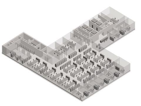
Upstairs, the offices are much as you would expect. The floors of the cube, fitted out by Pringle Brandon, are densely packed with desks and lined along their east and west sides with glazed office cubicles — apparently a culture shock for the managers, used to the privacy of walls. These banking floors are also all linked by a central timber stair, a late addition to the design when the client realised it was important for their working culture to have a direct and open connection, bankers liking to walk and talk. Such changes and additions seem to have characterised the five-year process, leading the design to tend towards a flexible container.
It is a mischievous conceptual blurring of the domains of God and Mammon
“The Rothschild organisation is in permanent redefinition,” says Koolhaas. “You would think that a bank is a very stable and conservative entity, but actually it is almost like the entertainment industry. During the life of the project, totally different configurations and hierarchies were introduced.”
OMA, and its mirror-image think-tank AMO, is known for tackling such baffling bureaucracies, from the Hermitage Museum to the European Union, rethinking their labyrinthine methods with refreshing wit. But is the reorganisation of a 200-year-old investment bank too much even for this office to attempt?
“In this case we are tampering with the organisation much less than we would typically do,” Koolhaas tells me. “Our main task was to make a machine that they can use in many different ways but that is always efficient and always pleasant.”
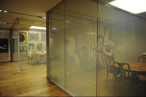
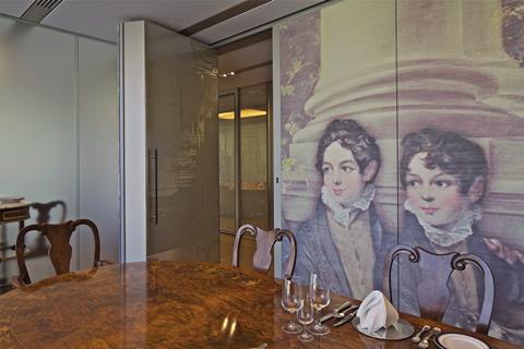
It may not be tampering on the level of their other projects, but OMA has reinterpreted some ancient Rothschild traditions with its usual panache. The ninth and 10th floors of the cube house suites of rooms for client meetings, in which meals play a large part. Accordingly, majestic mahogany dining tables occupy centre stage, surrounded by antique chairs, against backdrops of what van Loon calls “heritage walls”, expanses of raw silk, printed with supersized graphics from the Rothschild archive. The result is really quite surreal. The rooms’ lateral walls are glazed with smart glass, which can be turned opaque at the touch of a button, but always retain a pearlescent, milky consistency. This cloudy layering gives the whole floor a ghostly, unreal quality, mirages of vast cherubic faces looming out around every corner.
Elsewhere, walls are lined with bronze, brass and champagne-anodised aluminium, their surfaces milled with an abstracted pattern of wood grain, echoing the panelled interiors of the former building. Wall-thickness doors give the sturdy, impregnable quality of a castle. And the art collection?
Wall-thickness doors give the sturdy, impregnable quality of a castle
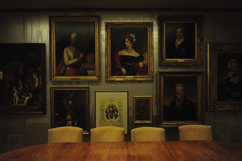
“Their rooms were full of copies of old paintings,” says van Loon, with slight disdain. “We told them to get rid of them all and only keep the originals — which we have gathered together on specific feature walls.” Similarly, one corridor will soon be lined with a densely packed vitrine of antiques. It is a tactic of decoration that OMA has proposed elsewhere, but not before realised, of “wallpapering” surfaces with artefacts for maximum effect, in the style of the historic wunderkammer. It is a more interesting approach to heritage than the recreation of the 1763 Robert Adam interior at the top of Rogers’ Lloyd’s building, although it remains to be seen how generations-old clients will respond to these rather clinical cubicles and their pop-antique tableaux.

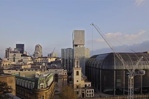
The success of the Rothschild building is perhaps best judged against what is rising around it, in London’s own architectural Babel. To the immediate south-west sit the bulbous buttocks of Foster’s Walbrook building, rubbing its plastic solar fins against the veiled mesh of the Rothschild’s shear glazing. Completed last year and still unoccupied, it is a brute groundscraper, symptomatic of a practice that is too big to take care over such projects. Over the lane, demolition is now complete on what will become Stanhope’s 90,000sq m Walbrook Square development, a grotesque mutant lovechild of Norman Foster and Jean Nouvel, which will rise to a faceted lump, its over-engineered facades sculpted to oblivion.
OMA, for all its reputation for outrageous forms and daring materials, has produced a refreshing foil to this melee, with a light, agile building, woven into its complex site and conscious of its duty to the street. Let’s hope more of the City will follow its lead.
Rem Koolhaas and Ellen van Loon of OMA speak exlusively to BD of their rejection of the ‘rat race of extravagance’:
Project team
Client NM Rothschild & Sons, Architect OMA, Executive architect Allies & Morrison, Structure, services and fire engineering Arup, Project manager Stanhope, Cost consultant Davis Langdon, Construction manager Lend Lease, Lighting Gia Equation, Landscape Inside Outside






1 Readers' comment