The formal consistency of Petra & Paul Kahlfeldt Architekten’s facades for a mixed-use development in Munich pays tribute to the city’s tradition of very large buildings
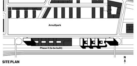
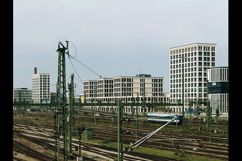
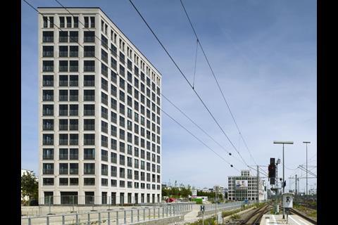
A large urban block has recently been completed on the site of a former railway depot near the centre of Munich. One side faces a vast railway landscape, while the other stretches along the Arnulfpark, a 40,000sq m park around which a new residential district is fast emerging. The scheme is based on a winning competition entry by three practices, Petra & Paul Kahlfeldt Architekten, Ekert & Probst Architekten and Frank & Probst Architekten.
The housing built on the opposite side of the Arnulfpark comprises a linear parade of slab blocks set perpendicular to the park. The formal purity of that arrangement has been softened significantly by the adoption of multiple architectural expressions. Even if the scheme had employed a more consistent language, it is questionable whether this arrangement — with its fluid distribution of public space between the blocks — would have proved a sufficiently strong response to the vast railway landscape. What has been built, however, reads as an essay in neo-modernist mollification, each and every detail having been differentiated to the point that the whole is robbed of strength. That failure is not merely a matter of taste. It is a failure to recognise the project’s urban significance and to invest it with an appropriate scale.
In determined opposition to the expression of this earlier housing, the Kahlfeldt team’s project comprises two closed perimeter blocks of a highly consistent architectural language. Their formal manipulation is complex.
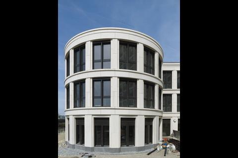
A continuous three-storey mass defines each block’s perimeter, while three seven-storey slabs subdivide them — the one subtle acknowledgement of the housing on the other side of the park.
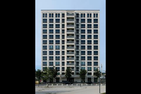
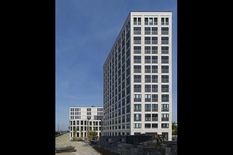
A pair of 13-storey towers book-end the new ensemble. The proposal seemingly orders the site in a single 450m-long gesture.
The group effort was directed not to differentiation but integration of expertise
The team divided design responsibility so that each practice might best contribute its own expertise while maintaining a unified expression. The Kahlfeldts designed the facades, Ekert & Probst planned the residential tower while Frank & Probst planned the offices. During the implementation phase it was decided that the office of Arno Lederer would design the second block (still waiting to start on site) while respecting the typological and formal decisions of the Kahlfeldt scheme. Again, the group effort was directed not toward differentiation, but to the integration of different expertise.
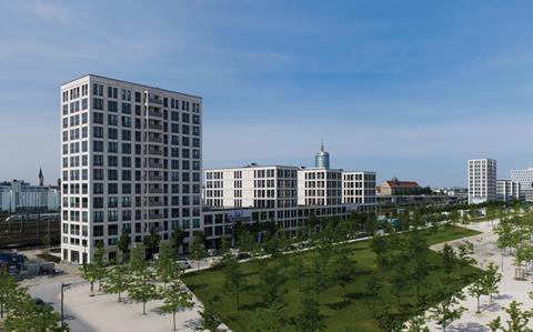
Paul Kahlfeldt enthusiastically lists the scheme’s references. First, there is Munich’s long tradition of constructing very large buildings, often comprising an entire urban block — the work of Leo von Klenze offers a number of instances of the phenomenon. But there are more recent sources at play too. Kahlfeldt mentions the work of his teacher and former principal Josef Paul Kleihues and the urban theories of Oswald Mathias Ungers. Ungers’ idea of the “megaform” — Grossform in German — is particularly relevant. In the 1970s Ungers concluded that, desirable as it may be, the maintenance of the coherent city was no longer a realistic goal. In his mind, the best a modern city could provide was a montage of different urban entities, each of a pronounced scale and singular identity.
Ungers reintroduced to the architectural discourse a rich history of large forms that provide internal consistency at the scale of the building while contributing to the definition of public spaces and a larger urban order. Some examples — such as von Klenze’s work — appear rich and timeless. Others appear diagrammatic and have yet to earn their place in history — some of Ungers’ own buildings come to mind.
While Ungers and Kleihues were regarded as opposing intellectual forces in the Berlin of the late 20th century, Paul Kahlfeldt readily admits his indebtedness to both. Kleihues’ interest in the crafting of building and the critical reconstruction of historic cities provided the fertile soil for Berlin’s architectural revival after reunification in 1989. The rhetoric of the city’s chief planner, Hans Stimmann, moved freely between a concern for urban form and the crafting of architecture.
The design might be likened to a dance, a complex series of moves small and large
In one interview he put it simply. “When one only stays within the typological realm, everything is simultaneously right and wrong. And many houses look like that. It does make an enormous difference whether a door handle is made of plastic, bronze or stainless steel.”
Stimmann’s Berlin provided the laboratory in which countless European masters worked, and from which local practices like Kollhoff & Timmermann and Kahlfeldt Architekten emerged. These architects left the conflicts of older generations behind. Concept and craft converged into an architectural practice that sought to engage the world of commercial project development.
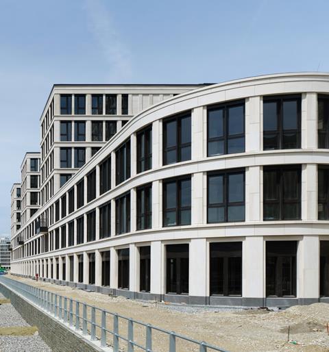
The megaform that the Kahlfeldt team has realised at Arnulfpark illustrates this attitude perfectly. Built for a real-estate investment company, it is a true hybrid building, designed without concern for the expression of individual functions. The lower parts are commercial spaces while the two tower blocks have a complicated residential programme. The size and layout of the apartments varies almost from floor to floor. There are very small studios, but also enormous penthouses that occupy an entire floor. Very little of this programmatic variety is made visible.
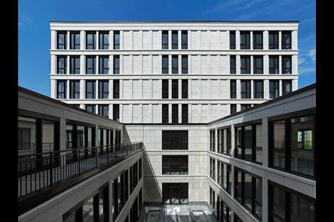
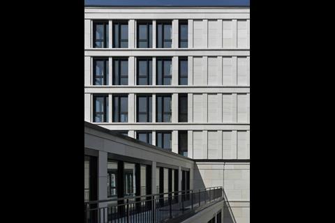
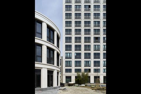
The entire development is clad with Portuguese limestone and is based on an almost uniform grid, which extends unabated into the inner courts. Where the grid is varied it is in the interests of architectural idiosyncrasy rather than functional expression. The ground-floor facades are treated as a plinth, punctuated by doors expressed as if they were the entrances to a big house. The upper-floor windows of the apartment towers appear as a cornice.

The three north-south oriented slab blocks employ deeper window reveals than the rest of the building and a bay width that is half that used elsewhere. That more insistent rhythm is extended down into the plinth, introducing a minor disruption to the long facades. The higher and heavier parts of the building dominate — the consequence of a self-evident formal logic.
At this point we might revisit the earlier observation that the building organises the site in one gesture. Rather than adopting a singular graceful move, in the Zaha Hadid sense, the design might be better likened to a dance — a complex series of moves, small and large, evoking human emotion while pursuing a highly considered choreography.
Introducing a recent lecture in Rotterdam, Paul Kahlfeldt showed an image of a stone column within a brick-lined space and stated that he had just two friends: the pillar and the brick. The complexity of the one-liner was lost on his audience of Dutch architects. Was this poor man a lonely soul? As suggested above, the Kahlfeldts are not without friends at all. And they have each other. Petra and Paul Kahlfeldt interrogate each other’s work both in the office and at the kitchen table.
Strangely, one can take Kahlfeldt’s joke literally while still having to think twice. A pillar is a pillar, a brick is a brick — but
they are more than just the prime tectonic manifestations of a load-bearing structure. Kahlfeldt said pillar and not column, and he said brick not wall. Columns and walls have tectonic meanings, but also manifest themselves in particular forms that carry cultural meanings.
Ultimately, it is this humanism that informs our experience of the Munich project. We enjoy the crafting of the stone work and the fact that the proportioning establishes a classical image; we recognise the building as part of a family of buildings with which we are already familiar. These are not urban signs, not icon buildings, but large houses in a big city.
The bias in current architecture is towards the picturesque, not just in the traditionalist realm but in modernism too. The Kahlfeldts’ sensibility is closer to that of a figure like John Nash. Although he certainly had a talent for the picturesque, Nash is best known as the author of large-scale interventions in London. Around 1800 he constructed an urban masterpiece that stretched from St James’s Park to Regent’s Park. The conventional terrace was the typological point of departure. The architectural ordering of the facades was conceived by Nash and prescribed to architects who did the odd interiors of individual dwellings. Top-down urbanism did not exist as we know it today. Nash’s classicism now looks familiar, but it was tough and radical once. In the same sense Arnulfpark is a radical project.
Postscript
Hans van der Heijden is design director of Biq Stadsontwerp, Rotterdam






8 Readers' comments