Chipperfield’s gallery, which opens this week, draws on the power and heritage of its mill-town setting
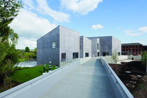
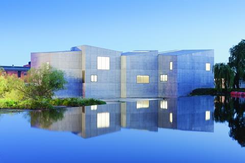
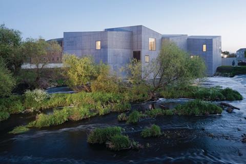
Huddled together at a crook in the River Calder, a cluster of concrete containers rises out of the churning waters at the bottom of a weir. Their canted planes and inclined rooftops collide in a dynamic, aggregated bulk. Polygonal cells of crystalline matter, the forms have a tough elemental geology, as if chiselled from the bedrock – Yorkshire’s answer to the Giant’s Causeway.
This mysterious shape-shifting mass is David Chipperfield’s latest building, the Hepworth Wakefield, a vast new vessel for the city’s collection of art – named after local daughter Barbara – and the country’s largest purpose-built gallery space outside London.
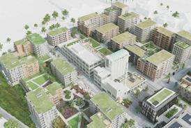
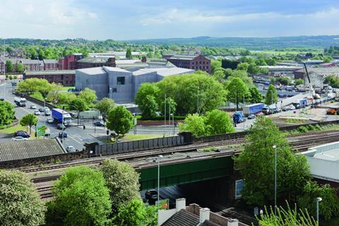
Positioned at the northern end of an island to the south of the city centre – a terrain hemmed by a bend in the river, a navigable cut and the messy confluence of two dual-carriageways – the gallery is the anchor building in what has recently been christened “Waterside Wakefield”. A long-neglected site of Victorian industry, home to the woollen mills on which the town made its fortune, the area was subject to a masterplan in 2003 as part of Yorkshire Forward’s Renaissance Towns programme, which aimed to transform it into a mixed-use urban quarter.
The plan, prepared by Faulkner Browns, is a sensitive proposal of restoration and addition, a carefully scaled sequence of courtyard spaces leading through the site, in keeping with the historic figure-ground of the industrial waterfront. The first phase, at the southern end of the site, includes new offices and apartments by the same architect and a warehouse refurbishment by BDP, completed in summer 2008. The middle phase is currently on hold, “waiting for the next upturn,” says John Ladley, service director for major projects at Wakefield Council.
This section comprises the grade II listed Rutland Mills, a handsome complex of industrial buildings from the 1870s, complete with polychromatic brick details. It was bought by the council in 2005 with the help of £4 million from Yorkshire Forward, but remains boarded up, its ground floors hopefully awaiting some temporary uses next year. Formerly used by rock band the Cribs as a rehearsal and performance space, it is an atmospheric setting for the artists who it is hoped will come to colonise soon enough. “Our three core values for the regeneration of the area are heritage, culture and creativity,” explains Ladley.
The former is here in abundance, while hope for the other two is vested firmly in the £35 million Hepworth. Standing at the quarter’s northern extremity, set back from the mills by a wide swathe of grass – a vacant development plot awaiting the arrival, one day, of three mixed-use blocks – Chipperfield’s 5,000sq m building terminates the sequence through the site with the bold force of an edifice confident in its setting. “We were trying to create something that had a certain authority,” says the architect, “that would plant itself as if it couldn’t be anywhere else than here.”
Although, at first glance, it may seem like an alien form, there is much in the composition that comes from its context. The jaunty roofline echoes the neighbouring jumble of pitched warehouse profiles, particularly when seen from the train, and its sheer facade plunges into the water like those of the neighbouring mills, almost reminiscent of Venetian palazzos rising out of the lagoon. Nestling in the embrace of a mature weeping willow, as river flotsam swirls in the eddies at its base, this robust building looks remarkably at home.
’The question was: how could you stop it from having a back and a front?’
Given the exposed, highly visible nature of the site, the task called for a particular method of composition. “It is a building that has to face all ways,” says David Chipperfield, as we stand on the opposite bank of the river at the end of a new footbridge that connects the gallery with the town, taking in the multiple perspectives provided by the surrounding banks, roads and bridges.
“The question was: how can you stop it from having a back and a front, given it is approached from all sides?” Set out in full view on its own, it would have to have the stand-alone qualities of an object building.
From the early competition stage in 2003 – which saw the practice beat entries from David Adjaye, Zaha Hadid and Kengo Kuma, among others – the very first sketches were of a fragmented form. It would be a series of gallery rooms defined as separate entities and then aggregated together in a picturesque composition.
But this brought a second urgent question: “If the building has a composite form, how can you give rigour to the composition, that isn’t just shape-making?” To an architect concerned with order, and dismissive of “funny-shaped buildings” for their own sake, the thought of wilful formalism was clearly anathema.
The parti was simple enough: a dynamic would be set up between interior and exterior – between the space which pushes out to form the walls, and the walls which are pushing back to form the spaces. The galleries would be made of rooms, and the rooms expressed as volumes. “It sounds like an innocent idea,” says Chipperfield, breaking into a smile. “But to be honest, it was a complete nightmare.”
The design development was an unfamiliar process of pure sculpture, of adjusting and tweaking roof heights and volumetric relationships, of fine-tuning pitches until the spatial sequence worked, both within and without – mostly done through large-scale physical modelling. “In order to get a sense of sculpture, we had to get the low point in one room next to the high point in the next room,” he explains. “We had set ourselves a puzzle, which was very difficult to solve – but a fascinating process.”
In some iterations, there were 24 separate volumes, in others there were five. Larger forms were dismissed as overly industrial, smaller ones as lacking impact. The final scheme comprises 10 interlocking pieces, which rise and fall with relatively subtle rooftop variation – there being only around 1.5m difference between one corner and another.
It is easy to read a kind of Zaha-envy into the acute corners and tilting planes
In its irregular angles and fractured massing, the building represents a clear departure for an architect best known for his orthogonal geometry and restrained, sober spaces. “It is the first time we have done this sort of thing,” confirms project director Oliver Ulmer as we stand beneath the soaring slanted ceiling of one of the gallery rooms. “And we haven’t done anything quite like it since.”
Word in the office has it that the scheme was developed at a time when Zaha Hadid was winning every competition going, generating an assumed pressure for formal novelty. It is easy to read a kind of Zaha-envy in what stands before us, in its acute corners and tilting intersecting planes – only handled with a little more restraint.
The ambitious formal nature and daring siting of the project brought with it a wealth of considerations during construction. “Technically, it would have been much easier to set the building back, but we would have been left with a margin that meant nothing,” says Chipperfield, who encountered a similar issue at the Turner in Margate, which suffers slightly from a broad, empty setback from the sea wall. Building in the Calder required the momentous parting of Wakefield’s waters. Terry Hughes, project manager at contractor Laing O’Rourke, tells me how a cofferdam of steel piles was erected in the river, 4m from the building’s facade – only to be breached twice in the first three months, washing everything away. But it is a credit to his team that this only set the programme back by two weeks.
More than 100 piles were sunk across the site to support the building, their caps then connected by a continuous ring beam, on which the walls were cast in situ in Lafarge’s self-compacting concrete. As they were to be pummelled by the full force of a weir – and serve as a flood defence for the area – the 300mm-thick monolithic walls were constructed to reservoir standard, with a dense mesh of 20mm rebar at 150mm centres, laid in both directions across both faces. This dense grid now actually shows through on the facade in places. The pigment – christened “Hepworth brown,” despite its distinct leaning towards faded aubergine – was tested on a number of mock-up walls, and, if original renderings are to be believed, it is somewhat lighter than intended. But, all told, the rather rugged, patchy finish adds a level of grain highly appropriate to the building – given its industrial setting and the fact that surface textures were a key preoccupation of the Wakefield-born Barbara Hepworth herself. Daughter of a civil engineer, the county surveyor no less, she would have no doubt enjoyed the fact that the craft of the process is so evident in the finished product.

Anton Sawicki, director at engineer Ramboll, whose team worked closely with the contractors, explains how they managed to continue the surface of the walls on to the rooftops, emphasising the blocks’ monolithic quality. The “upside down” construction, from a lightweight steel frame and precast concrete planks, with a pigmented screed poured in situ on top, preserves the homogenous external finish on the important fifth facade, which is seen from the road and railway. The thickness of the internal gallery walls, meanwhile, is used to carry all of the services, allowing a simplified floor construction. Ramboll also exploited the weir setting to install a river-water cooling system, which takes water in at the higher level and releases it at the lower, with all plant housed in the watertight basement.
In places, the swooping planes feel rather like a stage set divorced from its shell
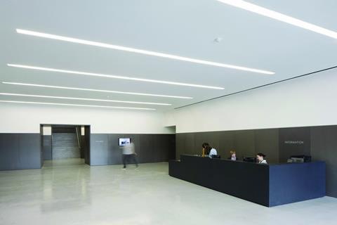
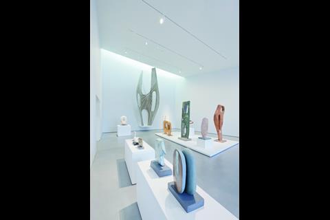
Beneath the building’s quirky exterior form, and hidden technical prowess, the organisation of the gallery itself follows that of a conventional 19th century museum. The ground-floor base comprises social functions that rotate around a central lobby – shop, café, education spaces and back-of-house, all generously scaled – while a grand central staircase leads up to a doughnut of gallery rooms on the first floor. The lobby is lined with a dark grey pigmented MDF, set to a 2.1m datum, an oversized wainscoting through which generous openings rise, giving a plinth-like classical weight to the entrance sequence. Its slightly mottled irregular surface brings an echo of the exterior finish, only tamed and tidied for within. Ascending the staircase, which fills the central, top-lit container, brings you back on yourself to the first main gallery room. This space shares the footprint of the lobby, but deviates from it wildly in section, rising towards the west and dipping to the north. A big picture window provides a view out to a diminutive early 19th century corn mill – currently being wrapped with a work by James Pyman – while a recessed slot in the ceiling at the other end of the room brings indirect light down on to the wall.
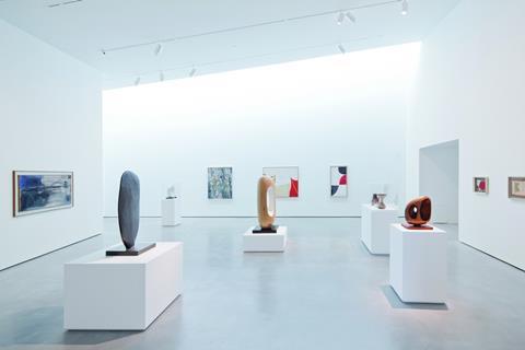
As we walk through the galleries, this format continues: each container is skewed in both plan and section, with a light slot cut along one edge of its sloping ceiling, and the occasional picture window providing carefully framed views out. Ordered as a transition of contrasting spaces, from one lofty peak to a compressed trough, from expansive 7m-high halls to intimate 2.5m chambers, it is a powerfully disorienting sequence, each room raising anticipation of the next. Doorways are cleverly positioned to allow partial glimpses into the spaces that await beyond, drawing visitors through the galleries in an unfolding story of diagonal vistas.
“You have two options when designing a museum,” says Chipperfield with the authority of a man who has designed many. “You either take a big box and subdivide it, or you make rooms and add them together, as we have done here. The former gives you fluidity, but the latter gives the curators a series of frames in which to play.”
Simon Wallis, director of the gallery, is visibly excited by his new playground. “Curatorially, it is a fascinating space in which to construct a narrative,” he says. “I’m thrilled by the way the views through create a real dynamic between the rooms. It means the sequence of work is never fractured.” The distinct character of each room allows themes to be set out and specific connections made, free from the deadening chronology of a more regular grid.
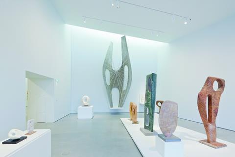
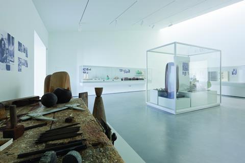
Six of the 10 rooms provide a new home for Wakefield’s own impressive hoard of 20th century art – ranging from Ben Nicholson to Patrick Heron – as well as a remarkable collection of 44 working models from the studio of Barbara Hepworth, the hallowed Hepworth Family Gift, housed in its own room with a vast river-facing window. Crucially, this allows views in as well as out. Standing on the other side of the river, you can clearly make out the willowy white forms with their trademark holes – a useful shop window for locals baffled by the arrival of this concrete hulk. Propped up at the tallest end of the long, studio-like room is the 6m-tall highlight of the collection: the aluminium prototype for Winged Figure, 1961, the sculpture that hangs on the facade of Oxford Street’s John Lewis. It brings something of the urban scale to this interior sequence, an important presence in spaces that lack the robust mineral finish promised by the building’s envelope, being somewhat sterilised by their pristine white lining.
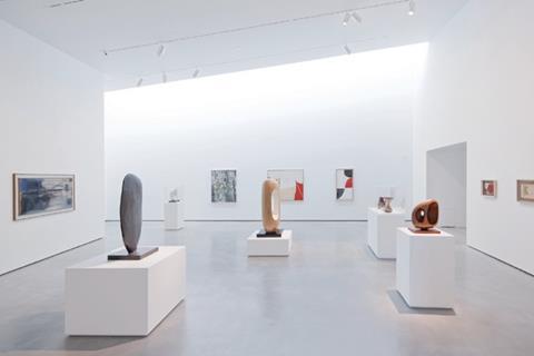
A section of the easternmost room is partially screened off to provide a space to exhibit pieces from the Gott Collection, a fascinating series of topographical drawings, maps and watercolours, depicting over 200 Yorkshire towns, villages and landmarks. Set into the back of a tall screen to baffle direct light into the room, an upholstered window seat appropriately provides views towards the 14th century Chantry Chapel of St Mary the Virgin, the city’s most precious relic, which rises out of the river at the centre of the medieval bridge. This goes to show that daringly engineered waterborne structures – however we may gasp at modern attempts – have a long local tradition.
At the south-westernmost corner of the galleries, four interlocking rooms provide 650sq m of space for temporary exhibitions – of which Wallis assures me there will be four to five per year. It currently sports the fantastical framed structures of Eva Rothschild. Here, views are directed back towards the Victorian mill buildings, and down to where an adventure playground is being installed to entertain art-weary children – from which another visual link is made to the educational spaces on the ground floor. “In so many galleries you feel you are supposed to be completely divorced from the life outside,” says Wallis. “But here, these views connect you back to the surroundings. It doesn’t feel hermetically sealed.”
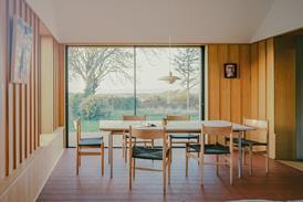
The introduction of large picture windows, balanced by recessed top-light, was a key move in developing the particular quality of the gallery spaces. “It could be criticised that the windows are too powerful, that they overpower the work,” says Chipperfield. “But they give the rooms character and supplement our physical experience of the space.”
Andy Sedgwick, daylighting expert at Arup, explains how the strategy came from the original home of the Wakefield Art Gallery – a large converted house. “The rooms were all side-lit by windows, and everybody liked the asymmetry that this created,” he recalls. “You could show a sculpture in silhouette by putting it in the window, or place more sensitive works further back.” This suited the mixed-media collection of drawings, paintings and sculpture, and so they decided to recreate this variable asymmetry in the new building – adding a vertical aspect into the mix with the recessed ceiling slots. The various sources of light help to render the three-dimensional modelling of the sculptures, while the changing conditions bring a human character to the spaces, too often banished elsewhere in the usual curatorial pursuit of consistency and neutrality.
It should not come as a surprise that the uncompromising outward appearance of the gallery’s raw concrete walls has raised a few local eyebrows
In some ways, the broad range of artefacts on show, from carved stone to oil paintings and pencil drawings, could be said to have disadvantaged the architect’s ability to create spaces that are precisely tuned to the work. Had the model been conceived as a dedicated sculpture gallery, there may have been more scope for creating rooms with a singular clarity, truly specific to the massive, textural qualities of the direct carving on show – such as at Carlo Scarpa’s Canova Museum of plaster casts, with its inverted corner windows, or Peter Märkli’s La Congiunta, with its linear, top-lit concrete galleries. The spaces at the Hepworth, although laudable for their flexibility, lack this visceral quality and suffer slightly from the ambition for novelty. In places, the swooping planes feel rather like a stage set, a dry lining divorced from its shell, without the tectonic force of the exterior – particularly exaggerated where the light shelves reveal the depth of the suspended ceiling cavity – a feeling more often experienced in projects by Hadid or Daniel Libeskind, than those by Chipperfield.
But these are minor details compared to the overall success of the building, and the true test will surely be in how it serves its locality. It should not come as a surprise that the uncompromising outward appearance of the gallery’s raw concrete walls has raised a few local eyebrows. A glance through the local paper reveals that Wakefield folk are not afraid to speak their minds. “One gets the impression of an old broken down unit on some industrial estate,” wrote one dismayed reader. “How about painting it white, or cream or even pink?” asked another, horrified by the “dreary dungeon gray”. But stubborn they are not – it is telling that those who have visited the building during preview events completely changed their minds. People have come away astounded by the bright airy galleries that lie within the austere shell, in disbelief that such a foreboding container can house such agreeable light-flooded spaces.
Whether the project will prove to be the regenerative saviour of the city is another question – but a question that, as Chipperfield himself has often argued, is rather misdirected. With the opening, two weeks ago, of Trinity Walk – Wakefield’s new 51,000sq m shopping Mecca – and the £140 million Merchant Gate business quarter well on the way, the Hepworth brings a further boost of confidence to a city that has every reason to be optimistic.
Project team
Client Wakefield Council, Architect David Chipperfield Architects, Landscape architect Gross Max, Structural and services engineer Ramboll UK, Lighting consultant Arup, Theatre consultant Charcoalblue, Acoustic consultant Paul Gillieron Acoustic Design, Fire consultant Safe Consulting, Security consultant Arup, Access consultant Jane Toplis Associates, Bridge engineer Ramboll UK, Quantity surveyor and project management Turner & Townsend, Main contractor Laing O’Rourke Northern, Graphics Apfel, Fit out contractor Realm Projects, Exhibition contractor Wood Mitchell
Downloads
SITE PLAN
Other, Size 0.81 mbSECTION and FLOOR PLANS
Other, Size 0.36 mb







No comments yet