Like its neighbour the Cheesegrater, the latest addition to the City skyline – Wilkinson Eyre’s 8 Bishopsgate – had to avoid impinging on views of St Paul’s Cathedral. The project team has come up with a very different response that is also super‑efficient
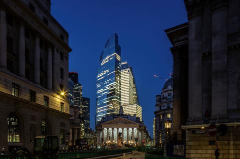
“This is the crispest, flattest facade in London,” boasts Oliver Tyler. We are standing on a terrace at level 26 of 8 Bishopsgate, the newest addition to the City of London’s tall building cluster.
Tyler, a director at architect Wilkinson Eyre, gestures towards Rafael Viñoly’s Walkie Talkie, a short distance down the road to the south. The glass panels on the Walkie Talkie’s northern facade ripple like the surface of a lake in a breeze, which only increases Tyler’s pride: by comparison, it looks a mess
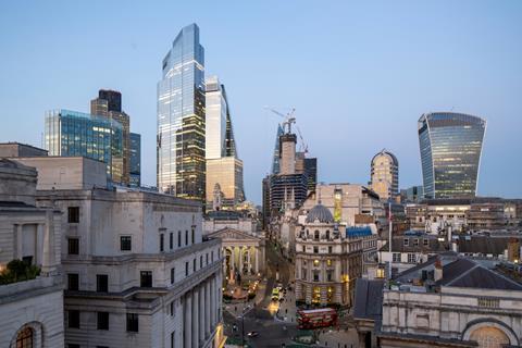
Tyler is the man in charge of the design of a building that is more widely known for other reasons. Like most tall City buildings, this one has been given a nickname: the Jenga. The name is a fair description of 8 Bishopsgate. Quite unlike any of the tall buildings in the eastern cluster, it splits into three distinctive sections that step progressively back from the street line. Each section twists relative to the adjoining one and overhangs the one below – just like a stack of Jenga bricks.
The three sections each have a distinctive character – the lowest is stone clad, while the middle and upper sections are glass; the middle section features narrower, more vertical glass panels and fins compared with the upper section, whose panels are smooth and square.
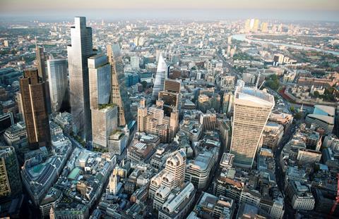
The roof of the lower section, which extends beyond those above it, is topped with a two-storey glass pavilion. And the uppermost section is crowned with a three-storey block that houses a viewing gallery and high-level meeting rooms. This approach breaks up the mass of the building, although some might argue that this gives it a disjointed quality that does not sit easily with a tall building. This argument breaks down when you consider that 8 Bishopsgate does not read as a standalone building as it is just three metres to the south of 22 Bishopsgate, which towers above it.
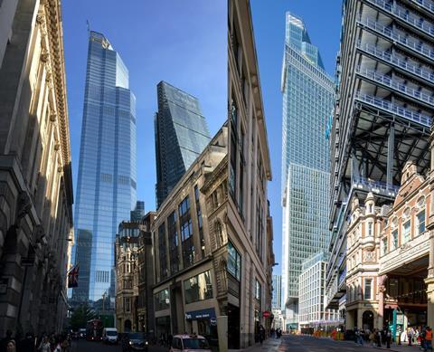
Indeed, this distinctive approach to massing is a good thing; those approaching the tall building cluster from the south were previously greeted with the sheer glass cliff of 22 Bishopsgate, which felt out of place in this relatively low-rise part of the City. The stepped sections, with their variety of facade treatments, go some way towards restoring that more intimate urban grain. This is helped by the precast cladding of the lowest section, which integrates well with neighbouring masonry buildings. But this is not the primary reason why the project team opted for this distinctive shape.
A view of St Paul’s
The new tower’s immediate neighbour to the east is 122 Leadenhall, nicknamed the Cheesegrater because of its distinctive sloped south-facing facade. Both buildings are responding to the same planning constraint: the view down Fleet Street, a mile to the west, is designated a locally important view of St Paul’s Cathedral.
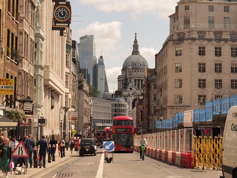
When the Cheesegrater was being conceived, Peter Rees, the chief City planner at the time, told architect RSHP that he did not want to see the building, which sits behind St Paul’s, intruding into the view of the cathedral from the Ye Olde Cheshire Cheese pub on Fleet Street. Like the Cheesegrater, 8 Bishopsgate steps back to avoid impinging on that view. “We didn’t want to replicate the canted facade of 122 Leadenhall, so we adopted this stepped form,” Tyler explains.
Jeremy Edwards, Arup’s property business leader, explains how this shape was born out of close collaboration between the engineer, Wilkinson Eyre, and Stanhope. He says Arup approached each of its design teams around the world and asked them to design the most efficient building form that took account of structure, MEP and location.
“We produced a version of what an engineered first-principles building might look like, and what the form of the building might be,” Edwards says. “We used that in discussions with Wilkinson Eyre to try and agree the form of the building. A large part of that was about conceptual efficiency from the energy, construction point of view and also the letting point of view.”
He adds that the primary driver was an efficient structural grid, describing this as a floorplate-first approach. “It’s absolutely crucial that we have an efficient floorplate because if you don’t have an efficient floorplate, you will never have an efficient building,” he says.
At the time of the first planning application back in 2015, the ill-fated Pinnacle was still in the running for the site now occupied by 22 Bishopsgate. Conscious of this lower-rise environment, the project team applied for and received planning approval for a 40-storey building on the site. The team were then stood down for a year because of difficult market conditions. During this time the 62-storey 22 Bishopsgate received planning permission, while approval was also given for a 40-storey building on the other side of the Bishopsgate Leadenhall Street junction. This more relaxed attitude on the part of City planners to height and scale encouraged the Bishopsgate team to think again about the height of their building.
>>Also read: Wellbeing: 22 Bishopsgate, London
The limiting factor to increasing the building’s height was that critical view from Fleet Street. Increasing the height of the upper stepped sections would, in theory, impinge on the view of the dome of St Paul’s. Tyler says the impact on the view changed depending on where the viewer stood on Fleet Street.
“It’s not fully on axis so, if you move 10 feet to the right or 10 feet to the left, the view changes. So we were defining the height of our building with something that was slightly arbitrary,” he says. The team decided to extend the height of the building by another 10 storeys, taking it up to 50 floors in all.
The height of each section of the building was extended proportionally, although the middle section was made narrower in order to remain within the viewing limits. Was this enough to keep the building within the viewing envelope defined by the Cheesegrater? “It nibbles,” Tyler says. This minor incursion into the viewing corridor did not faze the planners; indeed they preferred the extended design, saying that it gave the building a “more dynamic and eye-catching appearance”.
This increased dynamism was due in part to an increase in the size of the cantilevered sections. The building plot extends into the centre of Bishopsgate, giving the team the option of extending the building beyond the usual building line. The cantilever at level six was extended to 9m, taking it up to the pavement edge. The cantilevers above also touch the pavement edge. The cantilevers increase the internal area of the building by almost 81,000ft².
Making space for lettings
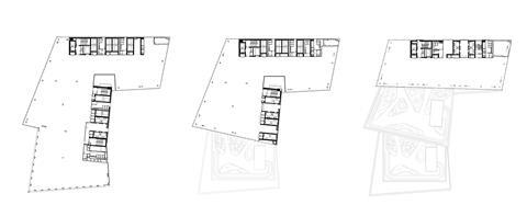
The narrow, stepped-back section of the building above level 26 presented the team with a challenge; the core could take up a large part of the floorplates, leaving a tiny area for letting. “There was a structural imperative that the structural core was as thin as possible for the tall part of the building,” Edwards says.
The answer is two cores – the full-height core is located on the northern perimeter of the building to leave clear space in front of it, with a second core extending up to the top of the middle section on the east side. The middle section is designed as a braced structural box which locks the cores together, increasing the lateral stability of the building. Edwards says this approach meant the core above level 26 was 20% thinner than it would have been, liberating space on the upper floors.
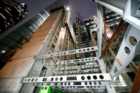
The braced box approach had a second advantage – it was a very efficient way to create the cantilevers, which normally require significant amounts of extra steel. “We were able to use the braced box to hang the cantilevers, which meant we could do this without a tonnage – and carbon – penalty,” Edwards explains.
He adds that the carbon footprint of the building structure was lower than for a typical high-rise London tower, which is impressive given 8 Bishopsgate’s unusual form. “When we looked at the tall building benchmark for buildings in London, there was about 25%-30% less steel than is typical,” he says. Equivalent to 5,000 tonnes of CO2, this was achieved by designing every steel element individually rather than grouping elements together. Clearly visible in the finished building, the steel I-beam flanges vary depending on length and location. A further 140 tonnes of CO2 was saved by optimising beam spacing for higher levels.
Carbon – and cost – was also reduced in the building foundations. Instead of using a traditional piled solution, Arup proposed a pile assisted raft that cut the number of piles from 89 to 28. This saved two months on the programme, £2m–£3m and 3,000m3 of concrete. “It also mitigated the risk of clashing with the existing piles in the ground,” Edwards says.
Stanhope is targeting BREEAM Outstanding and EPC A certification. The latter demanded very efficient services. Unusually, each floor has its own ventilation system, which means fresh air can be supplied to just one floor without needing to switch on the whole building system. “If no one is in occupation, that air-handling unit will be shut down and that will save a lot of energy,” explains Chris Edgington, associate director at Arup, who was responsible for the services design.
“Compare that with a centralised system where large air-handling units are needed at intermediate points with the need to distribute sizeable volumes up and down the building with all the pressure loss that that entails. That means integrating controls that shut off floors that need lower amounts of air at any given time. That is complex technically and takes a lot of area.”
The building also features a closed cavity facade that is 200mm deep. This incorporates automated blinds within the cavity, which reduces cooling energy demand by 530kW, equal to 5% of the energy load.
Flexibility
The building was constructed by Lendlease, continuing a longstanding relationship with Stanhope. The job was procured under a construction management contract for a value of £400m. For Stanhope this promotes collaboration and offers the flexibility to make design changes even after construction has started. Stanhope decided to increase the amount of amenity space in the building by 10%-15% just as construction was starting in March 2019.
“Having the flexibility to be able to do that just adds that extra value to the process,” Dan Ward, development director at Stanhope, explains. “On a building of this scale in a fixed-price scenario, would you be able to do that and how long would it take to price and design it?”
Paul Gransby, project director for Lendlease, describes the logistics as the biggest headache of the job. “It is as challenging as you would find in the Square Mile,” he says.
Hard up against 22 Bishopsgate with very limited access at the rear, the only way in for materials was at the front of the building on the west side. Two gantry cranes running on a rail were installed at second‑floor level, with this floor used as a holding and distribution area. “The only place on the building that we could take the hoists from ground level right to the top of the tower was on the east side, so we skated materials through to the east side of the building and up in the external hoists to their designated location,” Gransby says.
One of the late design changes was the incorporation of a 200-seat auditorium that is split between the first and second floors. This created a large opening in the second floor that had to be bridged to get materials over to the hoists. “To accommodate that change, we temporarily infilled the second floor with precast planks and just lifted those out once we finished with the hoists.”
The cores were a jumpformed structure using the M-Tech system, which Gransby says gave the good-quality finish needed for the exposed structure in the completed building. There was no advantage in using the faster slipform system. “To maintain the stability of the frame, we couldn’t exceed a separation of greater than 20 storeys as we built the cores,” he explains. “The steel frame had to come up behind the cores so there was no advantage in progressing a slipform core and racing that to the top of the building.” The other advantage of jumpform construction is tighter construction tolerances, which makes the job of installing the steelworks and lifts easier.
The cantilevered structural sections were supported with temporary trusses tied into the structure below. These were prefabricated to save time. “We prefabricated the trusses to the largest size we could, and from a programming point of view kept this as tight as we could without wasting time on the installation of temporary works,” says Gransby.
The loads could not be transferred from the temporary works for level 6 to the permanent structure until the structure was up to level 12. Jacks were used to transfer the loads from the temporary works to the finished steelwork – Edwards says the finished position of the steel was just one millimetre shy of the predicted figure.
To ensure that the building would turn out as intended, mock-ups were used as a test bed, including for the unitised cladding. This did not measure up to Tyler’s exacting standards, so cladding specialist Scheldebouw helpfully modified the assembly process despite the cladding system meeting the specification.
“We could still see visual distortions when we built the mock-ups,” he says. “I was very keen to get the glass as flat as possible, so we were able to work with Scheldebouw to slightly change how they built the frames to get the facade very flat.”
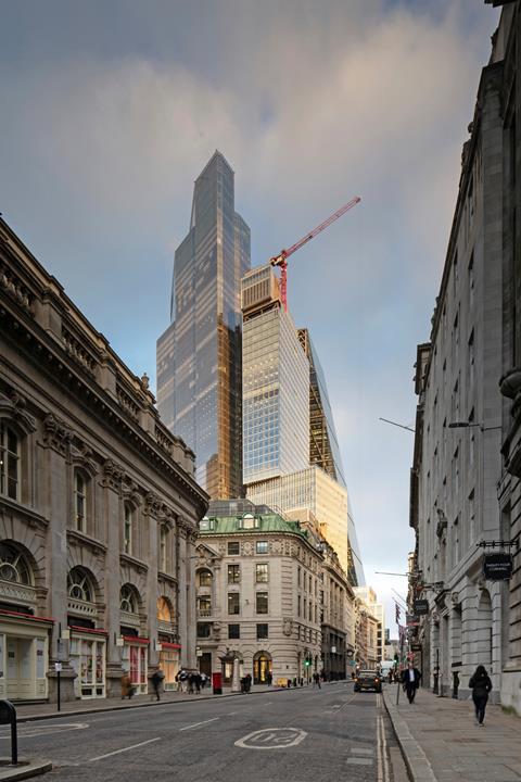
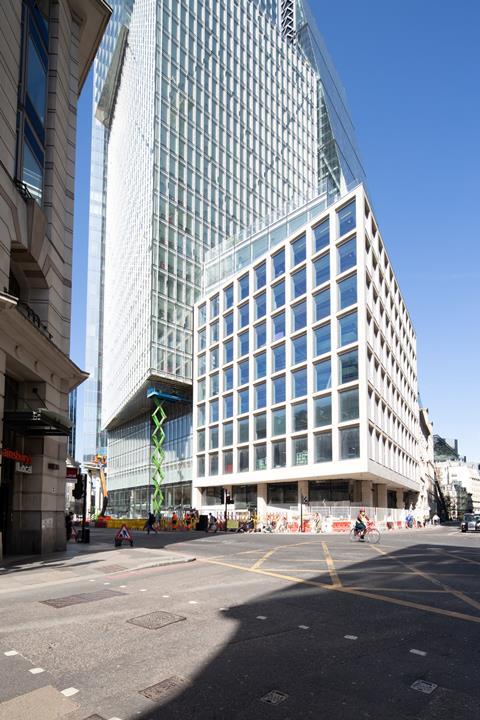
Precast concrete was used for the lowest building section. The cladding was installed independently of the crane at night, as the work was taking place over the pavement and road of Bishopsgate.
The work is almost finished, with practical completion scheduled to take place early this month. This is later than originally planned because of the impacts of the pandemic, which added three months to the programme.
The building is 35% pre-let with some tenant Category B fit-out well under way. Whether the tenants – and the general public for that matter – notice the uber-flat facade is debatable, but one thing is clear: 8 Bishopsgate is one of the more positive tall building additions to the City skyline.
What’s the building like?
Occupiers enter a double-height reception area, with the upper level of the double-deck lifts accessed via mezzanines on either side of the reception which are conceived as floating islands connected by a glass bridge. The materials palette is simple – the reception walls are clad with Carrera marble with the lift lobbies left in exposed concrete. The soffits comprise timber slats, while the terrazzo flooring is a Carrera marble aggregate. The whole effect is cool and contemporary with attractive detailing.
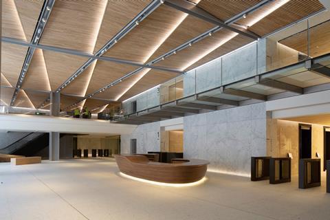
The office areas feature exposed services which are considerably softened using acoustic rafts that provide a visual plane to take the eye away from the pipes and ductwork above. The stepped-back sections provide three differently sized floorplates, with the largest reserved for the bottom nine floors and the smallest above level 26. This should help the building appeal to a wider occupier audience.
Like other City towers, there is a viewing gallery at the top of the building (at level 50) accessed by a dedicated lift. There are also executive meeting rooms at this level. These rooms and the viewing gallery are separated by moveable acoustic partitions which allow the spaces to be opened up into one big events space.
In keeping with the trend to provide lots of amenities to attract workers back to their desks, the building has plenty to offer. The whole of level 26 is dedicated to a restaurant and cafe and steps back at this level, providing a generous terrace for people to enjoy food and drink. There is also a cafe at ground-floor level as well as a 200-seat auditorium with removable seating. There is parking for nearly 1,000 bikes in the basement with lockers and showers too.
Project team
Developer Mitsubishi Estate
Development manager Stanhope
Architect Wilkinson Eyre
Structural and MEP engineer Arup
Cost consultant Alinea
Planning consultant Gerald Eve
Construction manager Lendlease
Steelwork William Hare
Concrete Keltbray
Cladding Scheldebouw




2 Readers' comments