3DReid found inspiration in a traditional symbol of the movement, to produce a building with a real buzz
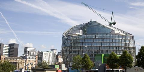
The plectrum-shaped HQ encloses a central atrium surrounded by three office floorplates.
With their emphasis on collaborative industry, co-operative societies have traditionally adopted the beehive as an appropriate symbol for their ethos. It was also a natural inspiration for the architectural form of the Cooperative Group’s new £114 million Manchester headquarters, designed by architect 3DReid.
The Co-op decided to invest in a new head office after research indicated that staying put in its current eight offices would require an investment of £180 million over 25 years. Instead, it decided to develop a new building for its own use, but one that would be attractive for sale on the commercial market - for single or multiple occupancy - if desired in the future.
This gave the Co-op the opportunity to consolidate its offices as well as creating a sustainable new office environment for its workers, with a Breeam “outstanding” rating - the highest ever given to an office building.
“The Co-op is an ethical bank and fair-trade supporter,” says 3DReid divisional director Mike Hitchmough. “Sustainability is at the very heart of what they are and what they do”.
The site, part of the 8ha Noma mixed-use development, is to the north of the city centre and bounded by Corporation Street and Miller Street. 3DReid looked at many configurations for the 46,000sq m building which would fulfil the requirement for floor plates no smaller than 2,300sq m but no wider than 16m, so that no desk would be more than 7m away from a window.
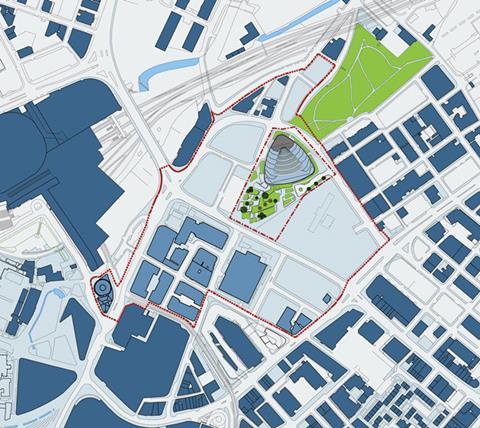
Mindful of the client’s brief for connectivity within the 16-storey building, the architect avoided a long thin plan. Instead, it wrapped the plan around to form a rounded triangle with cores in each comer providing structural stability, two rising to level 11, one to level 15.
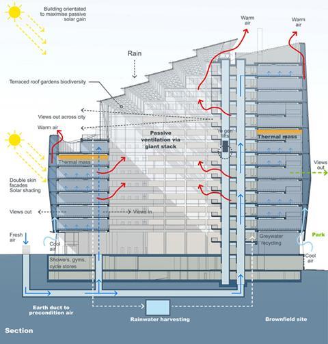
Open balconies overlook the triangular atrium. This central social space, which is glass-topped at roof level, is in effect the “glue” that binds the headquarters and its occupants together, says Hitchmough, as well as acting as an extraction duct for stale air passing up towards the vents.
“The buzz of the building will bleed into the central atrium;’ he says. “Wherever you sit on the floor plate you can either look out of the window or across through the atrium to see either the Pennines, the Peak District or the city centre”.
The building is tilted due south to optimise natural light, stepping down from the 15th to the 8th level. This last full floor plate includes the staff restaurant and terrace looking across the city. The design provides 2,800 desk spaces for 3,500 staff, in response to the client’s desire to introduce new ways of working, including an element of hot-desking.
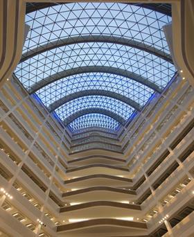
In so doing, 3DReid has avoided the need for three extra floor levels, thus saving approximately £20 million. The building provides 30,000sq m of office space as well as other facilities such as a 275-seat auditorium in the upper basement. The atrium functions as a temporary exhibition area with a business lounge for visitors, a café, and a meeting space for up to 500 people.
Initially, the design team considered a fully concrete frame but this would have made it difficult to achieve such wide, column free spans. Instead, it opted for steel with precast concrete floor slabs for thermal mass. In total the building uses 3,200 tonnes of steel.
“The programme we were working to led us down the steel route” says Hitchmough. “The structure is fully exposed so that the building is clear and honest and legible in how the concrete and steel come together”.
“The client was insistent there should be no internal columns so we had to span 16.5m from the atrium to the external wall. This meant the steelwork had to work harder, and there were cost implications. But the client was willing to buy that for the flexibility it gives it down the line.”
Hitchmough adds that “longevity and resilience of use was a key aspect of the brief - that’s sustainable design as well” making the point that this effectively future-proofs the building so that it will be able to perform to the same standards in a simulated hotter climate of 2050.
The hope is that the new building will operate with at least an 80% reduction in carbon emission and a 50% reduction in energy consumption compared to the current head office complex. The new offices have exposed concrete soffits, which act as a thermal sponge, and a doubleskin facade which, says Hitchmough, acts as a big thermal duvet.
A natural ventilation system draws through 50,000 litres of air per second using 150m of underground concrete earth tube, which passively heats or cools the incoming air.
The Category A office building is the largest commercial office in Manchester, cost £2,200/sq m, rising to £2,500/sq m after fit-out, which is currently underway. According to Buro Happold principal engineer Mark Phillip, it has surprised those who expected a more overtly bespoke solution.
“Anyone financial or legal could move in” he says. “It’s a fantastic office building rather than a Co-op building.”
According to Hitchmough, the new building will be a tool for the transformation of the Coop’s business and the wider regeneration of the Noma site.
The building was designed using bim, which will also be used for a post-occupancy research project into the building.
DOUBLE-SKIN FACADE
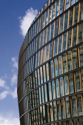
The Co-op building has a double-skin facade to improve its thermal performance. The thermal line is on the inside of the fully glazed building with the outer skin acting as a weather-tight thermal buffer to trap solar gain. This void swells from 800mm at the top and bottom to 2.5m in the middle, giving a fluid, dynamic outward form in contrast to the rational, inner skin.
“We wanted to create something with a real fluidity, mindful that as soon as you have curved glass the cost goes through the roof,” says Hitchmough.
Instead, 99% of the glass is in flat, triangular panels, cold bent with a very slight elasticity to them, which gives a 10mm distortion over a distance of 4m.
This outer skin is attached to the inner using secondary brackets fixed to the primary steelwork. These cantilevering arms follow the line of the outer skin.
A robust, anodised finish to the outer skin was specified at an extra cost to a standard, powder-coated finish to reduce maintenance costs over the life of the building.
ROOF
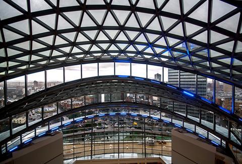
Taking inspiration from the Great Court at the British Museum (which engineer Buro Happold also worked on), five huge steel Vierendeel trusses span the atrium, tied together with a steel framed lattice.
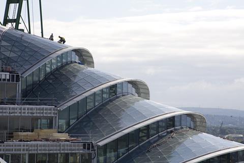
Each piece is framed by a pair of 300mm diameter circular hollow sections, which meet at the ends of the lattice. This lattice was welded on site and installed by the facade contractor.
The atrium glass has a 60% solid frit pattern to control light but preserve views out for those working in the offices.
“We wanted to create a roof that provided a window on to the city for the staff,” says Hitchmough.
MAIN OFFICE STRUCTURE
Use of steel enabled the required large, column-free floors. The steel frame is spliced at every third level and is tied to the concrete cores on every level via connecting plates welded by steelwork contractor Fisher Engineering on to plates cast in to the cores.
Fisher used 2,000 tonnes of cellular beams, chosen because of their service holes and also their ability to achieve a shallow floor depth. These fabricated steel I- sections are 590mm deep and spaced 3m apart. They span a maximum of 16.5m. These were combined with precast concrete coffer units for thermal mass. These are notched to sit on the bottom flanges of the beams. There is a 110mm concrete topping and a 400mm-deep lightweight raised floor for any additional services.
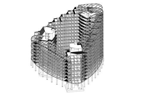
In total, there are 18 types of fabricated beams with varying flange and web thicknesses but a constant depth - the exception being the corners, where the rounded Fabsec steel beams are deeper at 900mm for extra stiffness.
“The main challenge,” says Fisher senior project manager Barry Craig, “was that because the steelwork members have the bottom flange exposed in their final state, we had to erect them to very tight tolerances and had to have a high decorative paint finish.”
Logistically, the steel frame erection needed careful coordination between the trades, with Fisher erecting three levels on one side at a time and then moving on to the next side while the precast coffer units were installed and the concrete topping cast. This was finished in time for Fisher to start on the next three levels using a lightweight cherry picker on the completed slab.
PROJECT TEAM
Architect 3D Reid
Client Co-operative Group
Structural engineer Buro Happold
Contractor HBAM Construction
Steelwork contractor Fisher Engineering
For a video case study of this building, go to www.steelconstruction.info/Video_case_studies
Postscript
In association with The British Constructional Steelwork Association and Tata Steel







No comments yet