Jonathan Tuckey Design has completed a subtle and seductive rebuild and extension of a house in west London, writes Ben Flatman

There is a particular pleasure and quality that comes from buildings that have evolved over time. They speak to our desire for continuity and connection with the past and are often enriched by the “found” nature of existing materials and details. A house close to Ravenscourt Park by Jonathan Tuckey Design (JTD) manages to combine all these elements into an entirely contemporary, yet satisfyingly idiosyncratic new home.  

The richness of the project partly derives from the history of the site, which has been assembled over time. There was an existing house on the middle of the plot, which had suffered bomb damage during World War Two and been rebuilt. Then, wrapped around the south side and rear of the house was an old carpentry workshop. The clients had been living in the original house for many years before also acquiring a small empty site to the north and appointing JTD to develop a design to unite the disparate elements.

A decision was taken early on in the project to entirely replace the existing house and add a new garage to the north. But the walls and steel truss roof of the carpentry workshop have been retained to create a new music room and entertaining space, and a courtyard garden at the heart of the plot.

The house sits in a conservation area on a quite side street. Although the area is bounded by busy roads to the north and south, this enclosed quality gives the neighbourhood the character of a haven, slightly removed from the noise and traffic. JTD have taken their design cues from the immediate context, with clear respect for the wider streetscape. Dan Stilwell of JTD, says the practice paid “a lot of attention to London history and London building techniques.” 

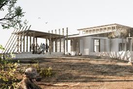
0157_Urban Barn_Collage

Source: Jonathan Tuckey Design

Collage drawing of the Urban Barn

The new central element largely preserves the architectural massing and rhythm of the previous house. JTD have created a relaxed symmetry through the addition of nonidentical but subordinate wings that flank either side of the principal façade. Stilwell says this reflects a desire “to avoid it being one huge house”. Instead there are three distinct parts to the building when seen from the street, while the extensive use of brick helps to tie these elements together.

The main entrance is now through the southern wing, which is faced in glazed bricks and topped by a glass sunroom. The front door sits adjacent to a large folding wooden door that is reminiscent of the old workshop entrance and leads directly into the music room space.

While the hierarchical composition of the façade draws on historical typologies, JTD has done this in a playful way, with an eclectic mix of materials and colours. This ensures that the building retains the informal feel of much of the surrounding neighbourhood. The building doesn’t shout about its newness.

There are plenty of postmodernist touches, such as the white enamelled ground floor front elevation, which is pulled away slightly from the rest of the façade and echoes the stuccoed elevations of the neighbouring houses. Elsewhere in the house pastel colours and an intriguing chapel-like bathroom on the first floor add to the sense that this is a building that is happy to have a little fun with its architectural references.   

Inside, the sense of a house that has evolved over time continues. The music room room sits beneath the renovated steel-truss ceiling of the old caprenty workshop. It is hung with artworks and is home to a baby grand piano. A beautifully engineered black-stained plywood staircase hangs from the underside of the timber deck above, and leads to the sunroom, from which there are views back down into the music room.

The ground floor is taken up mainly by a large kitchen-dining room and lounge. You step down into this space from both of the new wings of the house. The floor here has been sunk 40cm below the previous level to provide more generous ceiling heights. The rear of this part of the house is fully glazed, with direct access to the courtyard garden.

The first floor feels like a discrete element in itself – a quiet area that provides clear separation from the more social spaces downstairs. A seductive day-bed at the top of the main staircase doubles as a small library area, while a long corridor with clerestory windows connects to the guest bedrooms. A mezzanine study deck sits above the corridor, where the client builds model aircraft. These are rooms for quiet contemplation and seclusion from busy careers and the bustle of life outside.

The new garage wing, with a main bedroom suite above, has been built at a slight angle to the rest of the house. The primary staircase sits in between these two elements and narrows slightly as it ascends to the first floor. An extruded plastic handrail was made specially by an aeronautic manufacturer - a reflection of the client’s passion for aviation.

The end result is a highly individual residence, tailor-made to meet the client’s needs

Running across the street elevation of this section of the building is a brick screen, providing privacy to the internal spaces, while allowing in plenty of natural light. The bricks, which are laid vertically to create the screen, were all required to be frogless. “A traditional material used in a very different way,” says Stilwell.

JTD worked with the client using physical models to refine the scheme throughout the design process. It was a “very considered start to the project” says Stillwell, “making sure everything was just right before going to site.”

Although building work was originally supposed to take 12 months, the project was hit by the pandemic and the construction timeline was eventually extended to two years. But the delays allowed the client and architect to further evolve the design. Subtle Japanese influences were added and accentuated, to reflect the client’s interests.

In total the project lasted four years. The end result is a highly individual residence, tailor-made to meet the client’s needs. Designed and built over a longer time frame than originally envisaged, it stands as an example of how slowness – allowing space for architect and client to think – can sometimes work to the advantage of the finished building.

Suppliers:

Poured concrete floor: Lazenby

Solid timber floor: Dinesen

Stone floor to bathrooms: Lovell Stone

Glazed bricks to entrance: H.G. Mathews

Enamel panelling to bay window: A.J Wells & Sons Ltd

Metal frame windows: Secco

Sliding doors/ fixed glazing: Maxlight

Stair acrylic handrail: Zone Creations

Stone steps to kitchen: Artorius Faber Ltd

Steel kitchen worktop & splashback: JLK-DS

Brass curved skirting: Bridport

Polished plaster walls: Tadelakt