This year’s wooden spoon goes to a luxury block of flats in London’s Docklands

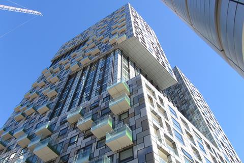
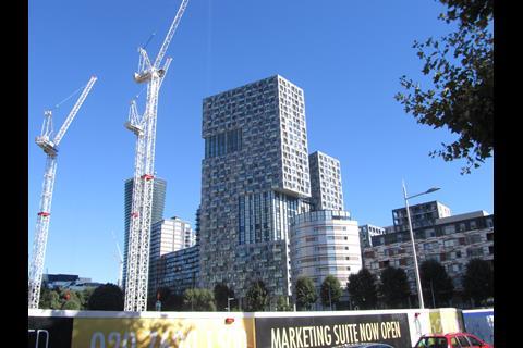
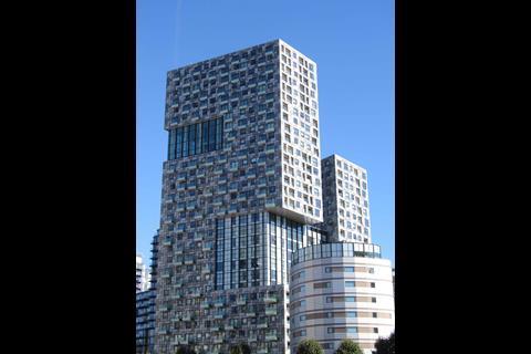
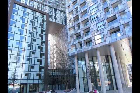
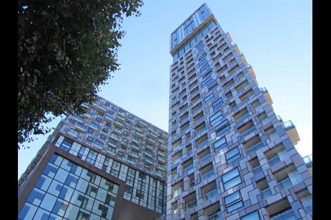
Lincoln Plaza, a residential development in London’s Docklands, is the winner of the 2016 Carbuncle Cup.
Designed by BUJ Architects for Galliard Homes, the development consists of two residential towers integrated with a hotel and a standalone drum shaped building set off to one side.
The winner was selected by a panel of judges consisting of BD editor Thomas Lane, architect and architectural critic Ike Ijeh, author, architect and BD columnist Ben Flatman and the LSE’s director of estates Julian Robinson who was responsible for commissioning 2014 RIBA Stirling Prize finalist the Saw Swee Hock Student Centre. Reader comments were also taken into account during the judging process.
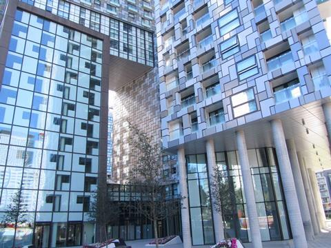
The towers, named Franklin and Greenwich, rise up to 31 storeys and contain air conditioned apartments with prices starting at £795,000 for the remaining 3 bedroom flats. Residents have access to a snooker suite, private cinema, gym and sky garden. They can also enjoy the hotel which offers “a range of fabulous lifestyle facilities”. According to the marketing blurb the development is “set to provide one of the most prestigious and sophisticated new landmarks on Canary Wharf’s iconic skyline”.
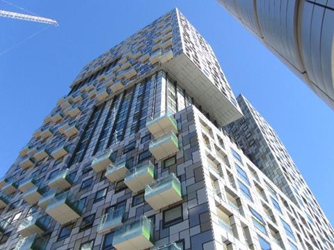
The judges disagreed, describing the building as a hideous melange of materials, forms and colours. Judge Ben Flatman said: “The pressing need for more homes at higher densities is done no favours by this scheme. Lincoln Plaza is the type of project that gives high-rise housing a bad name.”
Julian Robinson acknowledged the building might have been inspired by the Dutch architect Rem Koolhaas, whose practice OMA designed the bank Rothschild’s London HQ. But that is where the similarity ends, he added. “When you look at the crazy patterns, pick and mix colours and gimmicky balconies you can see that it lacks poise, foundation or clarity of vision. Its neighbours aren’t great but this is just an unmitigated mess.”
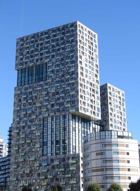
BD editor Thomas Lane said he failed to understand why the architect felt it necessary to cram so many elevational treatments on to one building. “This is the worst building amongst a swathe of mediocrity. South Quay is rapidly turning into London’s Carbuncle Cluster.” Ike Ijeh, BD’s architectural critic, described the building as a “grotesque Jenga game of rabid rectilinear blocks without the promise of collapse”.
Carbuncle Cup Shortlist 2016
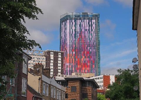
Saffron Square, London by Rolfe Judd
The south London borough of Croydon is in the throes of regeneration and has been revealed this week as having the UK’s fastest-growing local economy. But one imagines that this is in spite of rather than because of its brand new tallest building. Berkeley Homes’ latest offering has been variously described by our readers as having a “car crash of a façade” and “a cheap and less subtle version of Manchester’s Beetham Tower”. Croydon may be laying claim to being south London’s Silicon Valley but if it keeps on producing buildings like this the grass may well be greener elsewhere.
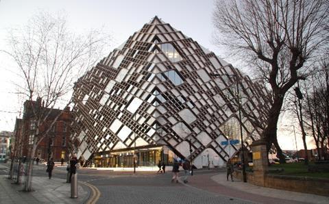
The Diamond, University of Sheffield by Twelve Architects
Many have struggled to define what the Northern Powerhouse actually is and this building’s unsettling similarity to a hydroelectric plant will not help. The allusions are not accidental, the new building provides accommodation for Sheffield University’s engineering students. And with the efficiency of a twin-thrust turbo engine, it commits sins on both the outside and the inside. Its desecration of a helpless neighbouring church is successively described by the nominator and a reader as “dwarfing” and “drowning” and space inside is also pronounced as “wasted”, “unused” and “outrageously mismanaged”.
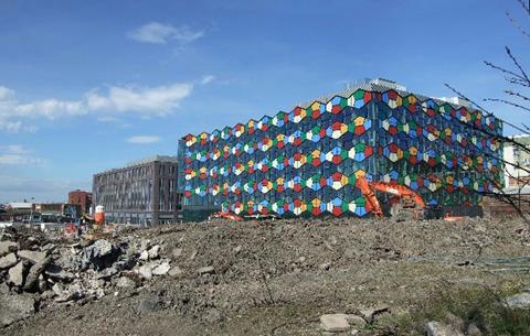
One Smithfield, Stoke on Trent by RHWL Architects
Regeneration has been long been hijacked as a vehicle for poor architecture and this is a classic example. An aesthetic mutation between the nostalgic 1980s brain games of Connect 4 and Blockbusters might not seem like a natural breeding ground for architectural malevolence but this building proves what happens when colour goes rogue. Our readers pilloried Stoke on Trent’s new council offices as being “hideous”, “nasty” and “awful”. But one saving grace is that its alleged role as a catalyst for local regeneration means that there are few buildings nearby forced to view it – yet.
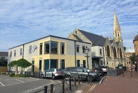
Poole Methodist Church extension by Intelligent Design Centre
Never has the aphorism “it’s not the size that counts” rung truer. This extension to Poole Methodist Church may be small, but the sheer scale of its deficiencies reverberate far and wide across the grim spectrum of planning failure and architectural blight. Not only is the current scheme the result of a bizarre planning episode that appears to have saddled Poole and its fine Methodist church with a scheme that looks remarkably similar to a previously rejected one, but the building screams of the same bland, belligerent mediocrity that is the insidious moniker of ostensibly polite and ubiquitous background architecture everywhere. The nominator rightly describes the building as “an unimaginative grey box” but its subtle subterfuge is such that it could easily slip into town, street or village near you.
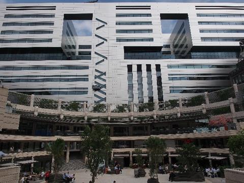
5 Broadgate, London, by Make Architects
When the developers behind the horrendous 22 Bishopsgate describe your building as “the worst large building in the City for 20 years” you know you’re in trouble. In a distinction only previously enjoyed by the Walkie Talkie, we received nominations for 5 Broadgate long before it was finished. 5 Broadgate has already been widely savaged in multiple quarters but in a withering citation the nominator variously described it as a “mute steel fortress” and “a flak tower that gives nothing back to the city”. This nomination also attracted the most comments from our readers with one claiming that its “greatest tragedy” was its demolition of “what was there before”.
Lincoln Plaza, London by BUJ Architects
Every now and then a project comes along that simply beggars belief. This is one of them. 31 storeys of bilious cladding are piled one on top of the other to create an assortment of haphazardly assembled facades that are crude, jarring and shambolic. Were that not enough the facades enwrap a grotesque Jenga game of rabid rectilinear blocks of no discernible form or profile and perforated by a series of balconies which one reader surmises are “an open invitation to commit suicide”. Another bluntly sums up the question we all ask when faced with horror shows like this: “How do these things get planning approval?”






21 Readers' comments