Redrock hits rock bottom
Of late, leisure centres have undergone something of a renaissance. No more the ugly, garish out-of-town container sheds that once encircled British towns and cities and served as the butt of suburban jokes for a generation of disparaging metropolitan elites.
Now, leisure centres are frequently subsumed within shopping centres with genuine architectural ambition, as evident at schemes like Victoria Gate in Leeds, Arc Bury St Edmunds and, to a degree, the two mighty Westfield shopping centres that signpost east and west London.
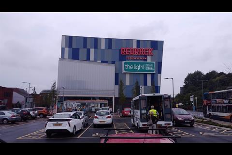
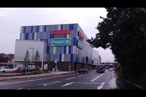
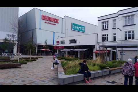
But every now and then an unrepentant relic of yesteryear slips through the net. And one of the biggest and most recent of this unhappy breed is £45m Redrock Stockport just south of Manchester. Redrock contains all of the obligatory consumerist paraphernalia one would expect of a town centre leisure complex. Ten-screen cinema, restaurants, bars, retail and a 340 space multi-storey car park across 75,000ft² of space.
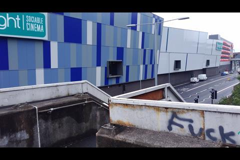
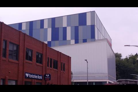
But sadly what it also contains is one of the most horrendous architectural responses ever conceived for Greater Manchester. An awkward row of disjointed boxes lines the M60, unhelpfully signalling Stockport’s aesthetic peril to unsuspecting motorists. All the boxes lean at alarming angles and are then sheathed in all manner of gross, insalubrious multi-coloured cladding.
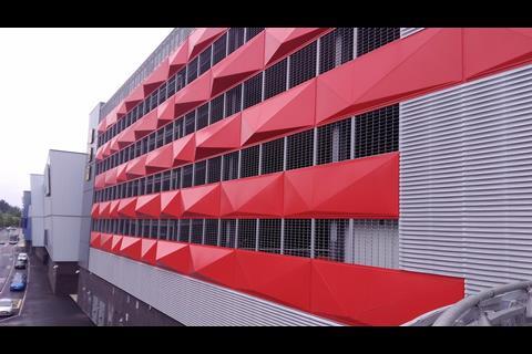
These range from a clumsy chequerboard pattern to bizarre pyramidal nipples injected on to the car park with the remainder entombed within a sickly translucent pall. Gross, gaudy and tasteless this stricken eyesore visually impoverishes the very town it wishes to revive.
It is worth saying that the opening of the complex earlier last November generated a huge amount of local interest with initial trading figures that exceeded forecasts. Equally the scheme was passionately championed by the local authority as a means to regenerate Stockport town centre and bring crucial retail footfall back into a shopping area which still suffers from empty and underperforming leases.
These are all circumstances that inevitably aided the progress of the development through planning and beyond. But a depressed town centre should not give free licence to create depressing architecture. Surely Stockport’s heart could be resuscitated with a better building than this?
Postscript
Please keep sending your Carbuncle Cup nominations to the editor at thomas.lane@assemblemediagroup.co.uk. Include a short citation explaining why it deserves to win architecture’s wooden spoon and a few publishable photographs taken by you to illustrate your case.







19 Readers' comments