One of the myths of modernism is that it is only concerned with the white cube. Today’s architects would do well to pay more attention to colour, writes Joanna Day
I have a bee in my bonnet about colour in architecture. We don’t teach it properly and we don’t consider it until the rest of the design is “done”. It’s just not taken seriously.
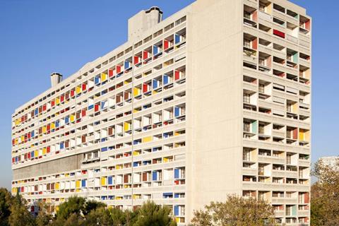
There are a couple of myths that still persist and cast a long, colourless shadow. Myth one is that classical buildings were milky marble, when evidence shows they would have been covered in vibrant colours. Myth two is that modernism was only concerned with the white cube (black and white photography has a lot to answer for). There are, in fact, many examples of colour being an integrated part of modernism’s investigations and vocabulary. However, its legacy seems to have robbed us of colour. It’s time we re-addressed this.

Le Corbusier said: “Polychromy is as powerful an architectural tool as the plan and section.” How apt, then, that at the small but important Colour Strategies in Architecture exhibition at the AA there was not an architectural drawing in sight. The critical word they used in the title is “strategies”. At last, a strategic appraisal of colour. Not another flimsy speculation that red makes you angry and green makes you calm, but a careful study of six buildings taken from the last century or so and discussed in architectural terms.
Why do we panic when it comes to designing with colour? Perhaps it is because so much about the perception of colour is subjective and dependent on other factors (light, orientation, the interaction with the other colours). But this doesn’t entirely wash for architects are accustomed to dealing with subjective issues in a thoughtful manner. In fact you could say it is an architect’s bread and butter.
Is it relevant that one of the architects of the six studied in this exhibition (and the book that goes with it) is a woman, Lux Guyer? I can’t help but think so. Her strategic colour approach of the late 1920s created a choreographed sequence through domestic spaces. It is called, by the curators, the “painterly promenade”. It is wonderful and rare. At a time when we are, still, analysing why the proportion of female architects is stubbornly low, the interior design profession is asking itself why the proportion of male interior designers is so low. Is this another clue? John Outrum once wrote: “Boys stop playing with crayons around the age of five. Girls never stop playing with clothes, make-up, hair and then interiors. Women have an intuitive grasp of colour.” This stereotyping makes my blood boil, but is reflective of the persistent notion that rational and functionalist architecture does not concern itself with frilly extras like colour. Colour consideration remains a decorative afterthought, a “feminine touch”.
So, how do we counter this? The notion of framing colour in strategic terms offers a way forward. Two architectural practices considered in the study are Basil Spence and Reiach and Hall, with completely different strategic approaches dubbed “tectonics clarified” and “hushed tonalities” respectively.
It is relevant that Basil Spence started each design not with the plan or section, but with a hand-drawn coloured perspective drawing on brown paper. His colour choice was in support of the reading of the architectural elements. The analysis in the exhibition and accompanying essay is full of words we use at architecture school: planes, volumes, hierarchy, composition, form, surfaces, structural systems and so on. The colour helps explain the architectural concept and the architecture is richer for it.
For those a little more squeamish about colour, Reiach and Hall is a useful reference point. Its strategy is defined as a “materials-based palette” with the careful use of soft hues that work in the northern light. The lesson here is that all buildings have a colour palette, whether we dwell on it consciously or not. The use of white and grey is not the absence of a palette and should be considered as carefully as any other colour if it is to successfully form the gentle and quiet background to everyday life often intended.

The case studies show that colour is not just about taste but about a holistic approach that works hand in hand with the architectural intent, which brings us back to Corb’s notion of colour as a “powerful tool”. These studies should work as a counterpoint to the prevalent slapdash wallpapering of our built environment with colour in an attempt to cheer it up.
It’s our challenge to use what budget and architectural will we have to try and implement something richer and more refined.
In the spirit of colour evangelists through the ages, I add my voice to the call to action. Let’s stop slapping on colour as an afterthought. Let’s shed our macho nostalgia for the white cube and let’s start thinking strategically and integrally about colour. The world will thank us.
Postscript
Joanna Day is founding partner at Langstaff Day Architects and a design tutor at the University of Liverpool


3 Readers' comments