Melbourne up in arms over ‘insensitive’ design of shop - in controversial square that once divided the city
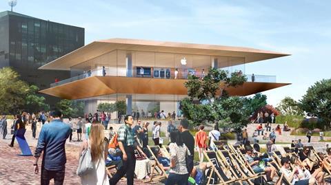
Foster & Partners’ plans for an Apple store in the centre of Melbourne have been criticised for not being in keeping with a public square which itself sparked uproar when it was built.
The designs for the store, which include a two-storey glazed pavilion, were approved by the Victorian state government at the end of December, but Melbourne city councillors are furious, saying the decision was made too quickly.
They object to the design, saying it is not in keeping with its proposed location in Federation Square.
Fed Square, a US$158m precinct opposite the city’s famous Flinders Street Station and St Paul’s Cathedral, was designed by UK practice Lab Studios and opened amid much controversy in 2002. Home to a number of cultural institutions, the whole development is clad in large angular shards and appears to lack any parallel lines. Daniel Libeskind was on the jury that chose the winning design.
Foster’s proposal for the Apple store, by contrast, is a minimalist glass pavilion with symmetrical metal and stone canopies.
The city council’s Future Melbourne Committee accused the Victorian state government of approving the demolition of a building currently occupying the site without public consultation.
In a debate on the plans last week, the council said it had asked the state government to redesign the store “to avoid [the current] pavilion or temple-like design that is out of context in Federation Square and poorly integrated with the square’s existing architecture”.







3 Readers' comments