A new hybrid building in Cambridge mixes academia with enterprise and hospitality to reimagine what a university should be in the 21st century, writes Ben Flatman
The way in which universities relate to their students, staff and the outside world has changed radically over recent decades. Fee-paying students are more inclined to demand facilities that match their consumer expectations. And universities have become ever more interested in finding real-world commercial applications for their research.
West Cambridge is the physical manifestation of this latter change. Begun in the 1960s, this sprawling campus is home to both the university and its spin-off companies. It was a far-sighted attempt to plan for the city’s burgeoning bio-medical and tech industries, as well as the university’s ever-expanding network of laboratories and affiliated research activities.
The only problem is that West Cambridge feels like the worst type of generic edge-of-town business park. It looks like somewhere that has gone out of its way to make sure no one would ever think they were actually in Cambridge. Only Hopkins’ Schlumberger Research Centre offers a sense that this might be somewhere special, with its immediately recognisable translucent roofs, like a tented encampment on the horizon.
It is in the midst of this archetypally 21st-century non-place that Jestico + Whiles were commissioned to design a new focal point for the area. I meet the building’s architect, director James Tatham, outside on a bright June morning.
“There was a real need on the site for a social hub that would draw people out of their silos,” Tatham explains. “No one was mixing outside of their faculty buildings.”
Too far away from the historic centre for most academics and students to pop back to college for lunch, West Hub is therefore reimagining the interactions of the traditional collegiate space in entirely new ways.
It is immediately clear that this building is being asked to do a lot of heavy lifting. Not only is it having to bring some sense of place and coherence to a previously soulless science park, but it is also being required to act as the social glue that holds the whole area together.
West Hub is also Cambridge’s first attempt at creating the type of mixed study and social space that has sprung up on almost every UK campus over the past couple of decades. The fact that Cambridge is a late adopter may be to its advantage, however, as the university has been able to see what does and does not work elsewhere.
Jestico + Whiles, who were already designing the adjacent Cavendish Laboratory, won this project through a mini-competition with Grimshaw. Both practices were already on the university’s existing architectural framework.
Tatham tells me that the practice drew as much on its extensive hospitality experience as its education work to win the job. As he explains, “it was the non-academic projects that were closer to what the university was trying to achieve”.
The project started in 2016 and Tatham tells me that the client “very wisely left a nine-month briefing period”. This is partly because the university was not sure what type of building it needed, or even if it needed one at all.
A key driver for West Hub was a problem identified by the university’s estates team, which had observed a wasteful duplication of spaces by the different faculties, who were often building their own separate lecture and exams venues. Convincing the university that another building was part of the solution proved to be challenging.
Luigi Scalera, a qualified architect and former capital project manager at Oxford Brookes, acted as the client’s in-house project manager. He describes how West Hub was “slightly orphaned” during its early stages. “You need a patron to navigate the various boards,” he explains and “we had to demonstrate to the university why the building was needed.”
Tatham tells me that this project had the “loosest brief of any building I’ve worked on. There was no defined budget or floor area.” Jestico +Whiles had to undertake extensive consultations to understand what was missing from West Cambridge in terms of amenities. And they produced a wide range of high-level options looking at size and cost to help the university decide on a preferred route forward.
Scalera and Tatham both agree that the university was not sure how to approach the project, as it sat outside the conventional typologies of the college and faculty buildings. “Navigating all the committees was fascinating”, says Tatham. “It’s such an old establishment.”
Scalera explains that ultimately the former pro vice-chancellor Duncan Maskell was critical in driving the project forward.
During West Hub’s lengthy gestation, the client visited a number of similar new hybrid university buildings elsewhere in the UK, including at the LSE and Coventry University. But this only convinced them that they did not want to duplicate an existing model.
Instead, it was new commercial office and hospitality spaces that caught their attention. “They wanted good food and ambience,” says Tatham. He references the Riding House Café chain, with its range of different interior spaces as a key influence, as well co-working spaces.
“Second Home had the right feeling,” he explains. “Very relaxed, very young, active and buzzy.”
The fact that the university was focused more on a certain type of ambience, rather than a preconceived idea of what the building should be, led Tatham to involve Jestico + Whiles’s own in-house interiors team.
He makes the initial stages of the design process sound like a mix between a conventional architectural options appraisal and mood boarding. “The interiors team have a different way of thinking about space which is refreshing,” he tells me. Critically, they brought their extensive restaurant and hotels experience to bear.
The brief ended up being part library, part workspace and part hospitality space, while the underlying concept draws a lot from contemporary office design. There is an emphasis on the mix and variety of spaces, with lots of collaboration areas for working together.
The building is designed to allow for the personalisation of the workspaces. The university was not looking for a single type of space. Instead, the design team has sought to deliver plenty of tucked away corners and a range of different environments.
One of the biggest innovations at West Hub is that this building is literally open to anyone. Although aimed primarily at researchers, academics and the staff of the surrounding companies, the building is equally welcoming to members of the public.
Critically, there is no reception desk. Visitors don’t need to feel obliged to “check-in” or explain their presence. On the morning that I visit, a cycle club is meeting for coffee before heading out onto the fens.
This is very much a layered building. A University of Cambridge research paper, Protolib: Researching and Reimagining Library Environments, helped to inform the design. It contributed to the idea of having ”low, medium and high intensity” study spaces, each with a different approach to acoustics, furniture, space and flexibility.
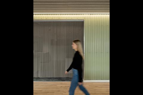
Each floor level has different ceiling heights and lighting. Active and vibrant at lower levels, it gets quieter and the lighting warmer as you move upwards.
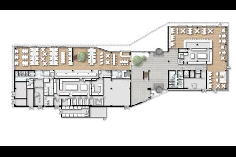
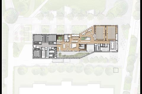
The layout is open and casual. There has also been a very conscious effort to make the ground floor porous, with a long east-west spine and north-south cross-routes, linking into the yet to be completed landscape. The intention is that people are drawn in, but also that they see West Hub as a crossroads when walking across the wider campus.
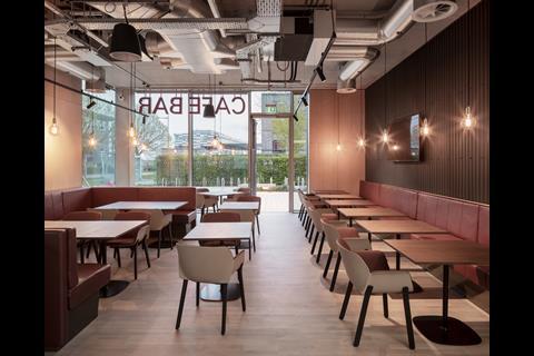
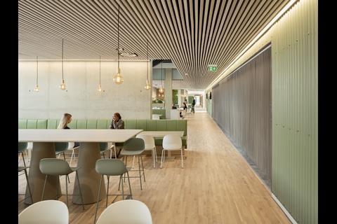
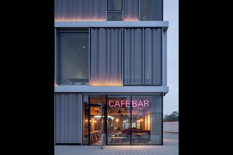
On the ground floor there is a mix of dining and café options, with varied seating, that includes banquettes, high and low tables and everything in between. At the eastern end of the building there is also a large bar/restaurant, operated by a third-party vendor.
The students who use the building are mainly postgraduates. “The client didn’t want a student bar,” Tatham tells me. “They wanted somewhere a little more grown up. Somewhere to take a visiting professor from Yale.”
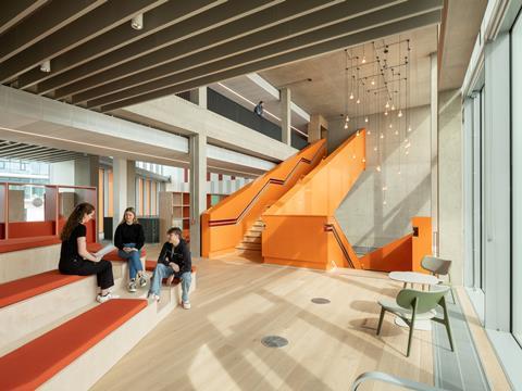
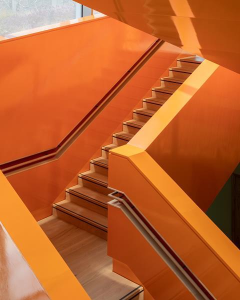
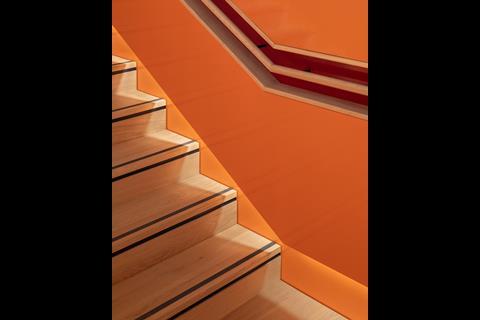
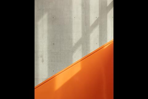
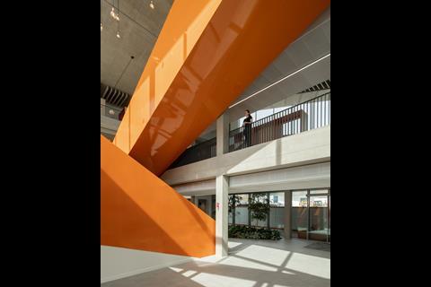
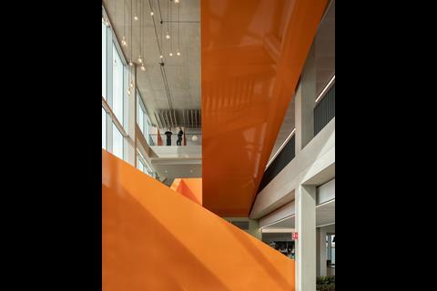
A gigantic plate-steel orange staircase zig-zags its way through the main atrium, providing the building with a visual and circulatory focal point. It’s a dramatic and effective way of giving the interior a vertical dynamic amid the otherwise dominant horizontal ordering.
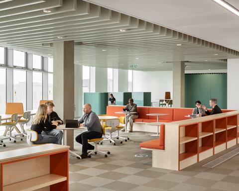
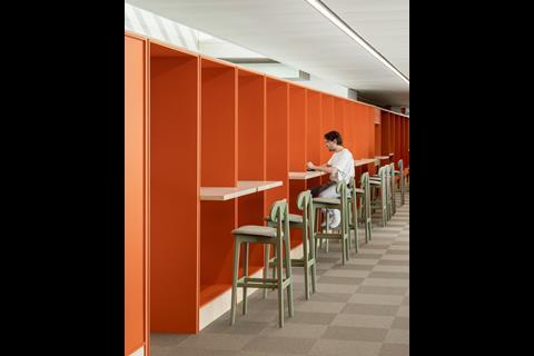
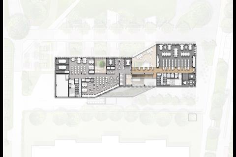
The first floor is for meeting and convening in a slightly more formal setting, but still has an open plan area, with an orange “learning spine” running through its centre. This hybrid shelving and furniture structure acts as both a wayfinding device and lightweight space divider.
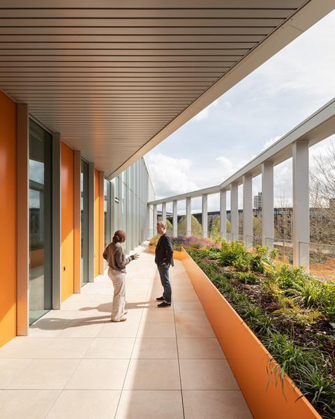
Lots of incidental spaces occur either side of it, each one offering a subtly different ambience. An external landscaped terrace is part of a wider objective to bring nature into the building.
Modular birch ply furniture designed by Jestico + Whiles helps to define further breakout and social spaces, while allowing for easy reconfiguring as activities change over time. Tatham said the furniture was one area where the practice had to battle hard to get what they wanted. At either end of the first floor there are several large rooms that can be booked by anyone for activities ranging from an investor pitch to yoga classes.
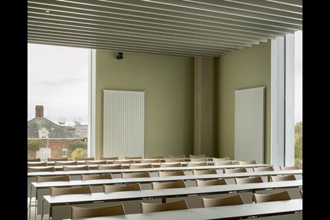
The second floor is intended as a quiet study space, with more conventionally recognisable “library” reading rooms and book stacks. At one end of the floor there are desks aimed at small start-ups. And there are also small informal meeting rooms aimed at pastoral care.
The building is designed to be open 24 hours a day, seven days a week. This is a huge departure for the university. On the day I visit the building is quietly buzzing, to the clear satisfaction of Tatham. “It’s very different to most university buildings, which are quite insular and where the visitor is not always sure whether they’re allowed in,” he tells me.
The active management and programming of this type of building is essential. As much as the “all-comers welcome” approach ensures a lively mix of people and activities, that could easily end up making it a rather transitory sort of space. The appointment of Anna Steeden from the Tate to manage West Hub is therefore central to its success.
She works to manage bookings but also to ensure that the activities are varied and an attraction in themselves. “Third parties are using it – there was a real need for this building,” she tells me. “And it’s amazing to see the flow of people, from students and commercial tenants right through to members of the public”.
Tatham sees the building as a celebration of this connectivity and vibrance. “It will never stay static,” he tells me, “it can adapt as needs change.”
The building was delivered by Bouygues on a D&B contract, with Jestico + Whiles retained by the client, and NBBJ Architects appointed by the contractor. Jestico + Whiles shared renderings of the interiors at the tender stage that were used as a reference to help ensure the original vision was maintained.
Tatham says that West Hub has been delivered on a standard budget for this size and type of project. Explaining the choice of materials, he tells me that they are “not necessarily high-end, but we have tried to use them in an interesting way.”
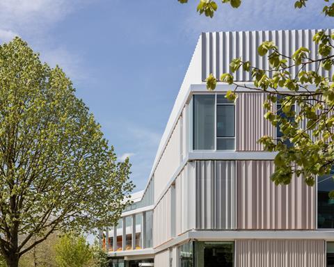
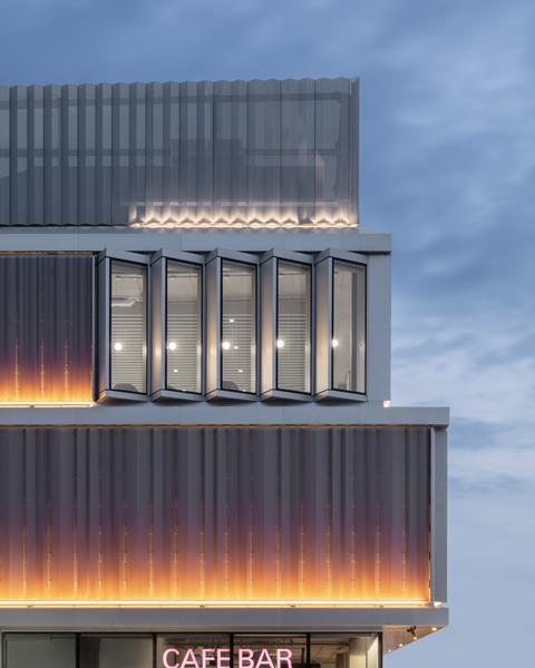
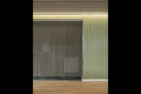
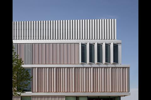
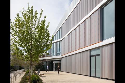
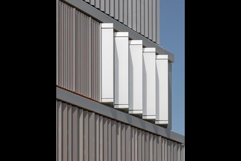
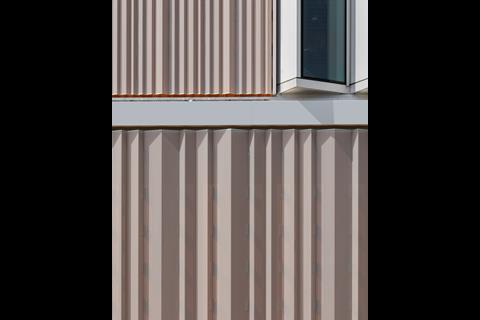
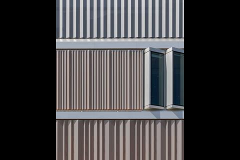
The exterior is wrapped in an aluminium “curtain”. It is perforated to different densities, allowing more or less daylight into the various areas of the interior. It is surprisingly reflective during the day and glows orange at night – acting as a beacon in the evenings for those working late in the neighbouring laboratories.
West Hub and the Cavendish Laboratory represent the first phase of a much-needed new masterplan for West Cambridge by Aecom, which includes a green pedestrian and cycle pathway. Eventually this parkway will run all the way to the Schlumberger Centre.
Tatham explains to me that Jestico + Whiles did not want their two buildings to be same. Nevertheless it feels a shame that there is not a little more of a formal dialogue between them at this gateway point to define the entrance to the new park.
The external landscaping is not yet complete, but the building has been designed to have an intimate relationship with nature. The northern elevation will face onto the new park, that runs east-west.
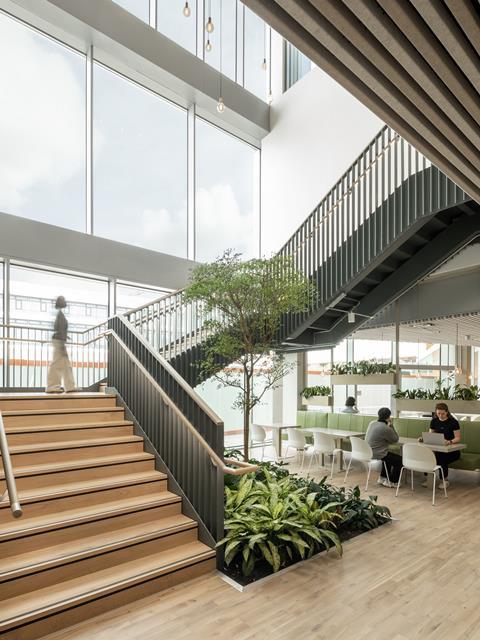
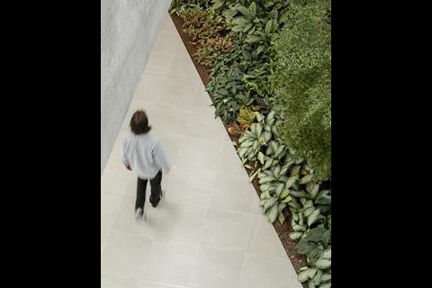
Two internal gardens, with hard fought-for mature trees, draw the landscape inside. And a nearby productive garden is intended to supply the restaurant with fresh ingredients.
Even though West Cambridge began in the 1960s, it still feels a place very much in development. Compared to the heavily design-coded Eddington to the north, West Cambridge is amorphous and lacks a civic character.
Scalera, who is a veteran of large-scale estates projects, notes that these developments are often “slow burn”, but then reach a critical mass “and then explode”. The implication is that West Hub will be the spark that finally makes West Cambridge come alive.
City and place-making are skills that we have had a problematic relationship with in this country for decades. The dire legacy of West Cambridge presented Jestico + Whiles with the most unpromising of contexts. And yet they have succeeded here in creating a seductive and striking new project that points the way to a better way of building.
In what was previously a forlorn corner of the city West Hub has significantly raised the architectural bar. This should mark the beginning of a process that leads to the reimagining of the wider area. The proof of this project’s success will therefore depend on to what extend future developments build on and succesfully develop West Cambridge’s urban tapestry.








1 Readers' comment