Council, hospice and media company also on shortlist
The client behind the decade-long redevelopment of King’s Cross has been shortlisted for the RIBA’s Client of the Year award.
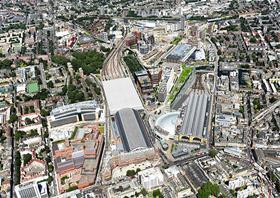
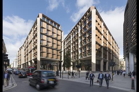
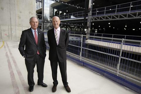
Argent is a finalist alongside three others including Bloomberg, which commissioned Foster & Partners’ Stirling-shortlisted headquarters.
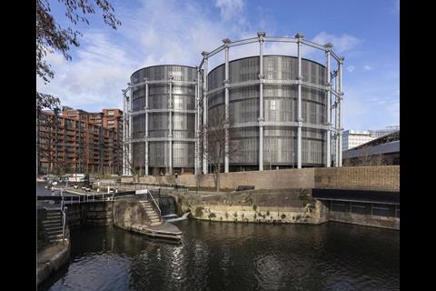
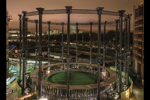
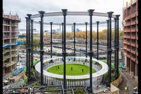
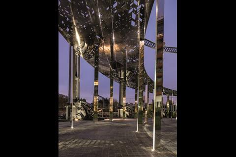
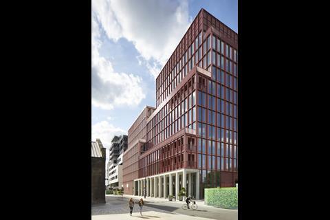
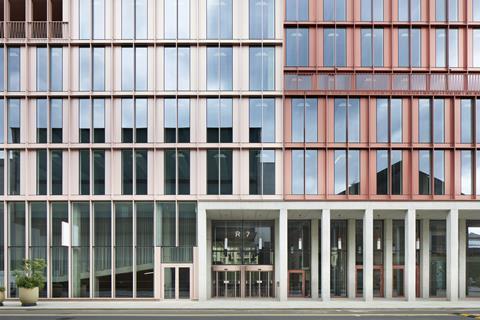
The developer has been recognised for for Duggan Morris’ R7 office building, Wilkinson Eyre’s Gasholders and Bell Philips Architects’ Gasholder Park, Stanton Williams’ Victoria Hall King’s Cross and “a number of previous RIBA Award-winning projects”.
Hackney council is also in the running on the back of projects by Karakusevic Carson and Hawkins Brown.
St David’s Hospice in Newport, Wales, completes the shortlist for its new in-patient unit designed by Worcester practice KKE Architects.
The annual award recognises the role that a good client plays in the creation of fine architecture.
Previous winners include Bedales School last year, the National Theatre, Manchester Metropolitan University and the Olympic Delivery Authority.
This year’s winner will be announced at the Stirling Prize party at The Roundhouse on October 10.
The contenders
Argent
Project: King’s Cross
Project data for: Gasholders London, by Wilkinson Eyre with Jonathan Tuckey Design
Date of completion: January 2018
Contract value: Confidential
Internal area: 14,050m²
Cost per m²: Confidential
Jury report
The industrial heritage of King’s Cross is integral to its regeneration and the triplet of grade II-listed cast-iron gasholders is the most distinct centrepiece.
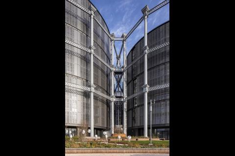
Constructed in 1867, the heavy industrial structures in their full restoration remain as a dominant feature on the new skyline of King’s Cross. Sitting comfortably within these structures are the three residential drums, clad in a delicate and intricate aesthetic of steel and glass panels with a veil of external shutters pierced in a pattern of circles to allow dappled light into the rooms.
These create a homogenous yet dynamic skin, paying homage to the original drums that once sat in these gasholder guide frames. However, they also fulfil a functional and environmental requirement for modern living. The judges were impressed by the facade design addressing the challenges of privacy, solar shading and window dressing while celebrating the industrial character of the gasholders.
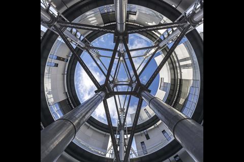
The architect approached the configuration of the three interlocking drums to create a fourth central drum-shaped courtyard, which is open and theatrical with the conglomeration of the gasholder structures coming tougher.
As a counterpoint to the external structure, the interior is based on the intrinsic aesthetic and working of a watch. The brass linings in the polished floor, balustrade design and custom-designed door handles reinforces this crafted approach to the details and is reminiscent of Scarpa’s instinctive designs, combining base materials with precious ones. A brass lining to the vertical edge of the external shutters continues this language onto the facade.
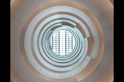
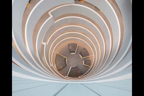
The residential drums are set at differing heights to suggest the historic movement of the gasholders and each one with its own central atrium floods light down into the heart of the structure and into the apartments through diffused glass screens. The circular walkways and light reflective surfaces create a ‘Guggenheim’ feel to encourage interaction with neighbours and other residents.
The integral design of the wayfinding throughout the development with signage embossed into the textured concrete panels is done with great intelligence. This considered approach to the design is also evident within the apartments with a take on boutique hotels where the detailing to the fixtures and fittings is meticulous and custom-made. The layouts of the pie-shaped apartments are well planned, embracing the concept of a radial arrangement to benefit from expansive views and daylight.
The provision of a spa, gym, roof garden, cinema and business lounge all add to a modern lifestyle offer. The client is finding that the demographic of residents is proving to be older than expected with an appreciation for the quality of detail and ease of use of the apartments with innovative technologies.
Gasholders London is a successful marrying of old with new where it sensitively handles the needs of modern 21st-century living with celebrating the most beautiful industrial structures in the renaissance of King’s Cross.
Bloomberg
Project: Bloomberg European HQ, London, by Foster & Partners
Date of completion: November 2017
Contract value: Confidential
Internal area: 66,354m²
Cost per m²: Confidential
Jury report
Occupying a whole block within the city, this project is a large office building to house all of Bloomberg’s employees under one roof for the first time. Externally the building incorporates a covered walkway all round its perimeter. There is also a new street created, carving the building into two blocks connected by bridges. Commercial units for restaurants etc are arranged at ground level. There is an external undulation in plan described by the architect as an expression of the movement around the building.
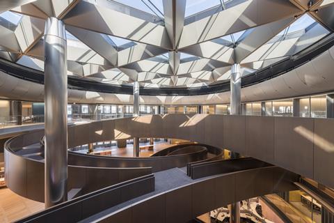
After entering the building one encounters some understandably very tight security, then one moves through an architectural procession to the lifts. This procession includes “the vortex” which is an art piece, one of several throughout the scheme. The lifts – specially designed – take you to a mid-level floor where the main concourse / café space is located. Desks and workspaces are then distributed in clusters accessible from a winding curved ramp, which curls through the building linking the various levels.
The whole building, inside and out, is executed to a very high quality.
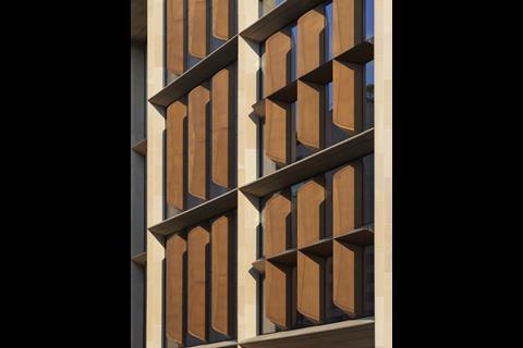
Externally the building is of an appropriate scale to the surroundings. It seeks to create a dialogue with some very old neighbouring buildings and in that it is quite successful. The covered walkway represents a level of generosity towards the city.
Internally, the process of moving through the architectural procession and up in the lifts creates a completely immersive environment. The concourse level is very vibrant, buzzing with activity and isolated from its surroundings. There’s a sense of Willy Wonka about the space. It is here that the real success of the project starts to emerge. Everywhere you look there is an inventive detail. From the bespoke folded aluminium ceiling “roses” to the magnetic floorboards. The aim of the building was to avoid standard office space and in this it succeeds.
Overall the project is a tour-de-force. This is the opposite of a quiet, understated building. In fact the multiplicity of invention at numerous levels is carried through with such conviction that you cannot fail but be impressed by it.
London Borough of Hackney
Projects include: Kings Crescent Estate phases 1&2 by Karakusevic Carson Architects and Henley Halebrown and Hackney Town Hall by Hawkins Brown
Project data for: Kings Crescent
Date of completion: December 2017
Contract value: £50,000,000
Internal area: 24,800m²
Cost per m²: £2,016 / m²
Jury report
The original Kings Cross Estate had been half demolished in 2000 and the remaining community have lived with the resulting wasteland until now. Instead of the usual demolition and rebuild model for large–scale estate regeneration, this project shows that community combined with local authority-led development can be a way forward to create a robust model for new and refurbished housing.
By upgrading the existing housing with large balconies, winter gardens and garages converted into new flats, the existing residents were very much engaged with the estate development, which allowed them to remain in their homes throughout the works. The master plan created new connections and permeable spaces: 3 courtyards with very different emphasises from contemplation to play and a gardening club; an intelligently furnished play street helps community integration creating a new public space.
Two architectural practices, Karakusevic Carson Architects and Henley Halebrown, working closely together has successfully allowed more variety in the build. This project results from a strong collaboration between the client, the London Borough of Hackney, and the architects, and acts as an example of what can be achieved in future developments within the borough and beyond.
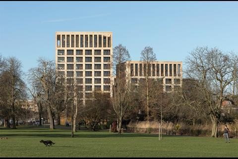
The three new brick-clad blocks vary in height from 5-12 storeys interacting well with the park and local streets creating a family of buildings. Brick, concrete steel and timber provide a simple palette for the estate. The brickwork contains subtle art deco detailing while timber is used on the balconies and in the generous lobbies. The dual aspect entrances are light and airy allowing views through to courtyards and shared amenities giving a sense of delight and intrigue. The hardwood timber framed shop fronts sit well at street level.
A well considered residential scheme that has repaired the previously desolate areas and helped to form a sense of community and ownership. A tenure-blind scheme reconnects the estate to the outside world and engaged the residents throughout the transformation of their estate.
St David’s Hospice Care
Project: New in-patient unit, Newport, designed by KKE Architects
Date of completion: November 2017
Contract value: £4,450,000
Internal area: 1,665m²
Cost per m²: £2,673 / m²
Jury report
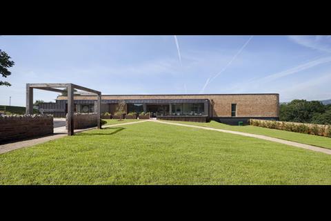
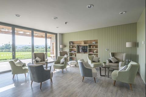
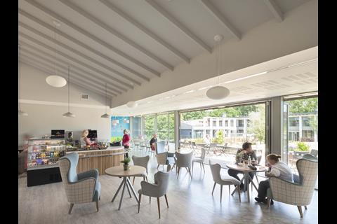
The 15-bed, in-patient hospice is a development of the original 2013 day hospice, itself a shortlisted project. The new building owes much of its special quality to unusually insightful clients. Their brief for the new building applies evidence gathered in the operation of the charity’s other centres and awareness of international best practice. Lessons learned have been applied in the clinical and operational aspects but also, most importantly, in the nature of the ideal aesthetic environment for end-of-life care.
Those of us who attend on a family member during their last days will not forget the character of their surroundings at that time, surroundings that are far too often both chaotic and austere. For those who have reason to visit St David’s hospice the experience is very different and, in so far as it is possible at such a time, in many ways really uplifting.
Nothing matters more to the patient than the feelings of the family that they leave behind, so it follows that the focus of design should be on the experience of visitors as much as, if not more than, on the patients themselves.
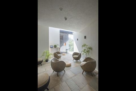
The hospice is beautifully calm and serene. It achieves an air of spirituality while avoiding any implication of judgmental sanctity. The colours and materials are restrained: a tightly controlled palette of warm natural tones. The consistency is thoughtful and deliberate, a specific requirement of the client that patients and visitors should not be distracted by any implied differentiation between occupants.
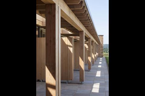
Spaces for withdrawal and contemplation follow the secular spiritual approach. Natural materials are used contrary to sterile clinical convention. Hygiene control may require more effort, but the environmental aesthetic benefits take precedence over any added operational burden.
The patients’ rooms have a gentle domestic character. Clinical fixtures are unobtrusive. Furniture and built-in fittings are refined, smoothly co-ordinated and well constructed. Careful consideration has been applied to every element: nothing is left to irritate or to jar the senses. For such a complex facility this level of design control is a terrific achievement.






No comments yet