Practice pushes award veteran Foster & Partners into second place
McInnes Usher McKnight Architects has nudged Foster & Partners into second place as bookies’ favourite to win this year’s top UK architecture accolade.
Hours after the 2018 Stirling Prize shortlist emerged, bookmaker William Hill placed MUMA’s Storey’s Field Community Centre and Nursery in Cambridge a nose ahead of Foster’s Bloomberg HQ in the City of London, giving the former odds of 10/3 against the latter’s 7/2.
Storey’s Field is MUMA’s second Stirling Prize shortlisting: the practice missed out to AHMM’s Burntwood School in 2015’s fray. Fosters has been nominated for the prize 10 times and won it twice – for the Imperial War Museum Duxford and 30 St Mary Axe.
William Hill’s initial odds for 2018’s winner placed Waugh Thistleton’s Bushey Cemetery neck and neck with Jamie Fobert Architects and Evans & Shalev’s New Tate St Ives extension. Both were given odds of 4/1.
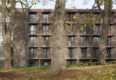
Niall McLaughlin Architects’ Sultan Nazrin Shah Centre at Worcester College, Oxford, was given odds of 9/2, leaving Henley Halebrown’s Chadwick Hall, designed for the University of Roehampton, as the outsider at 11/2.
William Hill spokesman Rupert Adams told BD the Stirling Prize was never a huge moneyspinnner for the firm, pointing total bets in the region of £5,000 to £10,000 placed in a typical year.
“It’s a small sum of money for us, but it’s an interesting market and one which the boys enjoy pricing up,” he said.
Adams noted that punters’ interest in the outcome of the prize – named in honour of James Stirling – tended to spike in the days and hours immediately before the winner was announced.
This year’s winner is set to be revealed in a ceremony at the Roundhouse on October 10
Runners and riders: William Hill’s odds for the 2018 Stirling Prize shortlist
- Storey’s Field Community Centre and Nursery, Cambridge, by MUMA (10/3)
- Bloomberg, London, by Foster & Partners (7/2)
- Bushey Cemetery, Hertfordshire, by Waugh Thistleton Architects (4/1)
- New Tate St Ives, Cornwall, by Jamie Fobert Architects with Evans & Shalev (4/1)
- The Sultan Nazrin Shah Centre, Worcester College, Oxford, by Niall McLaughlin Architects (9/2)
- Chadwick Hall, University of Roehampton, London, by Henley Halebrown (11/2)
Judges’ citations
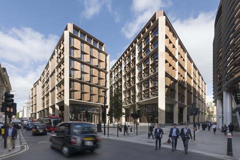
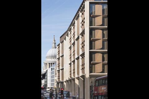
Bloomberg, London by Foster & Partners
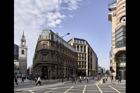
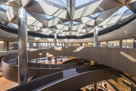
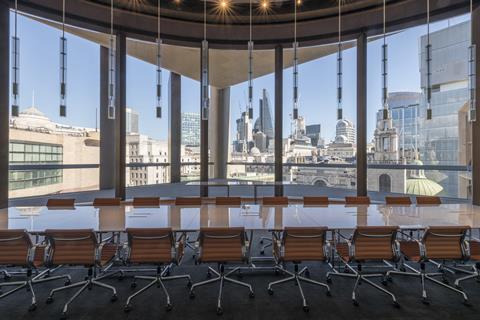
Occupying a whole block within the city, this project is a large office building to house all of Bloomberg’s employees under one roof for the first time. Externally the building incorporates a covered walkway all round its perimeter. There is also a new street created, carving the building into two blocks connected by bridges. Commercial units for restaurants etc are arranged at ground level. There is an external undulation in plan described by the architect as an expression of the movement around the building.
After entering the building one encounters some understandably very tight security, then one moves through an architectural procession to the lifts. This procession includes ‘the vortex’ which is an art piece, one of several throughout the scheme. The lifts – specially designed – take you to a mid-level floor where the main concourse / café space is located. Desks and workspaces are then distributed in clusters accessible from a winding curved ramp, which curls through the building linking the various levels.
The whole building, inside and out, is executed to a very high quality. Externally the building is of an appropriate scale to the surroundings. It seeks to create a dialogue with some very old neighbouring buildings and in that it is quite successful. The covered walkway represents a level of generosity towards the city.
Internally, the process of moving through the architectural procession and up in the lifts creates a completely immersive environment. The concourse level is very vibrant, buzzing with activity and isolated from its surroundings. There’s a sense of Willy Wonka about the space. It is here that the real success of the project starts to emerge.
Everywhere you look there is an inventive detail. From the bespoke folded aluminium ceiling ‘roses’ to the magnetic floorboards. The aim of the building was to avoid standard office space and in this it succeeds.
Overall the project is a tour-de-force. This is the opposite of a quiet understated building. In fact, the multiplicity of invention at numerous levels is carried through with such conviction that you cannot fail but be impressed by it.
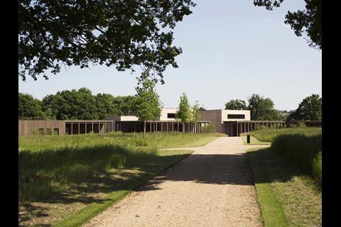
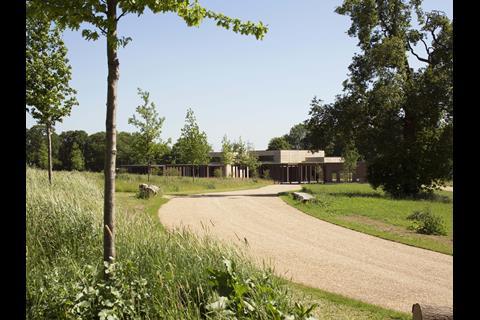
Bushey Cemetery, Hertfordshire by Waugh Thistleton Architects
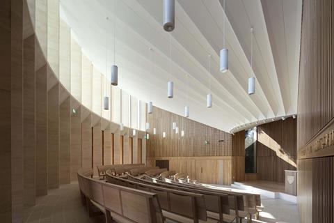
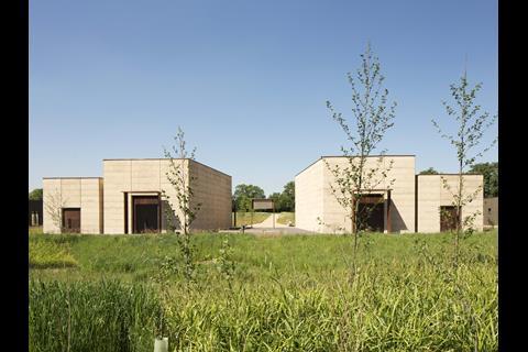
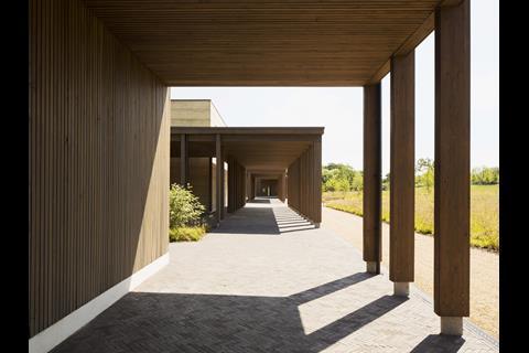
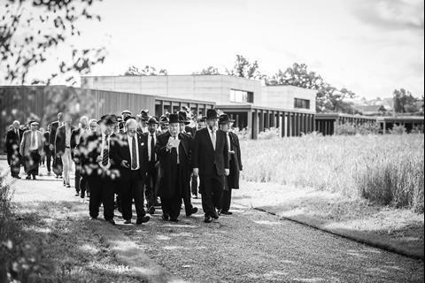
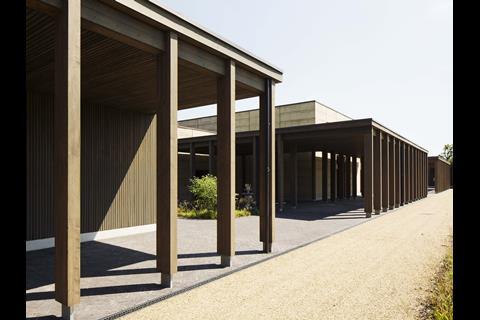
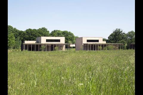
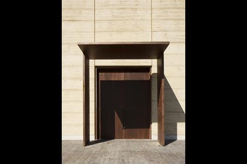
The architects, Waugh Thistleton, have a very strong, long-term relationship with the Jewish community. They have completed a number of synagogues prior to this project and the simplicity, austerity even, of the means and materials used in this project are a reflection of this mutual respect, trust and empathy. Every aspect of the building layout and progress through the landscape are in keeping with the spirit of the event.
In keeping with the Jewish idea of being buried very simply, in a cardboard coffin, simple clothes, the buildings carry through the idea of returning the body to the ground, “earth to earth, ashes to ashes”. In contrast with the plainness of the buildings, the landscape is almost lush. The cemetery is surrounded by a tree belt and a series of balancing ponds to capture the increased rain water runoff fed by a clever drainage system.
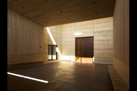
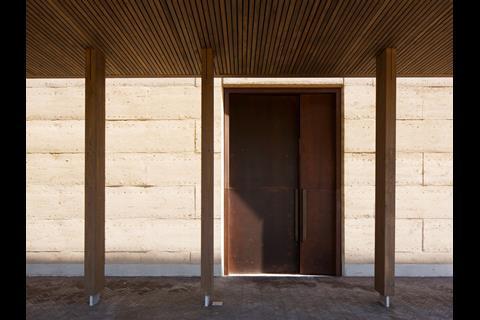
The limited number of buildings, the simplicity of the forms and expressionist choice of materials all reflect the symbolism of burial to the Jewish community. An example of the care with which each element has been considered is the gentle slope of the floor in the Prayer Halls that tips the visitors forward along the route to the graves.
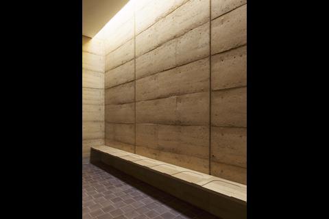
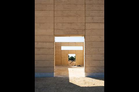
This project will be just a stage in the ongoing process of enlarging the cemetery so that the community can continue to honour and protect their dead. The fact that the rammed earth walls of the prayer hall will return to the earth once the cemetery is full and has to be extended again, is a poetic response to the programme for the cemetery and the traditions of the Jewish faith.
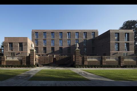
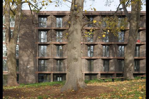
Chadwick Hall, University of Roehampton, London by Henley Halebrown
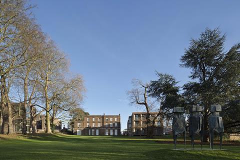
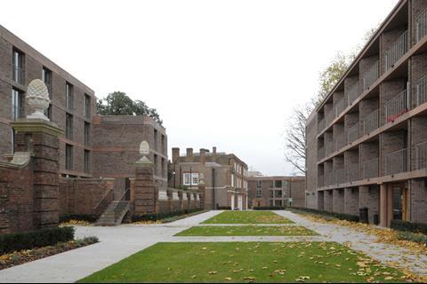
The scheme is set in the grounds of the Georgian grade II*-listed Downshire House which itself borders on the LCC’s Alton West Estate (grade II*). The brief sought 210 en-suite student bedrooms. These are provided in three new buildings.
Each employs a distinct plan type – two are villas, the third a modernist pinwheel plan. Two are paired around an existing historic sunken garden. The third lies on an axis with the sunken garden to the south of Downshire House, completing an ensemble with the house that creates a theatre for the students’ social life.
This is a good example of timeless architecture. It is inspiring while remaining simple. The scheme’s success is also based on a skilful masterplan with sensitive arrangement of the blocks within the landscape, existing listed building and the restored sunken garden. The concept is a nod both to Georgian architecture as well as to a modernist block of flats to the north-west boundary of the site. The design becomes a backdrop for the listed building and the sunken garden. It gives them the importance and provides a setting for social gathering. The main materials are limited to a dark red-brown brick and precast concrete, with a darker red brick which both relates to the listed building and yet remains subservient. The tall windows in all the blocks are for the bedrooms with wider ones for communal areas. The only exception is the large bay window which attempts to responds to the bay window of the listed building. The low cost of the building is not at all reflected in the external appearance of the scheme.
The panel felt that the architects managed to create a welcoming and calm space by careful masterplanning responding in turn to the street and the listed building structures as well as the wider landscape and the modernist building to the perimeter of the site.
New Tate St Ives, Cornwall by Jamie Fobert Architects with Evans & Shalev
The extended gestation of the reconfiguration and extension of the Tate St Ives has resulted in a building with more than twice as much gallery space which resolves the functional challenges of the original building, increases the car parking provision at the top of the site and creates an enhanced public route from top to bottom of the site. The visible manifestation of the new building is minimal and modest, underplaying its impact on the interior experience for visitors and staff.
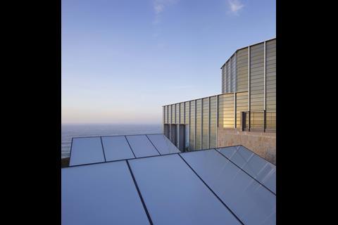
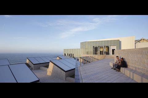
Externally the most prominent feature is the faience-clad loading bay. Visible from Porthmeor Beach, the subtle greenish-grey ceramic turret sits quietly between Evans and Shalev’s original building and the housing adjacent.
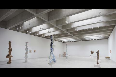
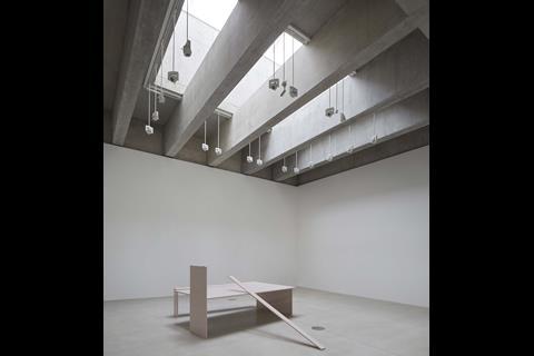
The gallery extension has been carved out of the hillside, connecting seamlessly to the existing galleries; the top-lit space is capped by deep, in-situ beams which create a rhythm and character very different in character to the 1990s spaces.
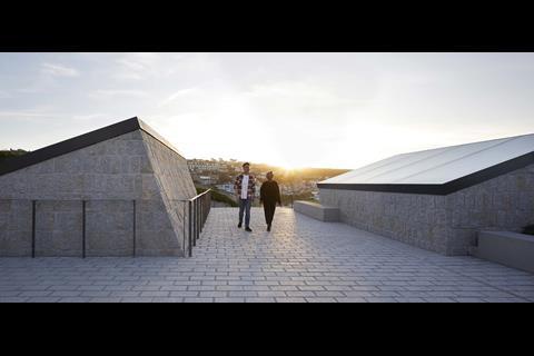
From the loading bay, soaring etched-glass doors give access to a huge goods lift which connects all floors (also providing enhanced disabled access to the gallery) – provision of a new picture store and workshop also enhances functionality. A winding in-situ staff stair with lacquered steel handrail celebrates simplicity while also connecting a new, upper level staff entrance to offices, meeting room and staff amenity which enjoy stunning seaward views. The granite and glass gallery roof lights emerge into a public landscape of granite paving and planting which echoes the nearby cliff tops.
The evolution of this iconic south-west attraction has overcome huge challenges, navigating vociferous local stakeholders and significant site constraints. By architectural ingenuity, a building has been delivered where there appeared to be no site available, with minimal intrusion on an already crowded horizon. It has created an intriguing new public landscape and pedestrian connection from hilltop to beach and, with subtle reordering of the original gallery, it achieves a seamless environment to in which to enjoy art.
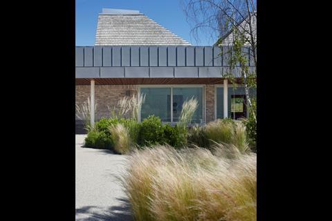
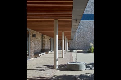
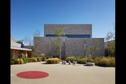
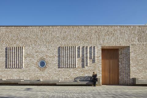
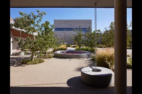
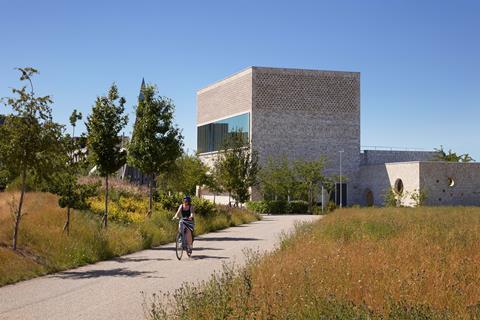
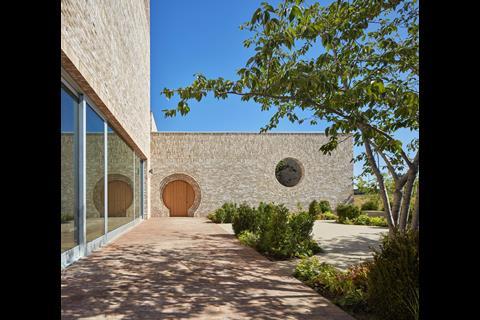
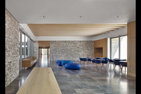
Storey’s Field Community Centre and Nursery, Cambridge by MUMA
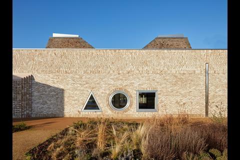
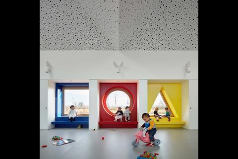
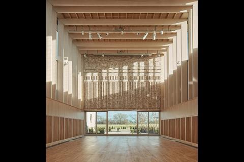
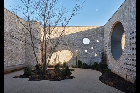
This is the very highest quality architecture. It shows how an architect can add joy, an enhanced experience of materials and human dimension to every part of a building. The spaces in the nursery are worthy of a much more sophisticated audience, but are always based around the scale and activities in each space. Where small windows are needed they are arranged in the pattern of constellations of stars (even with the correct orientation), where a decorative circular window from the enclosed garden is made out of a ventilation inlet grille, it is evidence of the skill, imagination and continuous attention to detail of the architect. This is a truly well-crafted building, where material or technology is only used where it is needed.
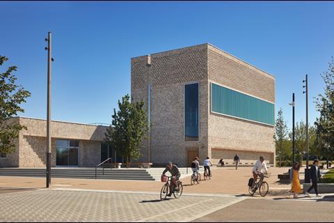
The community centre and nursery are linked operationally, so that a sense of space from views of the playground, daylight and ventilation are brought into the café but without compromising the privacy of the children. Where spaces have dual uses, like the external garden outside the wedding venue which can be used as a quiet reading room for the nursery, the competing needs of the users are balanced and the management of the building is happy to make the extra effort (opening doors or moving furniture) to make it all work.
The community hall itself has been designed to become a more important place in the new community at Storey’s Field, to become its civic centre or town hall. It offers opportunities for weddings, music concerts, funerals, political debate, which gives it a significance above and beyond a space for hobbies, exercise, local groups and kids’ parties.
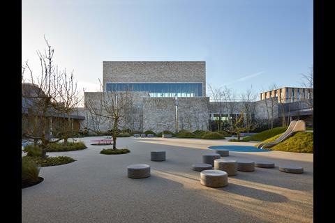
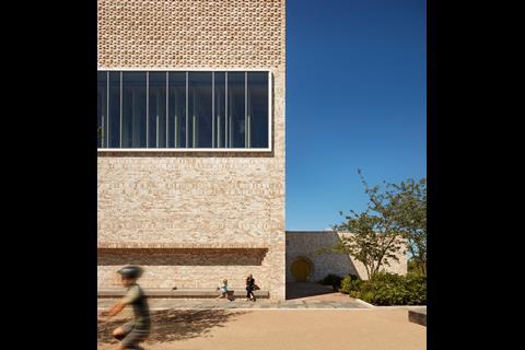
To address this enhanced symbolic value for the community, the architects stepped the building side wards to address a longer view in the masterplan, and set it back to create a gathering space outside the hall and a parents’ drop-off space outside the nursery. To complete the sense of civic pride, the external walls of the hall are lined with comfortable seats to stop and chat to neighbours while you wait to enter.
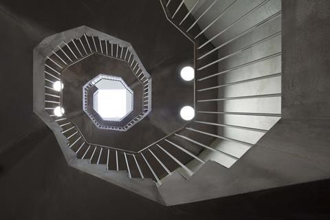
The inside of the hall is a beautiful balance of function, sustainability (it is vented naturally using an underground labyrinth), acoustic performance and expression of materials. The patterned brickwork of the enclosing wall acts to break up the reflections of music or speech to provide a good acoustic, but also suggests patterns of geology in the surrounding landscape. The amount of daylight or the feel of the acoustics can be changed by simply dropping or rising blinds so users can control the environment without complex management systems. Even the access stair to the plant on the roof is via a sculptural spiral staircase that takes its part in performances.
This is an example of the very best in British architectural design. When it is this good it offers ideas, skill and care in ways that transform the human use and experience of this building at every opportunity.
The nursery and community centre have been assessed for environmental sustainability using the Breeam methodology and are on track to be certified “Excellent” and “Outstanding” respectively. Natural ventilation has been elegantly integrated into the architectural form with stack ventilation drawing air passively into the main hall via an underground labyrinth. This naturally moderates the temperature. The Breeam standard is also reflected in the attention to detail given to acoustics and quality of daylight. High-quality robust finishes and design measures to cope with future climate change should ensure the building stands the test of time. A beautiful and biodiverse landscape design incorporates rehomed orchard trees that were no longer commercially viable. The project integrates with an ambitious masterplan for North West Cambridge with underfloor heating derived from a central combined heat and power plant, a rainwater main supplying the toilets, and new bus service and cycle route.
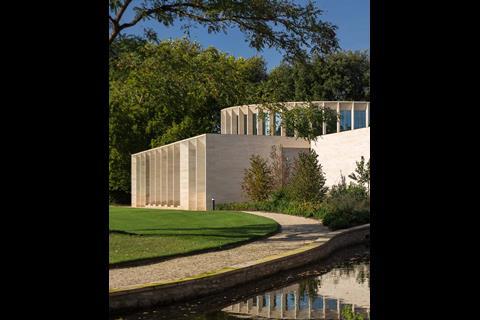
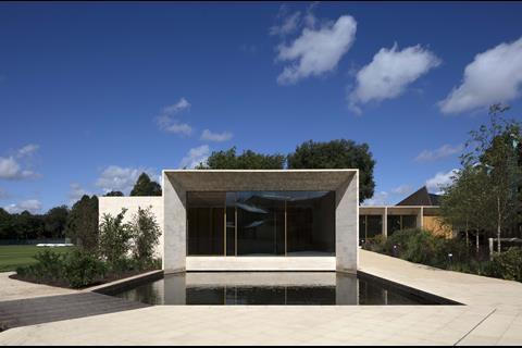
The Sultan Nazrin Shah Centre, Worcester College, Oxford by Niall McLaughlin Architects
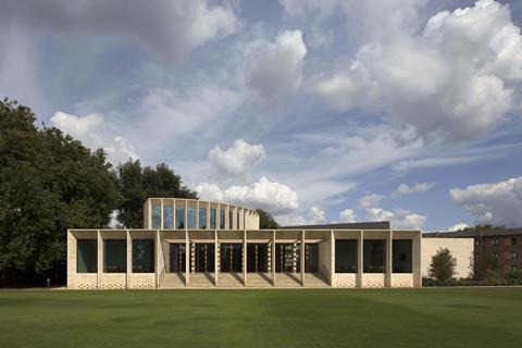
The setting for this building is unbeatable. It is beside a perfectly mown cricket pitch within the secluded, rambling and idyllic garden of one of Oxford’s most historic colleges. And there’s a lake nearby too.
To not only preserve but enhance this context would require a building of assured calm and grace. It would need to use materials with a tactile gravitas and be imbued with a timelessness which would make it feel as if it had always been there and need never leave. The Sultan Nazrin Shah Centre does all this and more.
It was not an easy path to get here: the college had an urgent need for the teaching facilities it contains, but had to prove that there was nowhere else in their capacious campus to accommodate them and demonstrate that they could build it without harming the floodplain, the adjacent trees or the matchless setting. It has taken time, unstinting application from the client and the procurement team, a generous donor prepared to cover the eye-watering build cost, a building team capable of the highest levels of craftsmanship and an architectural team capable of the very highest design quality.
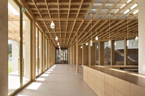
The result is a building of extraordinary elegance. In bald terms it is a relatively small single-storey teaching facility, with an auditorium, seminar rooms, a dance studio and ancillary facilities all arranged around a generous central foyer which opens on to a stepped terrace addressing the cricket pitch. But above and beyond this, every space is high-ceilinged and flooded with daylight, every element is designed and crafted to the most exacting tolerances and standards, and every part fits together sweetly from the radial brick pavers to the curved seats and huge oak doors of the auditorium up to the spaces themselves, formally arranged as discrete stone forms around which the forum flows.
The building is classical in spirit, with crisp proscenia and a slender stone stoa marching along the cricket pitch façade. However it is uncompromisingly modern in style, with smooth planes of stone and glass and minimal detailing. Yet there is nothing alien or mechanistic about it; in fact, it is surprisingly traditional in its craftedness, relying on stonemasons, plasterers and joiners at the very top of their game. It is the natural materials, superbly honed, that ground the building and make it belong. It is the architectural design – the timeless pursuit of ordering space and light and form – that makes it a thing of pure joy.




















3 Readers' comments