Mikhail Riches’ Goldsmith Street also a Stirling Prize hopeful
Four projects are in contention for the inaugural Neave Brown Award which will recognise new housing that tackles the affordability problem.
The shortlist was announced today, with the winner due to be announced at the Stirling Prize ceremony on October 8.
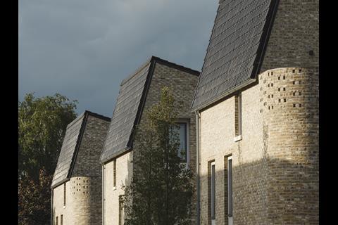
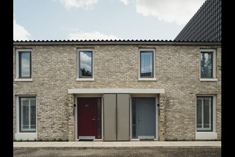
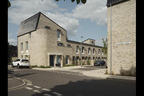
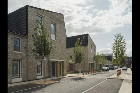
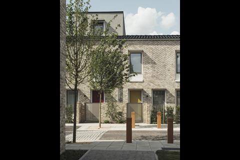
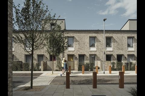
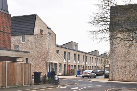
The four schemes include Goldsmith Street in Norwich by Mikhail Riches with Cathy Hawley which is also a contender for this year’s Stirling Prize.
Karakusevic Carson and David Chipperfield’s regeneration project at the Colville Estate in Hackney also makes the grade.
Mae Architects’ Brentford Lock project, West Keelson Gardens, and Wilkinson Eyre’s collaboration with Mole at Eddington in North West Cambridge are the other two finalists.
The shortlist was selected by a panel including RIBA president Ben Derbyshire, Jo McCafferty, a director at Levitt Bernstein, and Professor Adrian Gale, formerly of Plymouth School of Architecture.
Derbyshire said: “We urgently need to build new homes in the UK but must ensure they are sustainable and of the highest quality to meet the needs of current and future generations.
“This shortlist presents four exemplars – innovative, creative and highly desirable new communities in a diverse range of locations and situations.
“Each one addresses the challenge of housing affordability with impressive thought and innovative design – and are collectively a fitting homage to the legacy of the late, great Neave Brown.”
To be considered for the 2019 Neave Brown Award for Housing, projects needed to be a winner of a 2019 RIBA Regional Award, be a project of 10 or more homes completed and occupied between 2016 and February 2019 with a third of the housing needing to be “affordable”. Schemes must also demonstrate evidence of meeting the challenge of housing affordability.
Neave Brown Award for Housing 2019 shortlist
Brentford Lock West Keelson Gardens, London, by Mae Architects
19,606sq m
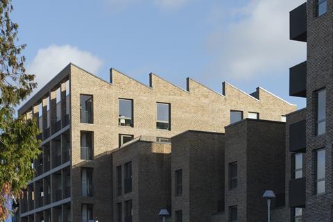
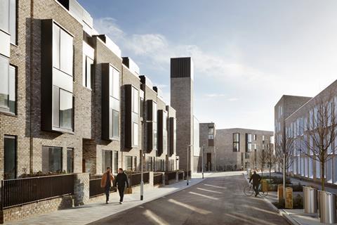
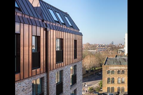
Thoughtful canalside development comprising six large apartment buildings, with distinctive saw-tooth roofs reflecting the site’s industrial past, linked with rows of four storey townhouses.
As phase two of a three-phase residential regeneration masterplan beside the Grand Union Canal, the scheme is a thoughtful evolution of phase one, housing a mixed tenure of accommodation.
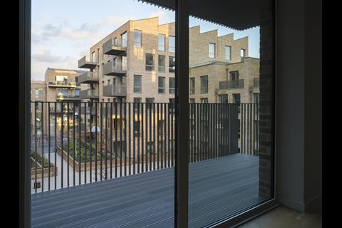
The scheme comprises two plots, one of which is formed around a courtyard garden for residents, and the other set back from the public canalside walk. Six pavilion buildings hold the corners of each plot with their distinctive saw-tooth roofs reflecting the site’s industrial past. These are linked with rows of townhouses and bridge structures that form entrance portals with accommodation above. The waterfront block incorporates a double height entrance and communal space between the two pavilions which affords a transparency to the scheme and visual link to the canalside.
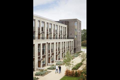
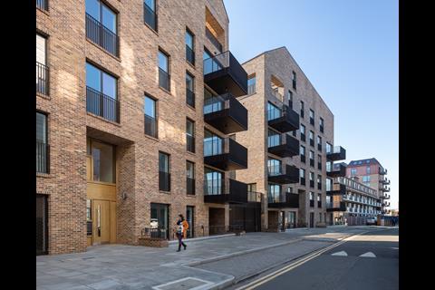
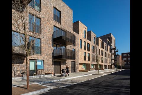
Each pavilion block is distinguished by gridded loggias providing depth and modelling to the facade as well as versatile outdoor covered spaces to the apartments. The material palette of warm brick, reconstituted stone and metalwork is controlled and carefully detailed throughout.
The buildings sit within a shared surface public realm and successfully define front gardens to the ground floor accommodation with low walls and varied planting.
Internally, the flats are well planned, and the arrangement of linked pavilions enables every flat to have dual aspect and enjoy a pleasant quality of natural light. The townhouses are arranged over four storeys and use the built form to hold a series of external gardens and terraces. The entrance hall to each townhouse provides an unusually generous and versatile space.
Overall, this is a high quality work of architecture, landscaping and residential environment achieved for a modest budget.
Eddington Lot 1, Cambridge, by Wilkinson Eyre with Mole Architects
19,444sq m | £1,981 / sq m
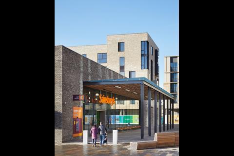
Designed for the University of Cambridge, this new residential quarter is an exemplar of integrated urban design. Incorporating a variety of housing types including generous apartments, some wrapped around a new supermarket and integrated with a new doctor’s surgery.
Occupying the central portion of the new Eddington quarter of Cambridge, this was a complex brief with a number of potentially conflicting elements, including a Sainsbury’s superstore, the combined heat and power ‘Energy Centre’, a doctor’s surgery, offices, and a variety of housing units of different types, majoring on affordable units. In response to the varied demands, it is appropriate that two architects collaborated to deliver the project.
Centrally positioned facing the new habitation’s main square, the large supermarket provided the design’s most dominant component, occupying by far the largest area of the plot. A grand canopy on the main square, marking the supermarket entrance, provides an appropriate focus for the outdoor space, and covers the corporate interior of the supermarket that could have dominated elevations. The architects used a clever device in wrapping single aspect housing along one of the store’s long elevations, thereby completely masking the store’s blank façade. These double stacked duplex units give the street elevations a depth and richness; grouped entrances are pushed into the main elevation line and bay windows pushed out from it. This, combined with small front yards that distance the ground floor windows from the street and roof features that were set back from the main frontage, give a complex, layered aesthetic that resonates with traditional urban rhythms, but is wholly modern in its aesthetic.
Pushing back a little on the original masterplan, the architects successfully argued the case for moving the Energy Centre from its planned position on the southern extent of Lot 1, and moving it to the middle of the site. Facilitating the creation of an intimate courtyard on the southern portion of the Lot, different in character to the external spaces elsewhere in Eddington. and wrapping housing around it that looks both onto the courtyard as well as out across the site was a clever bonus.
Flats around this southern courtyard are largely deck access, but again the deck has been given a generous width, enough to provide a buffer space between the flat windows and the walkway, which is enough to create a suitable balance between public, semi-public and private space. Much of this is simply created by a change of materials, which is encouragement enough for residents to colonise their semi-public space with plants, seats and other outdoor features. The flats themselves are well laid out enough to feel generous, and the use of built in cupboards and wardrobes demonstrates that this is a better use of space than can be achieved with free standing furniture.
The Energy centre is a contrast to the look and feel of the other elements, being simple, bold and functional. The delivery court is well hidden, and this element integrates remarkably well with the other elements.
This is an exemplar of integrated urban design.
Goldsmith Street, Norwich, by Mikhail Riches with Cathy Hawley
8,056sq m | £1,834 / sq m
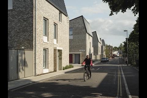
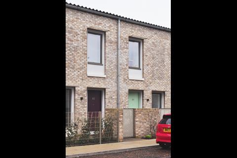
Large development of 105 highly energy-efficient homes for social rent, designed to Passivhaus standards for Norwich City Council.
Finding Goldsmith Street takes you through a very typical English Provincial City residential neighbourhood. Goldsmith street is an exception though. It captures the spirit of a very special place. A coherent visual field that communicated the best of enlightened modern domestic European architecture from the outset. The more one absorbs this project, the more this feeling is reinforced.
The architects won this scheme of just over a hundred dwellings a dozen years ago, and have worked and re-worked it, each time keeping their aim of creating a highly sustainable community in mind. The eventual layout is a simple series of seven terrace blocks arranged in four lines. An immediate connection with a very recognisable urban layout, the architects were able to convince the planners to accept a narrow 14m between blocks – effectively the street width – through a careful design of windows to minimise overlooking, and a very thoughtful asymmetric roof profile that allows good sunlight and daylight into the streets. The result is a very dense development, but one that is in no way oppressive.
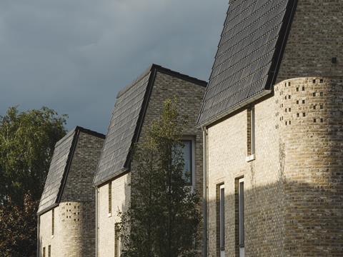
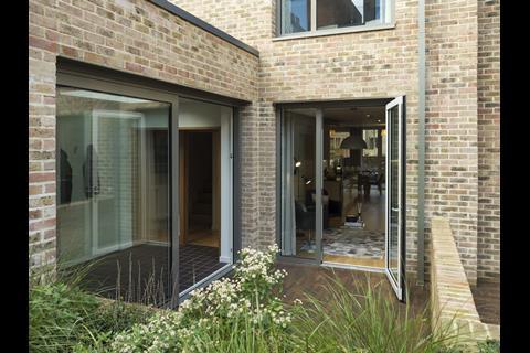
Although the layout has a traceable link with the English housing tradition, the rest of the project is very modern in its conception. Black glazed pantiles, mitred as they go from a roof covering to a wall covering, perforated metal brise soleil, and the new detailing associated with energy conscious design are wholly contemporary. The brick is also contemporary, with characteristic intentional white efflorescence colouration, set in a mews or small terrace layout. To be certified Passivhaus, the windows had to be smaller than the proportion in a Georgian or Victorian terrace, so the architects have used a set-back panel around the windows to give an enlarged feel, and panels of textured brick have been introduced into the main elevations, again to balance the feel of the fenestration along the terrace.
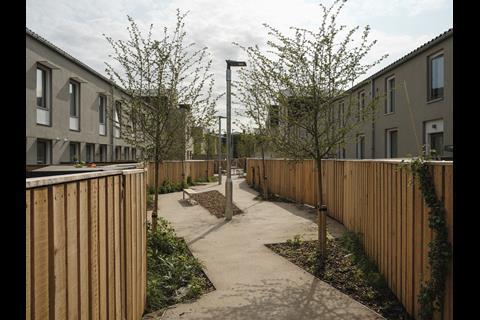
Provision for parking has been pushed to the perimeter, so the streets feel safe and ‘owned’ by pedestrians rather than cars. Bin stores have been thoughtfully used in the front gardens to create buffer zones between the public footpath and the front doors, giving a humane gradation of public to private territory. The ‘back street’ has gardens and a pathway down the centre that has been fully landscaped, although the path takes a wavy course that stops the sense of a ‘back alley’ and gives a welcome curving foil to an otherwise rectilinear scheme.
Tireless work by the architects has kept the standard of workmanship up to a very high level. Social tenants get impressively high specification interiors – in both the end-of-terrace flats and the central terrace houses. Passivhaus detailing has nicely accommodated the mechanical ventilation Heat Recovery (MVHR) units in the interiors, and the services intakes have been intelligently controlled. Each dwelling has a range of providers’ services pre-wired, so that they can be connected on demand, without the need for a service providers’ to come in later and drill through vital vapour barrier lines.
Bringing the reduced energy consumption associated with Passivhaus to mass housing is a great achievement, and one that has taken a large amount of effort and care by the architects. This is an exemplary project.
The Colville Estate, London, by Karakusevic Carson Architects with David Chipperfield Architects
34,000sq m
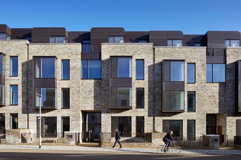
Bold regeneration of a Hackney Council housing estate, designed and delivered in close engagement with residents, to provide 925 new homes in a neighbourhood of legible streets and open spaces.Landscape architect: Muf.
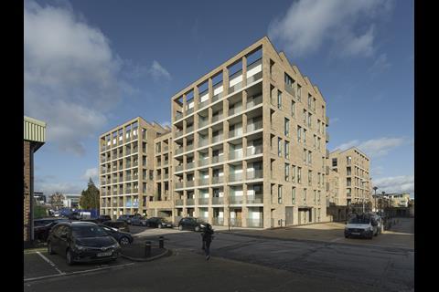
The master plan for this estate delivers 925 new homes, replacing 438 existing homes, and provides an additional 100+ council homes over an 18 year phased programme. When completed, the tenure blind development will be 50% social rent/intermediate tenure and 50% privately owned.
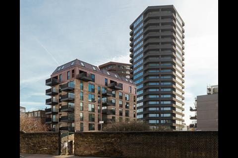
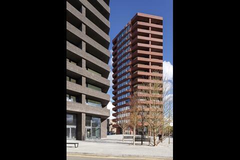
The first phase of this project provided 41 social rented units and was delivered in 2011, this has been followed by Phase Two A&B, designed by Karakusevic Carson Architects and completed this year, which delivers 116 mixed-tenure homes. Almost concurrently with these, David Chipperfield Architect’s Hoxton Press, a pair of tall residential buildings which have 198 units for sale on the open market and cross-subsidise the construction of new social housing on the site was completed.
This is a bold, long-term approach to regenerating a neighbourhood, it takes carefully calculated risks and addresses the pressing issues of the need to build to higher densities in inner London and to support less advantaged communities to continue to live here. More interventions of this scale and ambition are needed for wider societal and economic sustainability.
It also demonstrates a very significant commitment to working with the existing residents of the estate. The Colville Estate has one of the strongest neighbourhood spirits we have encountered in London. The masterplan design and delivery has been characterised by engaging and working closely with a pro-active resident steering group.
The commitment of the client to high-quality design is also evidenced by their appointment of several practices recognised for their architectural abilities and place-making skills. The masterplan creates a network of legible streets and open spaces that connect the estate back into the neighbourhood. The local authority client team are actively involved in the letting of the commercial spaces and are looking to support social enterprises were commercially possible. Their attention to detail is clear from the care taken to ensure business continuity for the existing estate shops that provide the social glue which takes years to develop.
It is inspiring to see the intense level of commitment in this clearly collaborative local authority and architectural team; negotiating inclusively and overcoming numerous obstacles in the current harsh governmental and commercial environment. They are very articulate proponents of high-quality placemaking and long-term neighbourhood sustainability.
Source: RIBA jury







2 Readers' comments