
Finalist for Retail and Leisure Architect of the Year Award 2023, Holland Harvey guides us through the specification challenges present at Tate Modern’s Corner Café
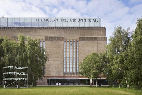
The judges for this year’s AYAs were impressed with Holland Harvey’s body of work, as the practice was named a finalist for Retail and Leisure Architect of the Year.
In this series, we take a look at one of the team’s entry projects and ask the firm’s co-founding director, Jonathan Harvey, to break down some of the biggest specification challenges that needed to be overcome.
What were the key requirements of the client’s brief? How did you meet these both through design and specification?
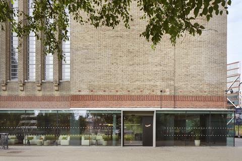
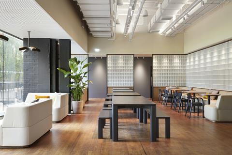
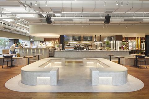
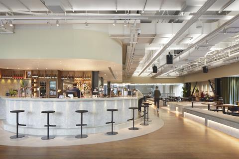
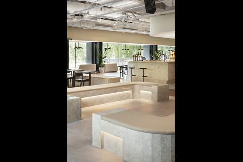
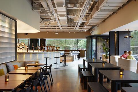
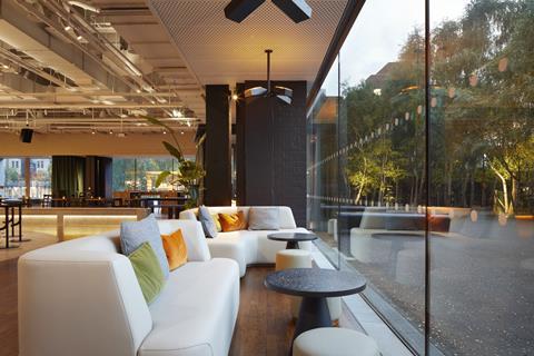
Corner is a new all-day café and bar, opening onto an outdoor summer terrace. For the first time, Corner will offer visitors a place for an evening drink on the riverside at Tate Modern.
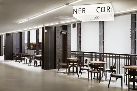
The ground floor corner space operated as a café since the gallery opened in 2000. Designed initially as a sit-down operation, the space was successful for many years. However, the café closed during the pandemic and the galleries’ needs have changed.
The new brief was for a radical overhaul of the space to rethink its function, feel and operation to better serve Tate Modern and its community.
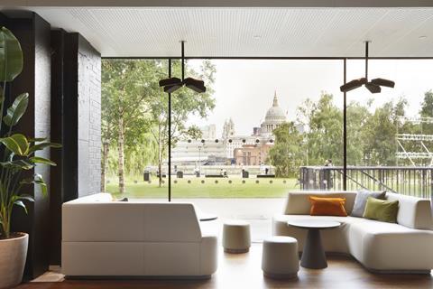
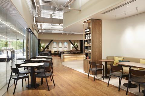
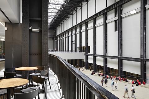
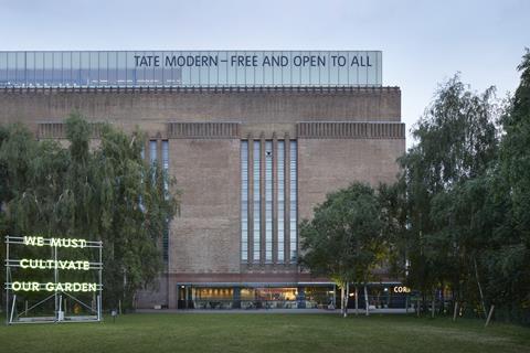
The result is a space, conceived as an extension of the public realm, that links two of London’s most iconic spaces, the Southbank and the Turbine Hall, via a new entrance onto Tate Modern’s lawns. The café is designed to celebrate accessibility and inclusivity - core themes of the organisation – to create an informal, playful setting that is welcoming for all.
What were the biggest specification challenges on the project?
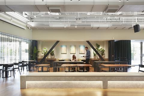
One of the biggest specification challenges was around creating a space that could explore themes of sustainability whilst also having a strong emphasis on robustness and durability. Something critical to a food and beverage space.
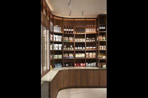
In response, where possible, we aimed to source locally to reduce embodied carbon as well as support social enterprises. We tried to consider specifications with a timeless nature to avoid the need to change the space in the future. We also sought to use materials with a significant design life or recycled materials to reduce the carbon impact.
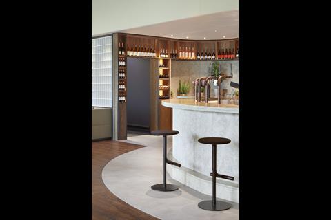
Material selections then needed to be balanced with what would work well for a space that will receive a high level of footfall and evening events that naturally require a high degree of durability. This led to choices like polished stone for exposed areas of bars and solid benches, as well as large format tiles for the floors where high levels of spillage were likely.
What did you think was the biggest success on the project?
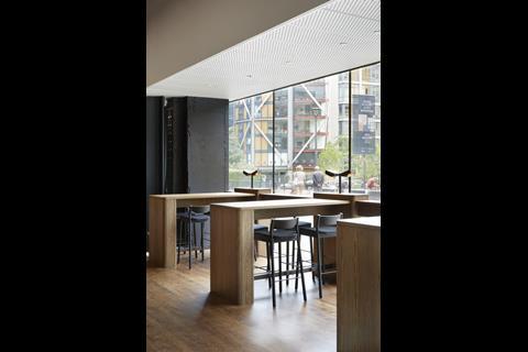
One of the biggest successes of the project was some of the stand-out furniture pieces. These included coffee tables by Spared made from waste coffee produced by Tate Eat’s coffee roastery and benches and dining tables by Goldfinger. The tables and benches are made from trees felled in London due to Ash dieback. In the absence of material passports, the coordinates of where each tree grew are then etched into each piece to help preserve the provenance of their materials.
What are the three biggest specification considerations on the project type? How did these specifically apply to your project?
Commercial food and beverage projects often make design decisions through the lens of short delivery timeframes, short commercial leases and cost alone. However, in the instance of Tate Modern, they own and operate their spaces, and so can afford the focus and have the reason to make careful and considered choices in what they use for reasons beyond just time and cost. This isn’t to say that budget is no object, but it’s more about giving priority to design decisions when appropriate and not accepting something until it is the right choice for all the right reasons.
Other key specification considerations for this kind of project, as mentioned, are around durability and environmental impact. Commercial food spaces have to deal with high volumes of people as well as spillage and food spread so it’s fundamental to manage this as much as possible through careful and deliberate design decisions. They also tend to be refreshed too often, so creating something with an extended design life was critical.
Project details
Architect Holland Harvey
Lighting designer There’s Light
Main contractor Westone
Furniture Goldfinger
Finishes Spared
Soft furnishings Kvadrat
Upholstery Chieftain Fabrics
Acoustic panel coverings Skopos
Glass blocks Glass Blocks Direct
Concrete tile floor finish Domus
BOH floor and mat wells Forbo Flooring Systems
Our “What made this project” series highlights the outstanding work of our Architect of the Year finalists. To keep up-to-date with all the latest from the Architect of the Year Awards visit here.




No comments yet