Finalist for Interior Architect of the Year Award 2023, SODA Studio guides us through the specification challenges present at Courier Media’s Hackney HQ
The judges for this year’s AYAs were impressed with SODA Studio’s body of work, as the practice was named a finalist for Interior Architect of the Year (sponsored by Zentia).
In this series, we take a look at one of the team’s entry projects and ask the firm’s interior designer, Matilde Menezes, to break down some of the biggest specification challenges that needed to be overcome.
What were the biggest specification challenges on the project?
The workspace tells the story of the client’s businesses but in a playful and approachable way. We wanted to convey that in the space through the materiality and there was a lot of back and forth on how to achieve this.
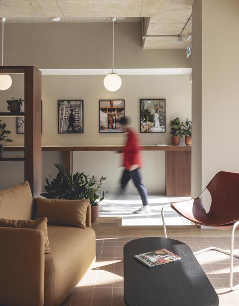
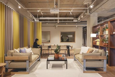
We agreed on a mature, mid-century palette, intersected with pops of colour such as the feature curtain surrounding the lounge and event space. The palette had to balance the bold and playful essence of the brand with a backdrop that was timeless, comfortable and inviting.
There was a lot of uncertainty over costs and materials due to the pandemic. We had to be quite inventive to resolve shortages and increased costs. We ended up re-using the raised access floor from another local project which turned out to be a very successful measure. Some of the joinery pieces also had to be changed while the project was on site due to the unavailability of tiles.
What were the key requirements of the client’s brief? How did you meet these both through design and specification?
This was the first time Courier had designed its own office. They wanted a space that reflected their brand and ethos. They are storytellers, so we set out to explore that narrative as you progress through the space by revealing and exposing elements of putting an article together.
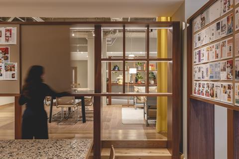
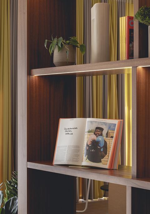
This was done through views into a collaboration room, with sliding panels sized for printing and pinning the magazine pages, where they could collectively mark up, change and visualize the output. When the collaboration room wasn’t being used as a pin-up, the sliding panels would open to frame views or provide a backdrop for shelving where products were displayed. We also introduced reeded glass into the podcast and meeting rooms to see activity and movement through.
We celebrated zones that were part of the company culture such as the café, which was placed on arrival where all employees, having taken a barista course, would greet and serve guests — immediately setting the tone of this informal and inviting space.
What are the three biggest specification considerations on the project type? How did these specifically apply to your project?
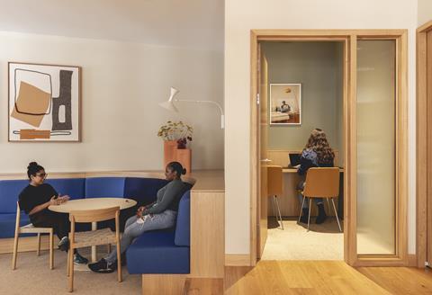
In terms of the brand and brief requirements, the aspirations of the projects were more in line with a domestic environment but this had to meet the commercial demands of an office space. We included several materials that would provide the comfort of the home such as natural fibre carpets, timbers and tiles but that equally were suitable for workplace projects.
Due to the variety of spaces such as a confidential meeting room, a podcast room, an event space, informal meeting areas and a library, the acoustics had to be reflected in the partitions and even the qualities of the materials. These included curtains enveloping spaces, furniture fabrics and fabric-lined acoustic panels.
Materials had to be selected while considering the budget and longevity. As the company hosts events outside of working hours, the space had to transition from day to night. This influenced the choice of materials which would work in an office environment but also a more informal nighttime setting, the lighting to facilitate different activities, and the dual function of several elements.
What did you think was the biggest success on the project?
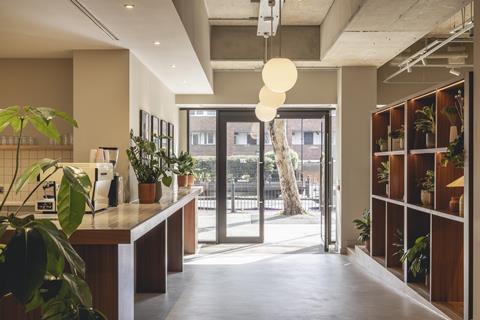
We rethought the workplace post-Covid as a modern hybrid office. We successfully created an office that encouraged interaction by means of circulation and adjacency of spaces. In addition, the design allows for the expansion and contraction of the team. The bar/cafe is the heart of the project, the focal point on your arrival which sets the hospitality tone for the rest of the space. It doubles up as a centre point for events in the evening.
We inserted a level change in the space which facilitated the split between public and private. On arrival you follow a gentle ramp to an upper level where you have all your client/collaborator facing areas, such as event spaces, meeting rooms and barista space. Where the space steps back down again you progress to the more private and secluded areas. The level change naturally creates a boundary from public to private.
Project details
Architect SODA Studio
Key suppliers Kvadrat, Forbo, Tretford Carpet, Solus, Gravity, Foresso, Lintex, Grestec
Our “What made this project” series highlights the outstanding work of our Architect of the Year finalists. To keep up-to-date with all the latest from the Architect of the Year Awards visit here.
Postscript
The Interior Architect of the Year award at the Architect of the Year Awards 2023 was sponsored by Zentia





No comments yet