Finalist for Office Architect of the Year Award 2023, EPR Architects guides us through the specification challenges present at the Life Without Limits Centre
The judges for this year’s AYAs were impressed with EPR Architects’ body of work, as the practice was named a finalist for Office Architect of the Year.
In this series, we take a look at one of the team’s entry projects and ask the firm’s director, Stephen Pey, to break down some of the biggest specification challenges that needed to be overcome.
What were the biggest specification challenges on the project?
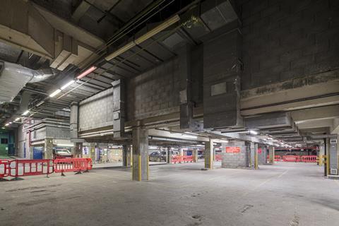
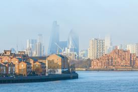
At the core of the Royal Society for Blind Children’s (RSBC) Life Without Limits Centre is the imaginative reuse of an existing space. We transformed part of an existing basement car park in the City of London’s Northern and Shell building — which had no natural light, low floor-to-ceiling heights, no clear access route and the Thames River on one of the perimeter walls — into an engaging hub of activity that provides flexible spaces for blind and partially sighted children to socialise and learn essential skills, whilst also providing a contemporary workspace for the charity’s staff.
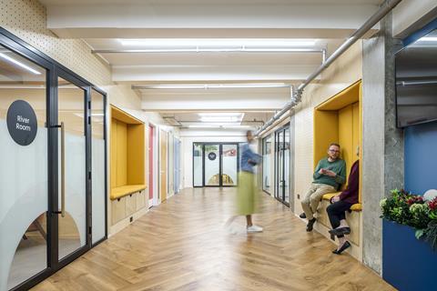
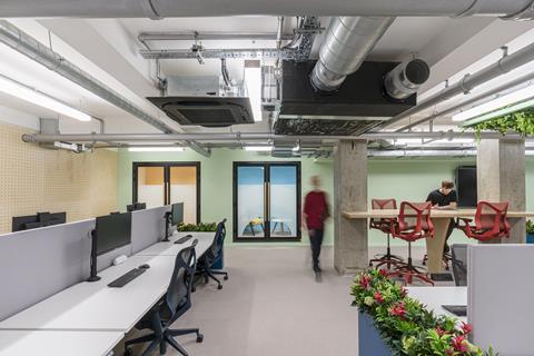
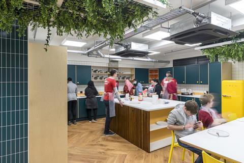
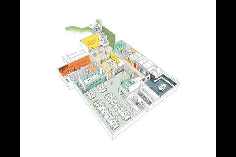
In keeping with the RSBC’s approach to blindness, we embraced the challenges of the existing space, utilising the layout to create an optimal and flexible floor plan — with every decision carefully considered to maximise impact and value. Structural columns were retained and carefully incorporated into the internal walls and space partitions, minimising obstacles and introducing a fluid circulation space with pocket snugs, private family support rooms, flexible workspace, meeting rooms, a training kitchen, creative suites and high-quality end-of-journey facilities.
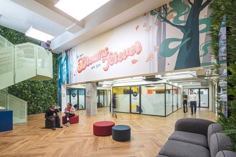
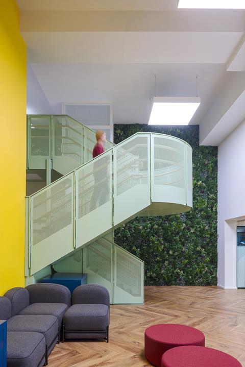
Creative architectural interventions have also created a new entrance on the Thames Path, providing vulnerable visitors with a safe, tranquil entry to the centre — away from the existing traffic-heavy entrance on Lower Thames Street. The design also utilises the existing double-height ventilation shaft to create an open entrance and reception lounge, allowing natural light to flood into the building.
What were the key requirements of the client’s brief? How did you meet these both through design and specification?
The key requirement of the brief was that the centre was aspirational, a home away from home and a new social hub for the blind and vision-impaired community. It was also essential that the space be safe and inclusive for vulnerable users.
Utilising a collaborative approach from the outset, we worked closely with the charity, setting up focus groups made up of the beneficiaries who reviewed our proposals and made comments at every stage of the design. It was clear that the space shouldn’t be institutional — it needed to feel young and energetic to suit the needs of its end-users.
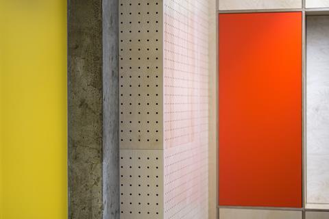
Our investigative approach ensured the final space was simultaneously inclusive and aesthetically pleasing, with carefully considered high contrast and tactile materials with varying surface finishes, acoustic levels, smells and colours to help blind and vision-impaired guests navigate and distinguish the various zones within the building. This approach minimised the need for specialist accessibility products, creating a ‘real world’ design aesthetic inclusive of all users with varying levels of sight loss.
What are the three biggest specification considerations on the project type? How did these specifically apply to your project?
Lighting was key with this project, as shadows and dark spaces can make navigation particularly difficult. To ensure the basement space was uplifting and bright, we worked closely with Zumtobel who supplied lights throughout the scheme, including in the double-height entrance, which were the first of their kind to be installed in the UK.
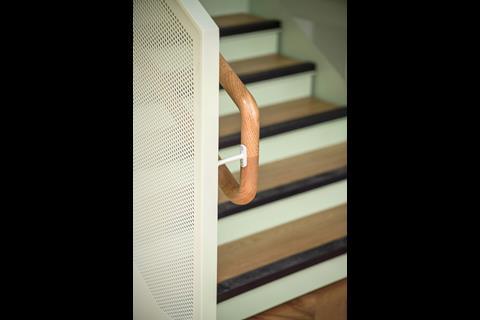
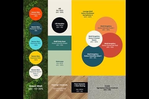
In addition to lighting, the choice of materials was also crucial, and the team worked closely with the blind and vision-impaired community to test materials, glass manifestation and tactile signage to aid wayfinding. People with vision impairments often distinguish surfaces by the amount of light they reflect. Therefore, for all the materials in each area — whether that be the flooring, walls, doors or the main staircase — meticulous colourway explorations were undertaken to ensure sufficient Light Reflective Value (LRV) contrast between any connecting surface.
Colour was also integral to our design to create the bold visual contrasts that vision-impaired people rely on to orientate themselves in a space. Several colours are visible wherever you are in the building, zoning key areas and countering the lack of windows.
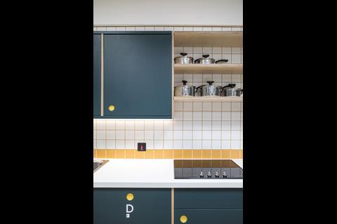
Carefully selected coloured appliances and furniture stand out while contrasting colours on walls help with spatial awareness and navigation. Strong colours mark doors, cupboards and bespoke storage units throughout the centre. Even small details were carefully considered, with contrasting colours chosen for handles and the inside of drawers to ensure they don’t protrude and become a barrier or obstruction for those in the space.
What did you think was the biggest success on the project?
A major success is that the centre doesn’t feel like it’s underground. With the natural light now flooding through, alongside the scheme’s vibrant interiors and bold planting schemes, the space is nurturing and helps boost users’ overall mood.
It’s been fantastic seeing the variety of spaces we designed for the centre in use and how it’s become a home away from home for the charity’s beneficiaries and staff.
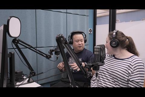
A plethora of weekly events are organised for the children and their families to enjoy, providing them with opportunities to build confidence and life skills through communal activities. These include cooking classes in the kitchen, interactive sensory workshops, music lessons and jam sessions, assistive technology classes in the media suite and podcasting in the sound studio.
Since completion, we have conducted several interviews and post-occupancy workshops with the RSBC and the blind and vision-impaired children and young people who use the finished centre to get their feedback. All comments have been extremely positive — with the children highlighting how they love having their own space that’s specifically tailored to their needs.
Our “What made this project” series highlights the outstanding work of our Architect of the Year finalists. To keep up-to-date with all the latest from the Architect of the Year Awards visit here.







No comments yet