The award no one wants to win goes to town centre regeneration project in Stockport
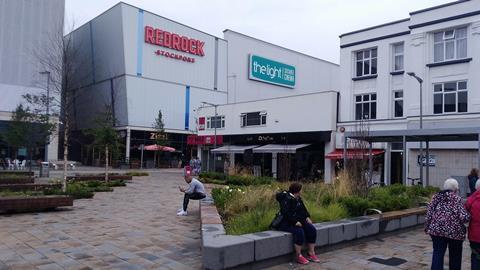
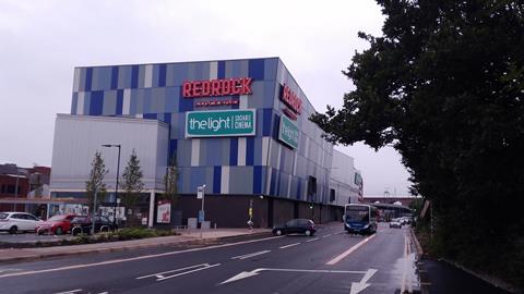
Redrock Stockport, a £45m leisure complex and car park, has won the 2018 Carbuncle Cup.

The town centre development, which contains a cinema, shops, restaurants and a gym as well as a multi-storey car park, was designed by BDP for the local council.
It is part of a wider £1bn regeneration project for the ailing community south of Manchester, but the judges said the shed-like building “ridiculed” the town centre it had been intended to rescue.
They described it as a “missed opportunity” and a “sad metaphor for our failing high streets”, with one adding: “You feel sorry for the people of Stockport.”
The judges, chaired by BD’s editor Thomas Lane, took readers’ comments into account during the judging process. These included: “Absolute monstrosity. I’ve seen better-looking prisons” and: “This is why the Carbuncle Cup was invented. Wrong in everything that is important and to a degree that makes one wonder what were the designers and planners who worked on this abomination thinking.”
The original nominator dubbed it “one of the most horrendous architectural responses ever conceived for Greater Manchester”.
The judges included BD’s architecture critic Ike Ijeh, the critic and author Jonathan Glancey and Rosemarie McQueen, who has decades of experience in urban planning and regeneration at Westminster council and is now a commissioner for Historic England.
They objected to the awkward form, disjointed massing and superficial decoration. The building is essentially a series of boring boxes jazzed up with arbitrary angles and garish cladding totally out of keeping with the local area.
“Urban regeneration can be a good thing,” said the judges. “But when it becomes an excuse to foist bad architecture on to struggling communities in the cynical pursuit of an ‘anything is better than what was there before’ methodology, it simply recycles the resentment regeneration was supposed to redress.
“The fact that there are multiple examples of this kind of garish, soul-less leisure shed architecture in UK towns doesn’t let Redrock off the hook: it puts more of those responsible for our built environment in the dock.”
The centre has proved popular with locals, but the judges said Stockport’s urgent need for revitalisation was not a licence to create depressing architecture.
The judges noted that BDP has an illustrious history and is currently working on the £4bn revamp of the Houses of Parliament. But on this occasion the practice had let itself down, the judges felt.
They said: “It’s like BDP has trodden on a piece of chewing gum and it will stick to their shoe for the next 40 years.”
The 2018 shortlist: Who was BDP up against?
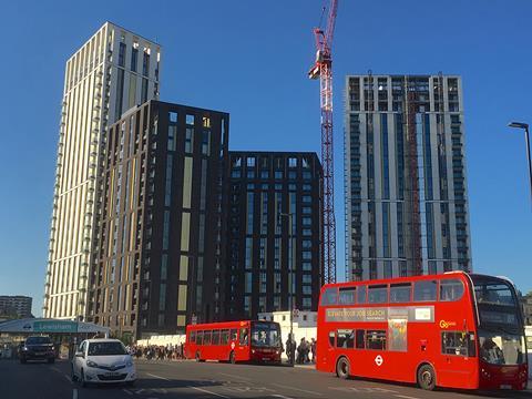
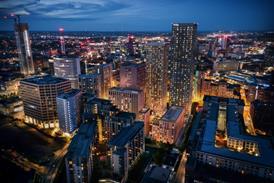
Lewisham Gateway, London by PRP Architects
Lewisham Gateway is a £375m urban regeneration scheme that includes the redesign of one of south London’s most notoriously inhospitable traffic gyratories.The first phase includes two residential towers and another two that are under construction. These towers embody all the lazy belligerence that sadly characterises the vast majority of tall residential blocks in the capital and they appear as curiously dislodged outposts from south London’s other mecca of high-rise regeneration mediocrity, Croydon. Bland, boxy and with some vaguely delinquent menace, the towers stand like a sneering street gang of four upturned middle fingers dumbly primed to hurl all manner of townscape obscenities at their unsuspecting environs.
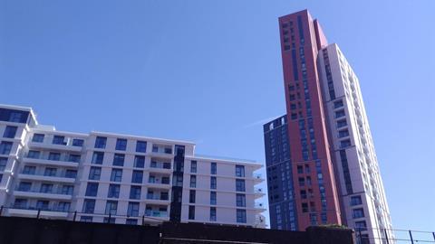
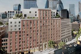
Haydn Tower, Nine Elms Point, London by Rolfe Judd
With at least three different types of cladding arranged in a messy stump of stacked vertical and horizontal stripes, this 28-storey residential tower is one of the most confusing and discordant buildings in Vauxhall, no mean feat among a sea of similarly dumb high-rise sentinels.
Our readers agreed, saying it looked like a series of “crooked chunks that are about to fall over” and a “hideous disjointed mess”. Is this really the kind of architecture that Vauxhall has to look forward to? Sadly, and for the fourth time of asking, Vauxhall’s loss is the Carbuncle Cup’s gain.
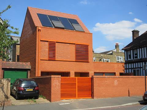
20 Ambleside Avenue, London by Pace Jefford Moore Architects
For some reason, the architects of this Passivhaus scheme in Streatham have opted for a single shade of red stock brick with matching pointing, orange guttering, tiles, shutters and gates, giving the house the appearance of a red-faced child who has said something gauche in a room full of grown-ups. The nominator described the building as “garish … blockish and a clumsy and alien blot on the streetscape”.
The exacting requirements of the Passivhaus standards necessitated small windows to prevent heat loss and shutters to reduce solar gains. Unfortunately the closed shutters combined with the defensive high front wall make it look more like an electricity substation than a home.
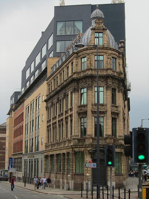
Shankly Hotel, Liverpool by Signature Living
This two-storey extension to an attractive historic building in the centre of Liverpool couldn’t be more out of keeping, said our judges.
Where the original is gently curved with intricate classical detailing and vertical windows, the new structure is all abrupt right angles and bland horizontality. It looms awkwardly above its parent, stealing the show from what was meant to be the building’s crowning glory, a pretty little dome at its prow.
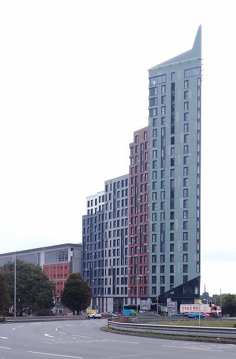
Beckley Point, Plymouth by Boyes Rees Architects
As many of Britain’s worst buildings tend to do these days, Beckley Point houses students. At 23 storeys and 78m high, it’s also the tallest building in the south-west.
The tower features vertical shafts of multi-coloured facades squashed together to form an awkwardly tapering ziggurat. The entrance crudely slapped on to the base is bad but even worse is the pyramidal spire that sprouts from the top like the traffic cones inebriated students are so fond of.
Worst of all is the wider townscape impact. Beckley Point is on one of the highest points in the city centre and can be seen from miles around.


