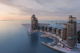
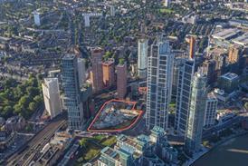
We draw for a variety of reasons, all of which have their own validity, but renderings have always blurred the line between what is and is not achievable in bricks and mortar, writes Eleanor Jolliffe
Lately I have been pondering architectural drawings. When I started working following Part II I did a year or so in masterplanning. My drawings were cityscapes with colours that would be easily interpreted by clients. Everything tended towards the 1:5,000.
For the last five or more years I have mostly been working on RIBA Stages 3 and later – my drawings have all tended towards the technical and detailed.1:200 began to feel very zoomed out.
I was then in Rome, and suddenly drawings could be what I wanted – there was no client, no house style and no necessity to produce certain details for contractors, or for planners. No approved colour palette or software package.
I played around with software settings I would never normally touch, I experimented more with sketches; and hand drawn studies of brickwork in pen on tracing paper resurrected skills I haven’t used since university.
Architectural drawing has never been static, personally or profession wide. Its role and purpose have shifted over the centuries, much as it does across the RIBA workstages.
However, even since Ancient Egypt there seems to have been a requirement for broadly two types: presentation drawings, and working or technical drawings. As the architect would become ever more remote from the process of building, the latter became more important – drawings must exist as an instruction manual in themselves rather than as a visual aide to verbal instructions.
In the early half of the nineteenth century a new type of presentation drawing began to appear in earnest in the UK – the rendered perspective drawing. As clients became increasingly less architecturally educated, fully pictorial representations of buildings began to replace elevations and plans as the preferred method for communicating an idea to a client. These drawings began to become products in themselves.
However, as we all know, a gifted artist does not necessarily make a good architect. Drawing a building is not the same as constructing one.
Clients began to find themselves inevitably disappointed when confronted with the designs built in the crisp and harsh lines of brick and terracotta, unsoftened by fully grown wisteria, not yet set in rolling lawns, details just slightly less picturesque than they were expecting.
Despite this the ease with which this drawing type can be read has meant their popularity has only grown. Drawing technology has got ever better since the 1800s and AI seems set to improve it again.
The profession now sells schemes to clients with what is often a photograph of an unachievable reality
The rendered perspectives we create now are not watercolour sketches or hand shaded views but visions of an alternate reality – so photorealistic that even the well versed struggle to distinguish them from reality.
This is where I admit that I hate CGIs. I don’t despise the artists who create them. In fact I don’t hate the images themselves, often they are beautiful. I hate their detail, and their promise. Nothing in these drawings is left to the imagination to fill in, but nothing looks anything like the finished building can either.
Details in CGIs can be more elegant – balustrades slimmer than their structural requirements would allow. Glass sheets larger than the budget will stretch to. Camera angles tweaked and finessed until that awkward bit no one quite knows what to do with is hidden or ‘fudged’ to make it work in a way it cannot in reality.
The profession now sells schemes to clients with what is often a photograph of an unachievable reality. Think of the disappointed clients of the 1800s. How much more disappointing is the contrast not between a water colour pencil shading and a real brick wall; but between the bespoke brick mix of the artist and the rather uniform one that the building was VE’d to?
As perhaps an extreme example I find some of the CGI images of Neom (The Line) in Saudi Arabia compellingly beautiful – a crisp shaft of light cutting through the shifting sand dunes of the Arabian Peninsula. It should never be built though – for a host of reasons, perhaps least of which is that it cannot look like the renderings promise – it is physically impossible.
In an essay in the RIBA’s recently released book on architectural drawing Hugh Pearman suggests that architecture does not have to be built to exist, that ‘paper architecture’ is a valid end in itself. I agree, and we should encourage this ‘paper architecture’.
We should perhaps even embrace the architectural design of virtual realities, such as the metaverse, as an architectural service with its own RIBA standard contract form. However, we should not allow ourselves to confuse the two.
Paper architecture must remain distinct; and it is dishonest to allow our clients to believe we can achieve exactly what these images seem to promise.
>> Also read: The Architecture Drawing Book: RIBA Collections
>> Also read: Drawing Attention: Architecture in the Age of Social Media
Postscript
Eleanor Jolliffe is a practicing architect and co-author of Architect: The evolving story of a profession
2 Readers' comments