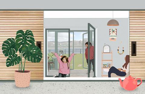
Open plan spaces are both inflexible and boring, so why not make use of some time-honoured alternatives, writes Chloë Phelps

My new practice Grounded is working on a new plan for Mainway, a 1950s housing estate in Lancaster that includes a deep retrofit of around 250 existing homes. We’ve just had the first of a number of conversations with the residents, and once we start looking at the layouts, everyone resoundingly says: “It’s not going to be open plan is it?” It’s almost the only thing that that anyone agrees on.
So why as a profession are we still designing open plan living and dining rooms, particularly in social housing? This isn’t new news. Estate agents and online forums have been decreeing the death of open plan for a number of years. Even office buildings are now looking to be more domestic in their nature. Few people want to work on a big factory floor. People want to have their own spaces and to feel comfortable whether at home or at work.
I think the open plan layout in multiple home developments has become a lazy default. It is the easiest solution to getting the most homes onto a plot, whilst still meeting the Nationally Described Space Standards (NDSS) for Housing. My colleague, Sarah Hutchison, pointed out that a single kitchen dining space enables people to create deep plans within single aspect housing developments. Being even more sceptical, the developer saves by having to build one less wall and door, too.
These open plan layouts are dull and lifeless. Nothing is left to the imagination – you open your front door, and you see everything. We need to be giving these spaces more important consideration, and it should be a really key area that architects co-design with the residents.
This is what we’re setting out to do at Mainway. We’re making some flats bigger by adding new wintergardens, while in others we are turning them into spacious and flexible one beds (helping those that are getting stung by the bedroom tax). This means that we can design them for single occupiers, or single parents whose children might not live with them all week.

By creating a living room that can be shut off completely, you create a space that can be used as a temporary bedroom for guests or friends and family who need somewhere to stay. The kitchen can then be accessed independently and, if we are creative with our flat planning, we might be able to squeeze a space for a table into the kitchen.
But how do we avoid the pokey nature of dark cellular rooms? Well, we might actually need to do some design work!
I am a big champion of the kitsch 1950s serving hatch as an example of how to address this challenge. Actually, it doesn’t need to be kitsch. A hatch creates an opening between two rooms that people can easily talk through and that can also easily be closed off to conceal the mess and smell of the kitchen. Things like this will create sight lines through the flat, and if both rooms have windows, they will allow more light into the deeper parts of the plan.
As my colleague Katie Fisher observes, “There’s also that sense of play with a closable hatch - I remember my gran used to have one and we’d always open it and close it and peep through. It’s such a simple idea, but it captures people’s imagination.”
The UK has some of the smallest homes in Europe and as such they need to work hard to support our increasingly complex lives. Let’s get out there and listen to what people really want and need from their homes, and if that means revisiting ideas we thought outdated, so be it.
Postscript
Chloë Phelps is CEO of Grounded, an architecture and urbanism practice that was established in 2021 with Place Capital Group, to build on the legacy of the work Chloë led in Croydon on the Small Sites Programme. She has experience as an architect, developer and planner in both the public and private sectors.


3 Readers' comments