David Rudlin shudders at the overwhelming rectilinearity of our cityscapes and ponders why architects are still so averse to addressing corners

You will hopefully forgive me for not writing about URBED this week. I will do so soon when the dust has settled, but for the moment I am sitting on a train, going into my new job at BDP’s Manchester office waiting for a slot at Victoria Station.
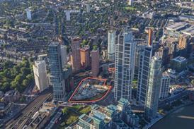
As I sit here I have been musing about the results of Manchester and Salford’s development boom, the results of which fill the views from my train windows – “I remember when all this were nought but car parks”. The architecture is variable, but my conclusion is that I’m not sure, after all these millions of pounds invested, that we have created a place.
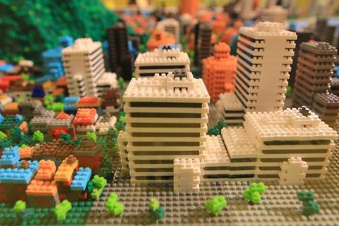
When URBED started doing consultation workshops with communities many years ago, we wanted a material for modelling. We experimented with wooden blocks and even lego, before realising that their unforgiving squareness was a real constraint. The sites we were dealing with were rarely square and even when they were they were dissected by footpaths or underground services at inconvenient angles.
This constraint is all too evident through the window of my train. I can see buildings of all sizes but only really one shape (at least in terms of the plan). Rectangular blocks jostle each other, squashed together uncomfortably on sites that are rarely square.

This is particularly evident on the corners that are left open and dominated by a face off between two bleak gables. Even the right-angled corners are treated this way. It is just too difficult, it seems, to join two blocks together and navigate a corner. This is upsetting because corners are really important to us urban designers!
We eventually decided to use plasticine for our models, a wonderfully plastic material that has the added benefit of taking everyone back to their childhoods. As urban designers we are taught to see the city as a solid block of material out of which the public spaces are carved. We may not quite mould the plasticine in this way, but it helps, because it can be moulded to fit into sites of any shape and gets people to think first and foremost about the public space being created rather than the buildings.
I have moaned before about the way that architects are trained to see buildings as objects. I may have mentioned the folder on my computer desktop where I drop photos from the mags featuring buildings with party walls in an urban context. Its contents are still pitifully small. But I’m not sure this is the problem in Salford and Manchester. I think there are probably two things going on:
First we have optimised the efficiency of these blocks for both residential and office use to such a degree that there seems like no alternative. The format is based on fire regs and travel distances, optimising the gross to net ratio and minimising the number of cores. The construction is based on modular elements and standard components. Throwing anything other than a 90o angle into the mix just messes things up, makes them bespoke and expensive. It is therefore not worth building into the corners despite the additional accommodation it would provide, better to whack a few more floors on top, the planners don’t seem to mind.

The second issue is scale and grain. In the past, one of these irregular urban blocks would have been filled with scores of buildings. The grain of development enabled them to fit into the site. Most were rectangular in form but there would be a few specials on the corners which would also have been the most attractive units commercially and therefore worth spending a few bob on.
This grain and complexity is long gone, replaced first with surface car parks and then bought-up and built-out by a single developer and architect with little incentive but to make the blocks as efficient as possible. It is this development model that lies behind our inability to create good places.
Interestingly this is less of a problem when an area is properly master planned. I always drive home to my team the importance of masterplans containing as many right angles as possible. Sure, its tempting to do a Haussmann with some etoiles and acute angles, or a bit of Sitte’s irregularity, or even a some Hadid-inspired sinuous curves. But if you do, the chances are that your plan will be dismissed as unrealistic and it won’t get built.
So maybe the plasticine has been misleading us all of these years. Our job is to create amazing places with a limited set of Lego blocks because that is all that is architects can do.
Postscript
David Rudlin is director of Urban Design at BDP, a former chair of the Academy of Urbanism and an honorary professor at Manchester University.
High Street: How our town centres can bounce back from the retail crisis will be published by RIBA Publishing in Spring 2023


11 Readers' comments