Chris Dyson explains why Michael and Patty Hopkins’ practice has had such a huge influence on his own work
I first became acquainted with the work of Michael and Patty Hopkins during my days at Oxford Brookes University. Michael gave a talk on the practice’s projects to the school one evening, and the work was rich with qualities that I enjoyed – the use of natural materials, context, scale and attention to detail, all in a modern way.
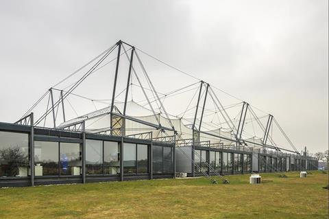
Early works, such as their house in Hampstead, the Patera system and Schlumberger Cambridge Research Centre were preoccupied with creating light and space using the least material, through repetition of standardised elements, a clarity of structure, and logical planning.
Their work drew parallels with other modern masters, such as Louis Kahn, Mies van der Rohe and Charles Eames, but updated them using the latest available technologies of the time, a composition of glass, steel and tensile fabric membranes.
Michael and Patty developed an approach characterised by honesty of materials and their functional expression in works such as the Mound Stand at Lord’s Cricket Ground, Bracken House and the David Mellor cutlery factory. Michael once said (to paraphrase) that if one pursues an architecture where the outside wall holds the building up, then a characterful architectural expression will follow.
The David Mellor factory was built on an old gas works (not dissimilar to the project my own studio did for Jeanette Winterson, as a similar circular form). The practice utilised the well-made foundations of the former gas cylinder, only adding a topping and some floor paint for finish.
They used the base to build the factory – a circular form is unusual for a factory, I’m sure, in anyone’s eyes – but the idea had legs, with their client embracing it for the production of cutlery. A circle is apparently as good, if not better, than a rectangle.
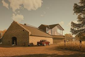
The client wanted a stone building and Hopkins embraced this with their usual flair for industrially-led design components, which are expressed in the ceiling, and the beautifully detailed lead roof form, which hovers over crafted stone walls – all modern conveniences accommodated within a contextual jacket, the project now a palimpsest, resurrected to accommodate its new use.
It became an instant success, winning many awards.
This led onto the Shad Thames showroom for David Mellor and apartments above. It was a tough context at the time, but now well healed – as London often does so well, a tough building in a tough context becomes something remarkable and memorable.
I think this is something I personally admired about Hopkins’ approach to architecture: you could kick it and it would probably do more harm to you than to the building!
Bracken House, a competition win built within the old FT building, was another Hopkins project that I admired, where the existing building envelope was retained and a new building formed within. The original Bracken House was occupied by the newspaper until the 1980s, and again from May 2019.
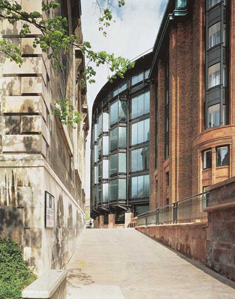
An example of modern Classicism, it was constructed from 1955 to 1958 to a design by Sir Albert Richardson to serve as the FT’s headquarters and printing works, on a cleared bomb site southeast of St Paul’s Cathedral. It is clad in pink sandstone from Staffordshire, as an allusion to the characteristic pink of the newspaper, with red bricks and bronze windows contrasting with the Verdigris of the copper roof.
Above the entrance on Cannon Street is an astronomical clock, which features the face of Winston Churchill at the centre of a large gold sunburst. Churchill had been a great friend of Viscount Bracken during the war, but by all accounts, there was little to ‘work on’ once the building was cleared.
In the words of Michael Hopkins, “only after research on the architect of the building, Albert Richardson [did we discover] that he had been much influenced by Guarini’s Palazzo Carignano in Turin, which he had seen on holiday.
”It is a marvellous, strong building, much better than Bracken House. One of the things that they have in common is that the Palazzo Carignano is built out of a dark rich pink brick. It is a very bold building.
“Richardson’s Bracken House plan was a muddle. None of the wings was placed orthogonally to any of the others. One of the young architects in the office played with Guarini’s geometry on Bracken House. He put an elliptical shape into the middle of the plan, enabling us to pivot the two wings around a new middle and tie the whole building together.’’
Michael and Patty’s later works developed strong contextual responses through a rigorous study of the site and its history to inform human scale, materiality and planning. They were also early pioneers of low carbon, sustainable design, decades ahead of the profession.
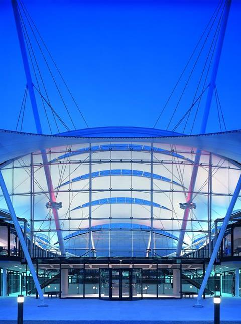
Projects such as the Inland Revenue and Jubilee Campus in Nottingham, and Westminster’s Portcullis House exemplified these traits, setting the highest standards for their time in energy conservation and reuse.
Portcullis House, a prestigious commission in the heart of Westminster, was to serve MP’s requirements for private chambers. The project was built over the Jubilee Line extension, and for some, the most exciting element of the building is the experience of emerging out of the ground into the huge Metropolis-like chambers of the underground station, before arriving in the ticket halls and the streets of Westminster.
Tradition and modernity united in perhaps the largest single project by the practice at the time. Unsurprisingly for such a long project, it led the young project architect Bill Dunster to form his own practice and branch out.
What distinguished Michael and Patty Hopkins’ later work from their peers was their ability to create a humanity in their approach to architecture. This was something that they achieved through an intuitive sensibility to context, an appropriate sense of human scale, along with opening up modern buildings to a wider palette of materials: brick, stone, timber and metal.
It was in this perspective of ‘tradition and modernity’ that Michael and Patty were able to create a unique pathway for a group of modern architects to follow. One that was not only concrete, glass and steel – a path that also allowed a building to wear clothes that respected its immediate neighbours, its context.
>> Also read: Hopkins’ Inland Revenue Centre gets grade II listing
Refined industrial architecture, like some of the best Victorian buildings – loose fit and capable of adaption, this practice has been building for a more sustainable future for a long time. No wafer-thin walls or temporary construction here – good, well-built, and thoughtful buildings, made to stand the test of time. Timeless, functional and elegant.
Take the Nottingham University and Velodrome projects, both won by competition. These projects provided much-needed new work for the office, and allowed new voices to emerge in the practice who are now the leading partners, engaged in building projects as far afield as Europe, Japan and Dubai.
Michael and Patty displayed a ‘generosity of spirit’ in the acknowledgement that others can lead, with their guidance as the founding partners. As a result, the practice today is going from this strong past to a strong future, working together with its many talented hands and principal partners, including Jim Greaves, Andy Barnett, Simon Fraser and Mike Taylor.
Michael Hopkins was knighted in 1995, shortlisted numerous times for the Stirling Prize and, together with his wife, Patty, won the RIBA gold medal in 1995. His five-decade legacy endures, and their practice continues to thrive.
This is thanks to a deeply human approach to architecture, and a great dexterity in working from the small to the large-scale, from museums to masterplans, taking on virtually any building typology – the thread that connects them is the enjoyment of their users; buildings that are inviting, inspiring and deeply rooted in meaning and place.
>> Also read: Michael Hopkins helped reshape British architecture for the better







No comments yet