RHWL’s Myhotel in Brighton’s luxurious interior by New York superstar design Karim Rashid is a riot of funky colour and organic forms, reports Pamela Buxton
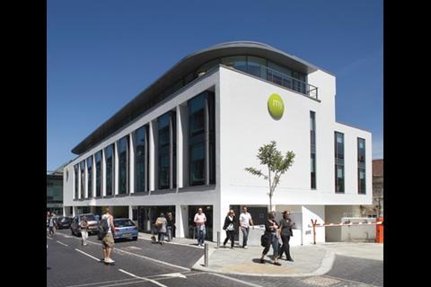
It’s billed by its owners as “Freddie Mercury meets the Maharishi,” yet the exterior of Myhotel’s 80-bed Brighton outlet looks quite unlike the confection that would merit that description. Instead, this substantial white-rendered building on Jubilee Square looks rather conventional, which is probably a mercy for the surrounding townscape. Inside, however, all that changes — with funky colours, curvaceous shapes, shiny surfaces and crystals, crystals, then more crystals.
The £16 million project, the third Myhotel and the chain’s first new-build, is a structure of many parts and with many designers involved. The base building, elevations and interior planning are by RHWL, which also played a major role in the schemes for most of the bedrooms, while New York superstar Karim Rashid, renowned for his organic shapes and groovy patterns, has come up with the colour palette and either designed or influenced the look of many of the public areas and bedrooms.
The hotel is one of the final pieces in the new quarter of Brighton around Jubilee Square in the North Laines area, opposite the award-winning Jubilee Library by Bennetts Associates and Lomax Cassidy Edwards. This team also created the restaurant on the adjoining side, masterplanned the square, and won the original planning permission for the hotel. The fourth side is Jubilee Street, a new road with retail and restaurants on the ground floor and offices above.
“It was quite terrible before — a dilapidated bit of wasteland used for carparking for 20 years. It was an opportunity waiting to happen,” says RHWL associate Andrew Monk. “Four years ago nothing was going on — now it’s got its life back.”
RHWL has designed a white-rendered box with regular bays at first and second floor levels, a reference to the local Georgian vernacular. Its glazed ground floor and entrance are set back from the main building line, as is a recessed glazed box penthouse. The L-shaped footprint accommodates 80 rooms and all the key facilities. Two lightwells cut through the building to bring light into the heart of the plan, in particular to the smaller rear bedrooms that don’t have external windows. Higher rate bedrooms are positioned facing the square.
RHWL was keen to create a more solid facade to the square than the glazed library and restaurant. “Being an urban hotel, we’re not designing it so that our guests aren’t overlooked at all, but we didn’t want a completely glazed, open building,” says Monk. Although, he continues, it is a place people come to show off a bit.
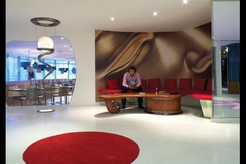
When it came to the interior planning, RHWL made sure it was conducive to Karim Rashid’s trademark curves and drama, especially in the ground floor plan. “Because our client had appointed an interior designer whose work is all about curved forms, we familiarised ourselves with Rashid’s aesthetic and worked with it, not against it,” says Monk. Public areas like the restaurant and café are pushed to prominent locations at the perimeter overlooking Jubilee Square and Jubilee Street respectively. The lifts are easily accessed in the main lobby close to reception, and back of house is kept to a minimum. That can’t be said of the crystals — Myhotel founder Andy Thrasyvoulou is keen on feng shui, and crystals pop up in every room and corridor.
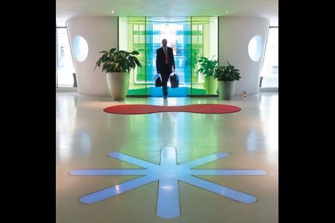
The architect wanted a sense of theatre on entry, and has achieved this with a curved, symmetrical lobby where blue and yellow external and internal sliding glass doors combine to make green when closed. This creates a transitional space from the rectilinear exterior of the square to the vibrancy of the reception area, where there are few straight lines. Rashid’s trademark shapes and symbols abound, with a bright pink rug and an illuminated star inset into the Bisazza terrazzo floor. To one side is a rounded niche full of opulent, richly coloured cushions, to the other a shiny metal-clad reception module — desk seems rather too mundane a word for it.
Myhotel’s founder Andy Thrasyvoulou is keen on feng shui, and crystals pop up in every room
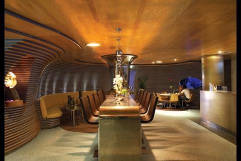
From the reception, there are views to all the key spaces — a Zilli Brasserie restaurant by Alan Phillips that spills onto the outside terrace, a Zilli café created with Rashid’s assistance, and the Merkaba bar, where Rashid’s original design was delivered by fit-out contractor Concept Bars, and the client’s son, Steph Thrasyvoulou. This space lures visitors into the heart of the hotel. The cocoon-like interior is clad in a curious combination of blue suede and timber horizontal panelling. It also features a gold-painted drinks bar and a bespoke, shiny high table with metal cladding that extends to incorporate a structural column. These three disparate spaces are fun in themselves, but together dilute the Rashid effect.
His talents are showcased far more effectively in the bedrooms and corridors, which are fun, fresh and chic. Here RHWL has created rooms working with the Rashid aesthetic, enjoying a “nice working relationship” with the designer. But it’s a shame more wasn’t made of the lift lobby walls or the lifts themselves.
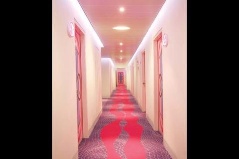
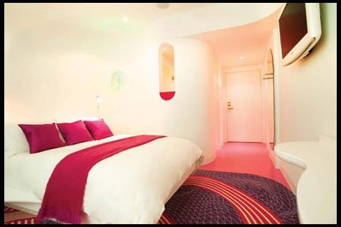
Each of the three upper levels has a colour theme (pink/blue, orange/pink and blue/green respectively) displayed in a kaleidoscopic wall panel, and resplendent in Rashid’s bespoke, distorted grid carpet design, which draws guests along the corridors and recurs in the bedrooms. These include RHWL-designed furniture such as desks with integral mirrors that flip up to reveal a cubby hole for storage, and beds with handy shelves along the sides.
Inside, RHWL’s decision to provide a visual link from the rubber-floored bathrooms into the bedrooms via a curved opening above the sink works well. There is no bathroom door — the toilet and shower have their own cubicles.
The three “artist studio” corner rooms and the penthouse present another aesthetic. Myhotel wanted a particularly Brighton feel, so it invited local artists and artisans — Martin Thomas, Lucien Hewetson, Alex Macarthur, Eleni Shiarlis, Phil Shadbolt and Mandala Bob — to create the rooms. The results are certainly individual and, in the case of the penthouse Carousel room by Linda Kay Stevens and hotel owner Andy Thrasyvoulou, a little strange. It’s more Starck than Rashid, with heavy leather sofas, a beautiful sculptural bath in the main room, furry rugs, and the surreal placing of a vintage carousel horse in the middle of the room.
RHWL has done a good and tricky job to work with the Rashid aesthetic and accommodate disparate others. But having enlisted the services of Rashid, it seems a missed opportunity for Myhotel not to have used his approach more consistently throughout. For all its flamboyant pretensions, the building’s interior feels a little shy of going for broke in the way of, say, Schrager Hotels and Philippe Starck.
Yet Myhotel wanted a true Brighton building and maybe that’s what it has — one with a fairly conventional exterior but with plenty of colour, theatricality, and New Age spirituality all mixed up inside. And after all, what could compete with the confection of nearby Brighton Pavilion? Now that really is Mercury meets Maharishi.
In the architect’s own words: RHWL’s Andrew Monk on how the distinctive scheme took shape

The brief for Myhotel Brighton was to create a “unique hotel with a strong sense of place that reflects its locality”. This presented us with a fantastic opportunity. Our design approach was to maximise natural light, views and interaction with the townscape.
The guest’s journey from arrival to bedroom was carefully considered to create a sense of theatre, a key characteristic for a boutique hotel.
Facade rhythm
The hotel is a white-rendered box with glazed, set-back storeys, and an entrance marked by a colourful, curving vestibule. The elevations have a rhythm of double-storey projecting bay windows, each with a window seat — a contemporary take on the Victorian bay windows in the surrounding streets.
For the bedrooms, we designed spaces with a balance of functionality and comfort. We collaborated with interior designer Karim Rashid, whose aesthetic is ideal for both the brand and the location.
Quality craftsmen
The bathroom units are open to the bedrooms to enable interaction and create a sense of space. We had a close working relationship with the client, and this idea arose in one of our many design workshops. The units are partly prefabricated, and the plasterwork is seamless. Each curve flows into the next — a credit to the craftsmanship of the subcontractors and a payoff for our on-site work with contractor Willmott Dixon.
Overall, we are very pleased with the results and this new addition to our hotel portfolio.
Downloads
Ground floor plan
Other, Size 0 kbRoom plan
Other, Size 0 kb
Postscript
Photographs Hufton & Crow and RHWL

1 Readers' comment