RIBA Award-winning Hayhurst and Co. focuses on residential projects for private developers
Practice statement
In the 8 years since we formed our practice we have completed 34 projects but have yet to build a building. Instead, we are part of a growing generation of architects developing our craft by material, spatial and programmatic adaptations and extensions of our existing building stock.
Working from within the context of existing structures and fabrics has lead to a pre-occupation with the analysis of interiority and context.
Following years of testing we have developed our own responsive and bespoke language of architectural intervention. An architecture that understands, playfully challenges and contributes to the order of the host building and the wider environment in which that building sits - an architecture of the inhabited cabinet, an architecture of the room.
2012 marks the celebration of this first phase of the practice’s work. This year has seen us win our first RIBA National Award (Hairy House), complete our first £1m+ project (Hayes Primary School) and will see us spend our first whole calendar year on site with our £3.6m Pegasus Academy project. This is the year we have been awarded for excellence and are demonstrating that we can innovate, test and operate beyond the ‘micro-project’ - this is why we should win YAYA 2012.
How we got here?
We built our practice by doing small, everyday projects well. By working directly for end-users we learnt how to listen and how to interpret needs and aspirations as a way of generating intelligent and playful architectural responses to transform existing environments. It was on these projects, working directly for the people that teach, inhabit and work in our designs, that we learnt our craft; how exceptional design can add exceptional value.
The unwritten contract
Understanding how to listen and interpret the needs of the people that will inhabit our spaces is something that we have held onto as we have started to work for institutions where stakeholders’ are removed from the decision making process. Engaging with our ‘inhabitants’ provides pertinence and the value-structure to what we do; something that needs to be protected as the procurement of architectural services becomes increasingly removed from those that inhabit the spaces we design.
Where we’re going next?
We are currently working on 3 residential developments for different private developers.
Five flats in Bethnal Green, nine in Buckhurst Hill and 32 units in Forest Gate. Collectively these projects aim to combine the intimacy of the domestic on the scale of the residential; where the narrative of a building or location will inform how the scale of the single ‘room’ meets the scale of the combined ‘building’.
Practice Particulars
Principal: Nick Hayhurst (34).
Project Architects: Jonathan Nicholls (33), Howard Miller (31), Anna Ludwig (31)
Established: 2004 (re-formed in 2009)
Practice Size: 5
Website: www.hayhurstand.co.uk
Based: Spitalfields, London
Contact Details:
26 Fournier Street, London, E1 6QE
T: 020 7247 7028
E: mail@hayhurstand.co.uk
Projects
Hairy House
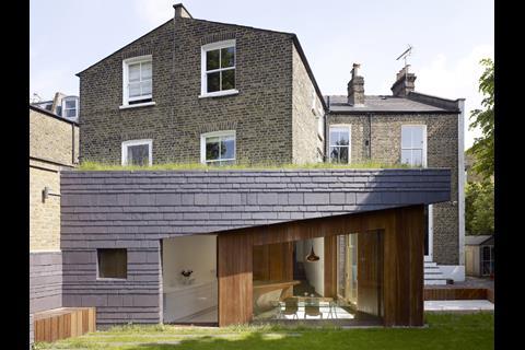
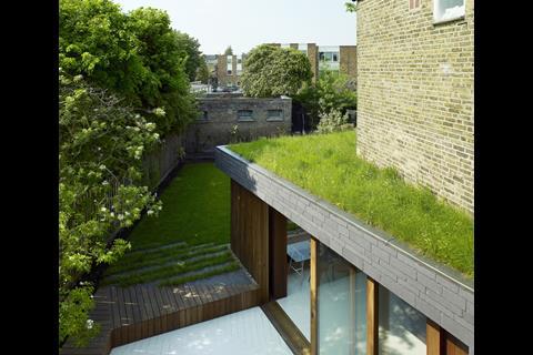
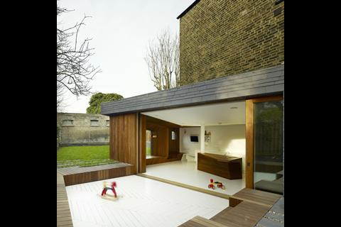
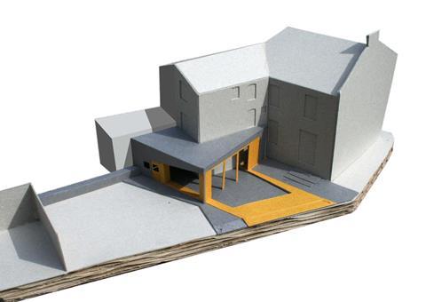
Hairy House, named because of the wildflower turf roof, is an extension to a Victorian end of terrace house. A mere 10 square metres larger than the previous footprint of a dilapidated lean-to, the extension provides a new family kitchen, dining and play space. The simplicity of the brief was
accompanied by a desire to use the opportunities afforded by the angled and tapering geometry of the site to create an unique architectural response.
Design Logic
The design of this room - a simple rear extension - is conceived as an architectural negotiation between the order of the existing Victorian house and modern patterns of occupation of domestic space. This manifests itself in a blend of design moves - some that abide by the rules of the existing house and others that seek to challenge them.
The lower ground floor level is lowered to provide a 2.8m floor-to-ceiling height that matches the proportions and sense of space of the existing house but the ceiling line is dropped on an angle to create the sense that the room opens up towards the south-west and the afternoon sun. This in turn defines the angle of the slate cladding on the rear elevation which creates the appearance that the timber is emerging from the ground below.
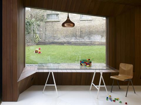
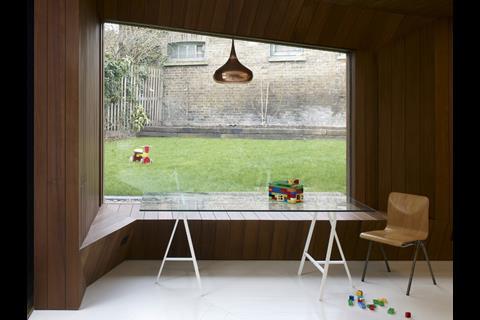
The slate, as an envelope, and the timber, as an internal-external lining are modified to enhance the functionality of the space. The formality of a space for dining is combined with the informality of a cosy window seat. The seat itself appears sculpted in form but is actually lined in boards to emulate traditional Victorian paneling. Natural slate - the existing roof material - is used as the external wall surface but the coursing varied to signify the fact that it is a cladding rather than load-bearing, like the existing masonry to which it abuts.
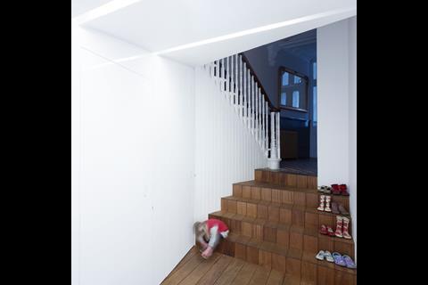
The hall connecting the staircase to the existing house widens in the middle to provide ‘shuffle-space’ for someone reversing out of the utility room with a laundry basket whilst the conventional timber floorboards used on the long stairs reduce in module size as they approach the original tiling in the entrance hall.
Externally the slate cladding is transferred to the garden with a scattered tile effect breaking down the traditional line between hard and soft landscaping whilst the white tiles laid in a herringbone pattern extending from inside to out.
Project Details
Location: Hammersmith, London, W6
Project Type: Residential remodeling and extension.
Client: Gareth Langdon and Lucy Carmichael
Value: not disclosed
Date: 2011
Architect Team: Nick Hayhurst, Anna Ludwig, Richard MacRae
Collaborator: Lucy Carmichael
Structural Eng.: Iain Wright Associates
Contractor: Rebuild (London) Ltd.
Kitchen: Gareth Langdon Furniture
Pegasus Academy
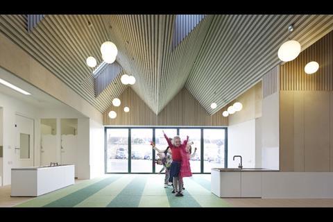
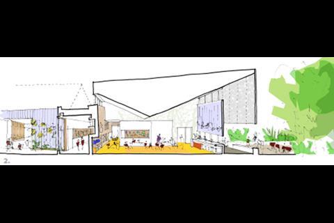
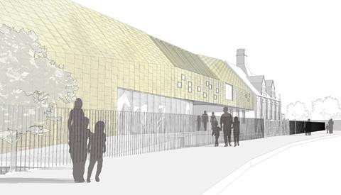
The remodeling and expansion of Whitehorse Infant and Junior schools builds on the character of the existing Victorian school buildings. Our design brings together a fragmented site with a series of interventions and extensions that thread new teaching spaces together through a complex arrangement of existing buildings. The project provides 7 new classrooms, 6 remodeled classrooms, a hall extension and a new administration hub.
Design Logic
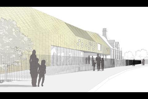
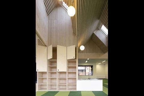
The concept of a ‘responsive roofscape’ informs a site-wide strategy to revitalise the different learning environments and provide a controlled sense of scale to the new development.
Conceived as a series of room-scaled extensions, the design assimilates the pitches and proportions of the Victorian school but plays with the scale, repetition and constructional authenticity of the forms. The language of the Victorian school is adapted to shape the character of the spaces created. Both inside and out, the roof-scape is intended to animate and excite a playful and stimulating learning environment.
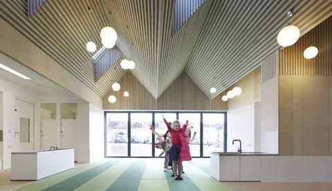
The miniature peaks of the nursery mimic the Victorian dormer windows of the Infant Hall.
They form the surroundings of a new square where young children are dropped off and collected by their parents. By contrast, the single pitch of the front facade is the scale of public building; holding its own in the streetscape. The scale of these pitches increase across the site, growing in response to the age of the children and defining the form of the room beneath.
Responsive Ceiling-scape
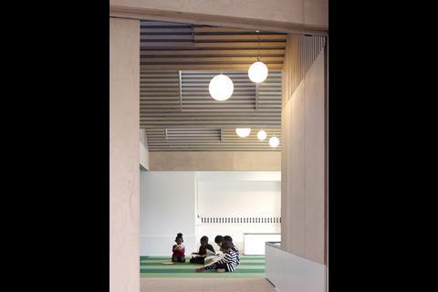
A new ribbon of timber slats at ceiling level within the circulation routes brings the two schools together and connects the new with the old. Within the building the varied scales of ceiling profiles aid way-finding and act as a shared reference point for children progressing through each year-group in the school.
Street Frontage
The new facade brings the two schools together by adopting the pitches and massing of the Victorian buildings at either end. The resultant form leads the eye towards the Victorian Junior Gym; reinforcing its prime position in the group of buildings that make up the frontage of the Whitehorse Manor schools. The form of the new elevation is cut to create a logical public entrance leading into the heart of the
Project Details
Location: Thornton Heath, Croydon, CR7
Project Type: Extention and remodeling of existing School.
Client: London Borough of Croydon
Value: £3.6m
Date: 2009-2013 (Phase 1: complete, Phase 2: currently on site)
Architect Team: Nick Hayhurst, Howard Miller, Anna Ludwig, Jonathan Nicholls, Andrew Ensslen, Jessica Tettelaar, Ardi Rexhepi.
QS.: SENSE
Structural: Iain Wright Associates
M+E: MSL (Phase 1), Edward Pearce (Phase 2)
BREEAM: Bianco Sale
CDMC: GEP Consulting
Contractor: Kier (Wallis) (Phase 1), Morgan Sindall (Phase 2)
Photographs: Kilian O’SullivanPhotographs: Kilian O’Sullivan
Hayes Primary School
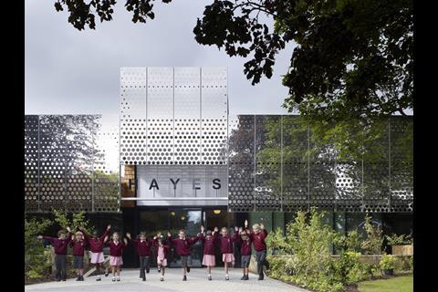
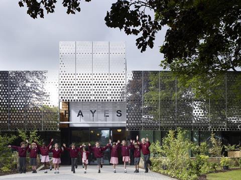
The expansion of Hayes Primary School provides an exciting and vibrant new extension to a tired and outdated school building; an extension that flickers and glimmers with the reflection of the adjacent trees providing a renewed energy to a building at the heart of its community. The extension provides 4 new classrooms, a small hall, ICT lab, admin area and external play spaces.
Screening the School
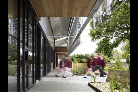
Prior to this project, the school building had developed in a piecemeal fashion giving rise to an incoherent complex of buildings which failed to announce itself on the street front. The new elevation incorporates a 54m long, mirror polished stainless steel screen on the front and side elevations. This provides a cohesive visual treatment to the front of the new building and in doing so shields the existing school building from the road.

The screen acts as a veil over the existing building; creating a new active elevation to Hayes Lane, breaking down the ‘visual mass’ of the extension and giving the impression of a ‘new school’.The perforations reduce in size towards the top of the screen in order to maximise the reflection at the top and the translucency of the screen at the bottom.
Closing the Loop
The organisation of the new accommodation wraps around the east and north elevations of the existing school building enabling a new circulation loop around the school to be formed.
The design builds on the strength and qualities of the existing corridors by extending the 3.5m width round to the north - this creates a new ‘active’
corridor for the Infants.
Reception Courtyard
The extension encloses a courtyard in the centre of the school which provides a secure external play area for the youngest children. The courtyard becomes a key part of the entrance sequence and brings natural light into the centre of the school’s circulation spaces.
The Classroom
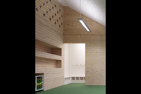
The classrooms are arranged around the perimeter of the extension. Each of the four walls is considered; the external wall provides light, the second provides thick storage, the third exposes the CLT structure and the access to the storage and cloaks and the fourth wall is for the Whiteboard and display. Each of the classrooms opens up to the landscape with a ceiling profile designed to maximise cross ventilation, translucency and a sense of connection with the landscape in which the school sits.
Storage Wall
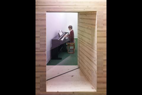
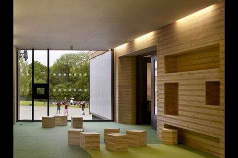
A central storage wall is one of the key navigators in the new building; it identifies the circulation route and demarks the extent of the new Infant teaching spaces. This is a 650mm thick wall, made up from horizontally stacked cross-laminated timber panels that give an internal elevation of exposed end-grains. The solid-timber pieces are cut and stacked to form openings in the wall, through to the classrooms, and with recesses on alternating sides that form shelves for the school library, seats and reading alcoves as well as storage for classroom equipment and teaching materials.
Project Details
Location: Kenley, Croydon, CR8
Project Type: Extention and remodeling of existing School.
Client: London Borough of Croydon
Value: £2.7m
Date: 2010-2012
Architect Team: Nick Hayhurst, Jonathan Nicholls, Graham Parton, Lizzie Ruinard, Jessica Tettelaar, Ardi Rexhepi.
QS.: Davis Langdon
Structural Eng.: Crofton Design/ Eurban
M+E: Crofton Design
CDMC: GEP Consulting
Contractor: Kier (Wallis)
Photographs: Kilian O’Sullivan


