This giant restrospective captures the rich diversity of Foster’s output, but leaves the man still something of a mystery, writes Sarah Simpkin
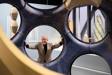
The current Norman Foster exhibition at the Pompidou Centre feels significant, not only for its size and firsts (biggest by area, number of projects, drawings never seen, all that), but for the fact Foster designed as well as headlines it. Reason enough to take a train to Paris. That, and the joy of a trip to the Pompidou.
Two French projects are celebrated from the off. On the front of the Pompidou Centre, there’s a giant photograph by Edmund Sumner of Marseille’s silver pavilion; then, at the entrance to the galleries, a wall-sized Daniel Jamme/Eiffage print of the Millau Viaduct.
Inside, the first room is an intimate salon hang of drawings around cabinets of open notebooks, a celebration of thinking with a pencil. I’m drawn to a concept for a development by the Fal estuary in Cornwall, proposed in 1965, the same time as the Creek Vean house was built. It imagines overlapping clusters of houses on a steep slope, just visible beneath the trees, and connected by footpaths – a romantic idea of buildings made to be reclaimed by nature that wasn’t shared by local planners.
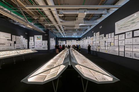
Further along, a first go with gouache, attempted in the last couple of years. There are simple pleasures; a study of a table set up for lunch on wicker chairs under an awning. Then a façade detail for the Apple headquarters, with a note to David Nelson and Stefan Behling. These notes make interesting reading. There are thumbnails of pages with instructions for a film storyboard. On another double spread, a diary plan and precise to-do list dated 12th July 1979, Hong Kong. My favourite: “TALK TO STEEL MAN.”
Also in this room, a back-lit display of hundreds of photographs taken by Norman Foster, of everything from the metal structure underpinning the broken awning of an old ice cream parlour to the eaves of a Chinese temple. One shows the early days of the Riverside studio, looking down from the mezzanine at green (!) columns and an exposed ceiling; a space, like the practice it contains, that has been refined over the years.
A note is scribbled in the corner of a snap of Foster cycling down the ramp of the Reichstag dome – “Not by me! NF.” A hint of the desire for this exhibition to be right, clear, and the intensity of effort that has gone into realising that.
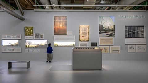
From this intimate space, visitors move into the bright main gallery, divided thematically. There are new headings for consistent topics: Nature and Urbanity, Skin and Bones, Vertical City, History and Tradition, Planning and Place, Networks and Mobilities, and Future.
Norman Foster’s name is on the wall, but the exhibition also synthesises the work of Foster + Partners, Team Four and the Norman Foster Foundation.
Like the skin of, say, a Berlin library or university arts building, it manages to fuse different elements - the legacy of the man and the collective - to make the subject legible for visitors.
There must have been difficult decisions to achieve that. Which projects to include? How to recognise the many collaborators? I can see how they ended up with 10,000 names on a wall, all past and present staff alphabetically listed. I look for my own and it’s pleasing to see it happens to fall on the line below a friend.
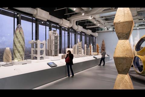
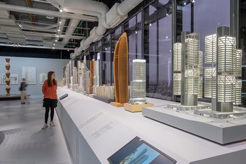
On the far wall, a row of model towers stands against the Paris skyline. Unlike many surveys of great architects, there are no sketch models of Foster + Partners’ projects here, a by-product of the design process too often used as lazy shorthand for creative genius. These are polished, illuminated, beautifully finished objects.
The only exception is a grid of studies for a tower that still looks like an upturned canoe. 30 St Mary Axe is there, though it’s hard to see with fresh eyes, the ‘Gherkin’ is such a familiar presence – easy to forget how radical it was in 2004. I remember walking past its building site, talking to a friend who was incredulous at the prospect of a round skyscraper in the City, “Whatever next!” A Walkie Talkie, Cheesegrater and a Can of Spam, thanks to the precedent it set.
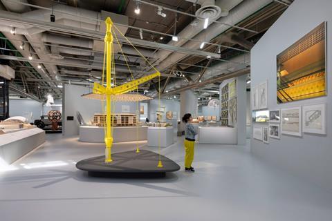
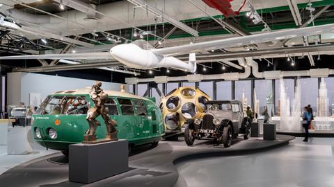
In Skin and Bones, a yellow column of the Renault Distribution Centre reaches up as if to touch Richard Rogers’ and Renzo Piano’s ceiling. A cable restrains its metal arm. It’s a useful metaphor for the philosophical distinction between exposed components and the integration of structure, services and form that set their career trajectories apart. Deyan Sudjic likened Rogers and Foster to Bell 47 D1 and Bell Jet Ranger helicopters. A very macho comparison, though Foster has no doubt piloted both.
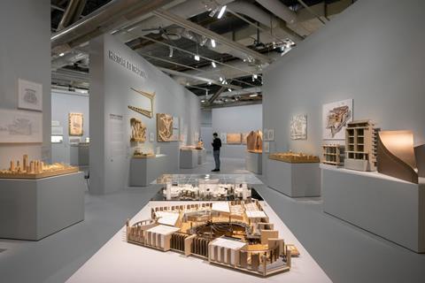
Nearby, Bloomberg’s London headquarters has a prominent position under a section of its very clever metal ceiling. The office floors are pulled apart to reveal the design’s innovations in circulation, acoustics, sociability, material warmth and energy efficiency. Its response to context leads well into the next theme of History and Tradition; Bloomberg’s arcade reinstates the line of Watling Street, it incorporates the remains of a Roman Temple of Mithras, and three bronze and water sculptures by Cristina Iglesias invoke the subterranean River Fleet.
There are many enjoyable moments and objects, not least the inflatable office, and works of industry and art by Ai Wei Wei, Umberto Boccioni, next to the Dymaxion car, a glider and collaborations with Buckminster Fuller. The experience of bringing all these things together captures a little of the absurdity of life in the Foster studio: one day, a skyscraper on Park Avenue, the next, a museum, maybe a new city, a headquarters for the world’s biggest tech company, a hospital or a moon base.
Of all the themes, Planning and Places is perhaps the hardest to make visually engaging, but this area of the gallery feels like the essence of the studio’s thinking. It’s good to see the model of Slussen, a project to reverse the legacy of early car-centric planning in Stockholm.
Nearby, in a similar vein, is the pedestrianisation of Trafalgar Square, which involved consultation with hundreds of people and organisations. It was strategic, research-based, diplomatic. I read that they had Atkins take on a more prominent role to help pre-empt public concerns on traffic. And it worked – they were able to take the bold move of eliminating vehicles from the north of the square.
In today’s culture wars played out in transport policy, it’s hard to imagine that same result. The project was part of the 1996 World Squares for All masterplan, which also proposed the closure of the south side of Parliament Square to traffic. Two decades on, there are signs that this will finally be realised, albeit by another firm.
There are two darkened rooms at the end. In one, a film of the Pompidou’s Deputy Director, Frédéric Migayrou’s interview with Lord Foster. In the other, Futures, more systems thinking. There are models and films of lunar and Mars habitations, droneports in rural Africa, a hyperloop distribution system and nuclear microreactor.
It’s a valid question whether this is the future we want, whether we believe technology will save us, and more eminent critics than me have opinions. But as trends shift, it’s worth remembering that it’s the same forces that invented the starchitect label that now pull it apart as a straw man for the much more complex social, economic and environmental emergency we find ourselves in.
Foster might not like that label, but he does seem to accept the starchitect’s cape comes with global responsibility, evident through his Foundation’s activities and moves to help with the rebuilding of Kharkiv in Ukraine. He’s cited Buckminster Fuller’s call to reinvest the financial and intellectual resources spent on war into the quest for more sustainable life on the planet: “moving from ‘killingry’ to ‘livingry’,” as he put it.
We need a narrative of hope, a vision, as much as the motivation of fear.
An architecture retrospective can be commercial, a strategy to raise a designer’s profile on a continent where business is growing. But a show in Gallery One of the Pompidou Centre in Paris is a rare invitation: it’s a public gesture.
With this in mind, I watched the other visitors. A man in a cowboy hat spent a long while pondering IBM’s Pilot Head Office, there were a few architects, judging by the cut of their tote bags, an elderly couple had an argument about where a project was, and there were a lot of families and children at the start of the summer holidays. It was busy; people of all ages seemed to be enjoying the displays. By that measure, a tremendous success.
It’s still hard to know what to make of Norman Foster the person. To me, he’s notes in the margin. Any characterisation is based on thin evidence; he gives little of himself away in interviews, always bringing the focus back to the idea, the project, the big vision, or reflecting on his influences. Which is what he does with this exhibition. The overall impression reflects his advice to young architects, as he once put it: “an appetite for hard work and passion for design.”
Over six decades, Foster has been answering the same questions from journalists, over and over again. This exhibition, coinciding with the release of a major Taschen monograph, appears to definitively answer the questions he wants to be asked. For now, at least, until the next big idea demands a rejig of the contents page. If you get the chance before 7th August, go.
Postscript
Norman Foster is at the Centre Pompidou until 7 August
Sarah Simpkin is a writer, artist and communications consultant






1 Readers' comment