O’Donnell & Tuomey’s joyful new building is the stuff of theatrical legends,
Theatres often like to cultivate a foundation myth around their buildings. From the Theatre Royal on Drury Lane, which has proudly occupied the same plot for almost 350 years, to the Young Vic in Waterloo – which had its “temporary” 1970s auditorium recently enshrined, relic-like, in a permanent casing – there is a thespian habit of maintaining an aura of significance around the sites of the beloved boards.
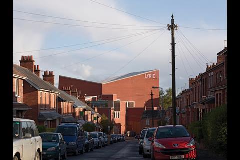
The story of the Lyric Theatre in Belfast is rather different. It started life 60 years ago in the window recess of the consulting room of Dr Pearse O’Malley and his wife Mary’s house, at 117 Lisburn Road. As the Lyric Players’ ambitions grew, and the O’Malleys moved house, performances took place in their narrow, converted stable loft. Sixteen years later – the theatre having swelled to incorporate a vibrant programme of recitals, lectures, exhibitions and a children’s drama school – it moved to its current site at the end of a sloping red-brick terrace in south Belfast, to occupy a purpose-built, 300-seat auditorium. It became much loved and continued operating as a neutral base throughout the Troubles, but lack of funds meant that dressing rooms, wardrobe and toilets had always remained outside, housed in flimsy portable buildings across a service yard. By 2003, the theatre was suffering from a leaky roof and was no longer fit for purpose.
An international design competition was launched, attracting 56 entries, and was won by O’Donnell & Tuomey Architects. The Dublin-based practice proposed a dramatic concoction of luminous crystalline forms, embedded in the sloping site, in a scheme titled “House for Theatre” – a play on the venue’s domestic origins and its continuing family-run feel.
“Everyone who works here is part of the theatre family, no matter what they do,” says project architect Mark Grehan, as we stand at the bottom of the hill, looking up at the red-brick cliff face, that forms one elevation of the Lyric’s new £18 million home. “It should feel like a home – an extension of the houses along the street.”
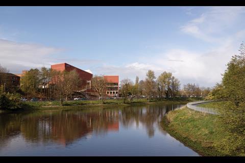
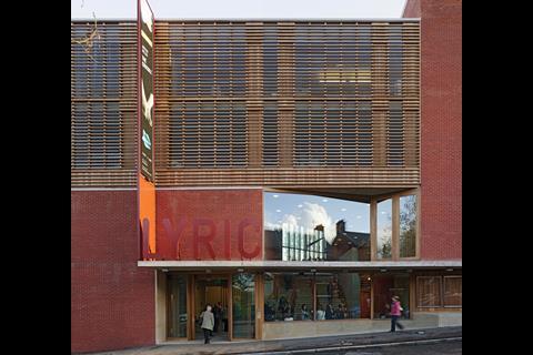
Inserted at the end of the terrace, the building cleverly mediates between the grid of brick streets that rises to the north west and the serpentine swathe of green that drops down to the River Lagan below. An aggregation of angular forms, it changes aspect as it descends the hill, initially continuing the datum of the neighbouring houses along the street edge, before rapidly growing into something much more bulky and industrial as it climbs down the road. By the time you reach the corner and turn along the embankment, you are confronted with the sheer geological mass of the main auditorium. If this is a house, it is one with big ambitions.
’It should feel like a home - an extension of the houses along the street’
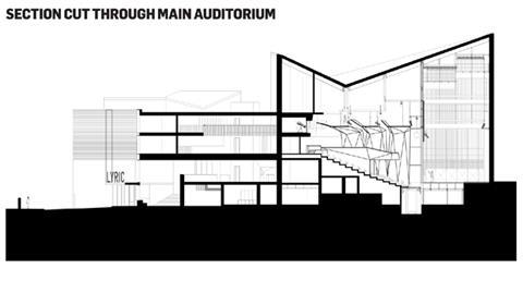
“It was a very restrictive site, squeezed from all directions,” says John Tuomey. “Yet we were working with big volumes of fixed dimensions that barely fit within the boundary in plan.” The challenge was deftly overcome in section by the counter-intuitive move of flipping the auditorium so the rake ran against the slope, thereby opening up a usable chasm below. The architect also raised the rehearsal room to provide space beneath it for the bar. The three primary volumes, of theatre, studio and rehearsal room, are thus conceived as objects, pushed to the edges of the plot, leaving a stream of public circulation space to wind under, around and between them.
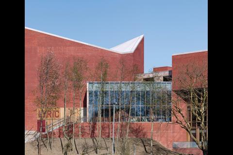
“They are like rocks in a river,” says Tuomey. There is something elemental about these fixed masses anchored on the sloping site with their carved, faceted forms – folded expanses of blank wall punctured with glazed, timber-framed lanterns.
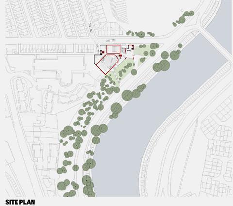
From down by the river road, seen through a coppice of tall, willowy trees, the composition has undeniable echoes of Alvar Aalto’s 1950s Säynätsalo Town Hall, all nested brick planes and canted rooflines. At the eastern corner of the site, the hat is further tipped to the Finn, with angled grass-covered steps carved into the slope, retained with timber sleepers – only here they serve as an outdoor auditorium. As you approach the main entrance, off Ridgeway Street, it becomes clear that it is not just the aesthetic of this period that is employed, but its attitude towards expressing, and catering for, human inhabitation: the facade is slightly cranked inwards, providing shelter under a projecting canopy, while a stepped stone plinth forms a series of seats by the doorway – both inside and out, providing somewhere to wait.
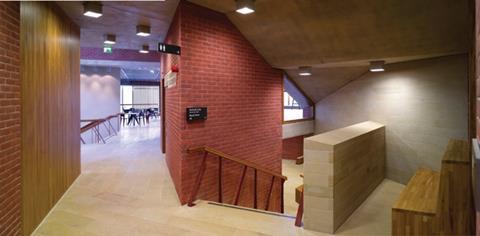
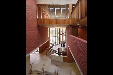
Moments like this continue throughout the building, making it a genuine pleasure to use and explore. Tuomey talks of “tailoring spaces”, and there is a sense that the public routes have been carved out and modelled by hand, with an awareness of how the in-between spaces will be occupied during intervals and before and after performances. Walls are inflected to create nooks and niches, crannies and perches, while stairs narrow and swell, kicking out to lead you up around corners. Little peep windows provide glimpses between levels and up into the rehearsal room. “It’s like a whittling process,” the architects explains. “It is quite a rigid plan, but every chance we get, we’re cutting away to release the pressure or direct the flow, to pull people through in the directions we want them to go.”
Stairs narrow and swell, kicking out to lead you up around corners
At the entrance to the light-flooded atrium, a cascading sandstone stairway tumbles down from a generous open landing with views through to the glazed upper foyer that looks out over the river. A “walking handrail” with red oxide-finished steel balusters – angled like legs and folded where they hit the ground to form little feet – marches up the treads, separating the “slow stair” from the narrower “fast stair”, which is distinguished by one fewer landing.
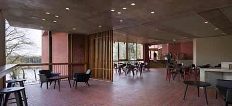
The upper foyer acts as a kind of fulcrum space, with different functions pinwheeling off it. To the left, the wall folds into the café-bar – kitted out with Jean Prouvé furniture in dark timber and the same red steel – where the sandstone floor gives way to tough variegated brick, a treatment used throughout to signal slower spaces for meeting and loitering. To the right, a kinked stair winds down into a cave-like sandstone world of loos (with more than twice as many provided for women as for men to solve that age-old conundrum), whose floors and fittings are cast in solid terrazzo. Close inspection reveals the concrete ceiling seams are set on a diagonal to mirror those in the floor – the kind of meticulous attention to detail that makes it hard to believe this was a design-and-build contract.
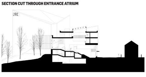
Returning to the foyer, the studio theatre entrance is framed in an iroko timber-panelled box – the language used for key thresholds – that leads, through a light-and-sound lock, to a large, flexible warehouse-style space, complete with 150 retractable seats and a tension wire lighting grid. Unusually, for such a black-box space, a shutter slides back to reveal a big picture window in the wall looking out on to the street, allowing the room to open up and connect back to the town.
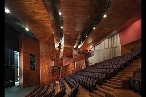
From the upper foyer, conceived as a long, hall-like extension of the bar, a broader staircase – again chamfered out to a generous sweep – brings you up to the main auditorium, truly the masterpiece of this crafted concerto. Three timber arches rise up from this folded wooden grotto’s walls, creasing into faceted ribbons as they span the chamber, carefully inflected to provide the right lighting angles, while flat enough to retain the proper acoustic. Beneath this twisted ribcage, the seating is gently curved in a parabolic section, as though cupped in the palm of a hand, with an asymmetrical aisle cutting at an angle through the rear eight rows – the result of having only two places to locate the exits. Tuomey, however, has a much more poetic justification, describing the seating angled “as if the room is turning towards the action, twisting in its seat,” arguing that a theatre auditorium should be “a bit alive – not neutral like a cinema”.
“Going to the cinema is anonymous, you keep your coat on, don’t talk to anyone,” he says. “The theatre should be a social experience, it’s a collective gathering.” A diminutive balcony on either side of the room provides two single-file strips of seats, one side accessed by a secret stair. “Rationally, they were unnecessary,” admits Tuomey, as they only add a few extra places and are sold at the same price. “But they populate the walls and make the room feel narrower, more intimate.” At 390 seats, the new theatre has about 100 more than before, but it retains the sense of cosiness and the design means that it will never feel empty, even midweek.
The seats curve ’as if the room is turning to the action, twisting in its seat’
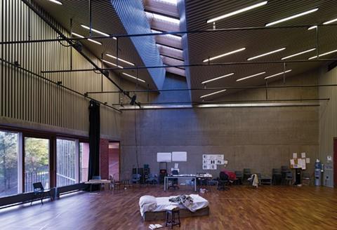
One would expect the auditorium to be the showpiece of such a building, but what is so evident here is that the quality of finish even continues into the back-of-house areas – so often relegated to painted blockwork, as at Daniel Libeskind’s £68 million Grand Canal Square Theatre in Dublin. Crossing the threshold, timber flooring leads to the rehearsal room, a soaring, top-lit hall with a pinstripe lining of acoustic battens and a large window looking out over the valley. Two storeys of airy offices – expressed externally as a timber-slatted lantern – share the opposite aspect, looking out over the university gardens. This upper level is treated internally as a lighter, woody counterpart to the masonry world beneath, the iroko balustrades that run around the atrium recalling lofty Shakespearean balconies when seen from below.
It is hard to believe that a building of this scale and ambition was completed for a construction budget of £13.8 million, particularly given the level of finishes and irregular details. Although, from the outside, the expanses of brick are patchy in places, the general quality is outstanding.
“The difficult geometries and complex setting out actually helped to make the product better,” says Tuomey. “People rise to the challenge of making something that is a bit tricky – it’s matter of pride.”
It was also down to some canny moves on the architect’s part: noticing the quality of the joinery produced by the shuttering contractor, Mastercraft, they also had it fit out the auditorium panelling – a job it has executed with the precision of boat builders. A further reason for the quality is down to the fact that every last inch was designed. “We drew every single brick,” says Grehan, surprisingly unfazed at this mammoth undertaking. Given the protracted nature of the project, from winning the competition in 2003 to starting on site in 2009, the architect had time to draw every last detail – with much of the work done before the contractual process even began.
Buildings are rarely made like this any more, with a luxury of time and attention to detail usually absent from most contemporary contracts. And while parts of the design might feel overly stuck in a former idiom – much of it is pure 1960s Scandinavia – it is through its old-fashioned approach to design and construction that the architect has succeeded in crafting a joyful building that will endure for generations and soon gather its own creation myths.
Project team
Architect O’Donnell & Tuomey, Client Lyric Theatre, Structural engineer Horgan Lynch Consulting Engineers, Services engineer IN2 Engineering, Theatre consultant Theatreplan, Acoustics Sound Space Design, Project manager EC Harris, Graphic design Red Dog, Main contractor Gilbert Ash NI
Sub-Contractors / Suppliers
Mechanical and electrical Vaughan Engineering Group, Concrete and internal joinery Mastercraft, Primary and secondary steel Metaltech , Brick Ibstock (Gilbert Ash), Windows Hynds / JC Ramsay, Fitted furniture JC Ramsay, Stone McConnells, Terrazzo Fegan Terrazzo, Lifts Kone, Ironmongery MB Architectural, Flooring Owen James Flooring, Theatre specialists Multistage, Oxford Sound,
Downloads
LYRIC FLOOR PLANS
Other, Size 0.53 mb






No comments yet