The Builder reviews the newly built Fleet Street landmark, now considered one of London’s best Art Deco buildings
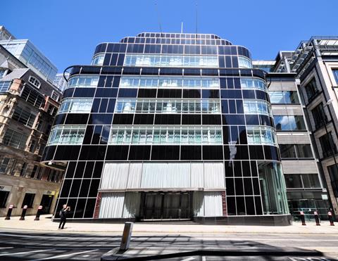
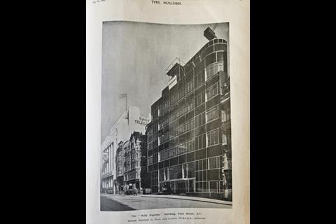
The Daily Express Building on Fleet Street is one of London’s most striking Art Deco buildings. Even today, the 90-year-old grade II*-listed building looks like it could be a freshly built glass and steel office block.

The Builder described it in 1932 as undoubtedly the “youngest and brightest” of a series of buildings on the street designed in the stripped back, futuristic modern style of architecture that became fashionable after the First World War. The publication’s reviewer described its famous lobby as ”so full of colour and brightness that the eye is taken by surprise”.
It is no wonder that so many heritage groups, including Historic England, lodged objections to plans designed by BIG to build a 21-storey block wrapping closely around the side and back of the building. The new scheme, now under construction, will rise to twice the height of its near century-old neighbour.
Review in The Builder, 15 July 1932
THE “DAILY EXPRESS” BUILDING
REVIEWED BY L.W. THORNTON WHITE
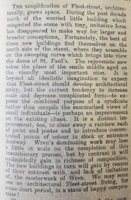
THE simplification of Fleet-street, architecturally, grows apace. During the past decade much of the worried little building which congested the scene with tiny, imitative form has disappeared to make way for larger and broader conceptions. Fortunately, the best of these new buildings find themselves on the north side of the street, where they assemble on the sweeping curve which brings into view the dome of St. Paul’s. The rejuvenate new takes the place of the senile middle aged on the visually most important sites. It is beyond all idealistic imagination to expect that Fleet-street should develop architectural unity, but the current tendency to increase scale and decrease complicated form - to express the combined purpose of a syndicate rather than compile the summarised views of small individuals - is perhaps an improvement on the existing chaos. It is a distinct improvement, too, to clear away a rainbow rash of paint and poster and to introduce concentrated points of colour in clock or entrance doorway. Wren’s dominating work may lose a little in scale on the completion of this transitionary process, but by contrast it will undoubtedly gain in richness of composition. The new buildings in turn will gain by reason of their contrast with, and lack of imitation of, the masterwork of Wren. We may soon see an architectural Fleet-street living, for some short period, in a state of happy compromise!
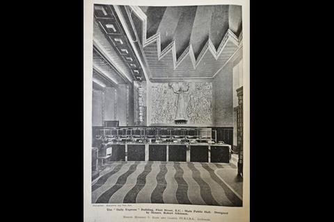
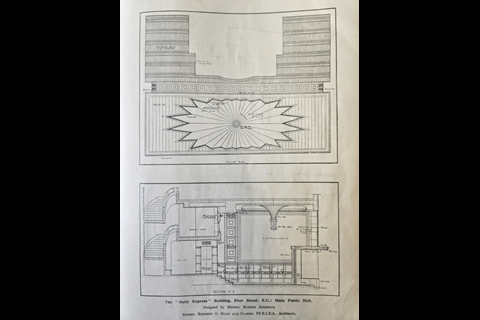
The youngest and brightest of the newcomers is undoubtedly the new Daily Express building, designed by Messrs. Herbert O. Ellis and Clarke, FF.R.I.B.A., with Sir Owen Williams as consultant for the structural framework, and Mr. Robert Atkinson as designer of the entrance hall. The new building is an extension of the existing newspaper premises in the rear, and has a frontage to Fleet-street of 84 ft. and a return depth along Shoe-lane of some 120 ft., exclusive of the old work. It rises on the centre line to a height of 95 ft. above the pavement and sinks below ground to a depth of some 40 ft. Up to first-floor level there is a deep set-back to provide a private vanway from Fleet-street within the confines of the site, the upper floors being cantilevered over this vanway, leaving a clear area entirely free from stanchions. The main entrance is in the centre of the Fleet-street frontage and leads to a generous entrance hall. The hall is planned to accommodate in open manner an inquiry counter, waiting area and public office, connected by telephone to all parts of the building. The richness of the hall is amazing; it is so full of colour and brightness that the eye is taken by surprise - it discovers a dual focus in the two modelled panels representing “The British Empire and Industry,” the work of Mr. Eric Aumonier. A veritable riot of topical reference is revealed beneath the gold and silver leaf and bright touches of colour of these enormous reliefs. Above is a fibrous plaster ceiling of vigorous character, whose fluted silvered and coloured pendant centre is richly illuminated by concealed lighting in the sparkling surround. Walls as well as ceiling glitter in silver and spring-like green, but subdue themselves almost to a dull grey when approaching the “Birmabright” metal and gold leaf coffers encasing the
concrete stanchions and main beam which swings across the hall. A small amount of simple wall surface is faced with highly polished slabs of travertine marble. Below, by way of contrast, the counters, telephone boxes and the dado running around the walls are faced with real ebony, divided into small sections by bands of chromium-plated metal strips, or Staybright steel - reflecting in the business fitments of the interior the business-like facing of the exterior. A rubber-covered floor, in a strong wave pattern, alternating in bright blue and black, divided by narrow green strips, links the two counters together. Upon this flooring rest chairs and stools of chromium-plated tubular steel, upholstered with emerald green leather, reflecting the soaring key of the wall and ceiling brilliance. The sombre uniform of the Corps of Commissionaires approaches, and one is transported from the scintillation of the showcase to a deep background of organised efficiency.
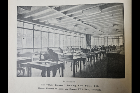
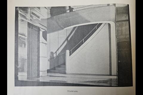
Immediately opposite the main entrance doors, a short central flight of stairs in black marble leads beneath a reminding clock to an exceedingly fine main staircase, giving access to the upper floors. Oval on plan, of generous width and “going,” and given initial importance by commencing about 3 ft. above the entrance hall, this staircase must be one of the most impressive office stairs in England. It is well lighted so far as internal staircases go, but the lighting suffers a little in contrast with the daylight conditions of the entrance. Situated on either side of the stairs, immediately outside the oval well, are passenger lifts, leading from ground level upwards. Above are five floors of offices, each 11 ft. 7 in.. high, floor to floor, with the exception of the first floor, which is 12 it. 6 in. high. Above the level of the first-floor ceiling a large internal area, giving light to adjoining property as well as to this building, cuts somewhat awkwardly across the site. The fourth and fifth floors set back along the Shoe-lane frontage and the fifth floor alone along the Fleet-street façade, legal necessities which are excellently and economically managed on elevation. The roof is an asphalt-covered flat, on which the elaborate ventilation plants rest. These are enclosed within a screened wall treated as a windowless attic story, again set back behind the fifth floor below.
The final section of the work, joining the new building with the old, is not yet completed, so that the final allocation of departments has not yet taken place. Suffice to say that the small fifth floor contains the insurance department and the fourth the circulation and competition departments, all these planned openly without dividing screens or partition walls. The third floor houses the managerial private offices along the main frontage, with the counting-house in the rear.
The second floor is to be similarly divided to accommodate the editorial offices. At first- floor level the advertisement department is planned along the frontage, with the linotype room behind. Top light from the central area augments in this room the direct light from Shoe-lane. The main ground floor, lying behind the entrance hall, is 13 ft. high and is given over entirely to a newsprint reel store, with twin runway access from the private vanway along the side street, 6 ft. 6 in. below. Immediately beneath the reel store, in a mezzanine floor 13 ft. high, the publishing department is planned. Quick access along short conveyors connects the department to the open publishing counters along the Shoe-lane vanway. Conveyors set at a sharp angle deliver the reels from storage to the machine sub-basement. There is also a general purposes goods lift connecting the ground floor with the floors below. And so we reach the machine hall, the most important unit in the plan organisation of a newspaper building. The hall is entirely below ground, 29 ft. high and with a clear central area of 114 ft. by 58 ft. without intermediate supports.
Its planning is clean and direct; it should be most efficient in working and exceedingly simple to supervise. Three rows of line-unit presses occupy the central area. At right angles to them, under the Fleet-street pavement, is arranged a resistances room, a control gallery and a visitors’ gallery, in tiers one above the other. Clear views are readily obtainable along the lines of presses from any part of these galleries. The main switchboard, second only in impressiveness to the presses themselves, is arranged along the length of the spectators’ gallery, from which it is divided by means of a glazed teak screen. This is an excellent example of good economical planning combined with a ready eye for showmanship which should not be lost on the visiting public. Ink and oil stores are to be found in the machine hall at high level, slung below the vanway, in which position they receive supplies direct from lorries. The weighbridge mechanism is also slung in like manner.







1 Readers' comment