There are many ways architects and their clients try to hoodwink planners. The fightback starts here, writes Esther Kurland.
Did you know that national planning policy in the early 1990s said that design was a purely aesthetic issue and that if planners refused schemes on design grounds they would have awards of costs against them? That is what an early version of the Planning Policy Guidance 1 (PPG1) said. Of course this changed by the late 90s and early noughties when the urban renaissance took hold. Politicians of all parties came to recognise the importance of built environment design in meeting their various economic, environmental or social objectives.

Yet despite the new consensus that design was an important part of good planning, By Design – the well-known government guide to national policies – was not updated throughout the noughties and was finally archived in 2011. At the same time planning has changed, development trends have changed and all too often planning just doesn’t deliver where good design is concerned. In light of this, more up-to-date guidance for planners is needed that relates to current planning policies. What’s needed is a sensible, whispering voice to planners and councillors about how to consider design within their work.
We need to tackle some of the ways that planning can get in a tizzy about design. Here are some suggestions:
· Character has always been seen as an important quality of well-designed places and many planning polices and decisions revolve around “fitting in with local character”. But character, or identity, can be good, bad or indifferent. Simply “fitting in” is not a very grown-up approach and can allow a poor-quality place to be an excuse for a poor-quality scheme. Instead planning should look at how the opportunity created by changing a place can be used to actually make it better.
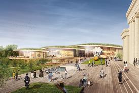
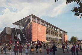
· Planning schemes are often illustrated by an array of visual material. All too often those viewing the graphics can be hoodwinked and confused. It is important for planners to understand what is accurate and part of a proposal, and what is just indicative of what the place might (or might not) look like. They need to know what is drawn to scale and can be measured properly and why perspective drawings, though more visually realistic than a flat elevation, cannot be used in this way.
· Planners also need to think about what is not shown in glossy illustrations. The bit of the building out of the frame that is going to be dead street frontage, the way two roofs will meet behind the conveniently added tree in the graphic, and so on.
· Planners need the confidence to take the more flowery ways schemes are sometimes described with a pinch of salt. For example being cautious of anything described as a landmark, icon or gateway. After all, how many spots are really worthy of marking? Does anyone see a building within a neighbourhood as a “gateway” and how many icons does any one place really need?
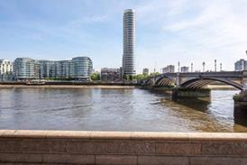
· Tall buildings can be a tough thing for planners to deal with. Although architects sometimes might like to think of their creation as a single entity which will be admired in splendid isolation, in reality this is hardly ever the case, especially as tall buildings are most appropriate for dense urban areas. In the real world, people tend to experience three parts of a tall building, from three general areas: the base from up close and personal on the street outside it; the shaft from the surrounding neighbourhood; and the top in more distant skyline views. So each part needs to work from a different user perspective.
· Still on the topic of tall buildings, planning can become bogged down in debate about their visual impact while skimming over the more practical issues of microclimate, servicing, maintenance, management and the cumulative effects of adding more than one tall building to an area. A three-pronged planning policy regime, looking equally at the visual, functional and environmental issues around tall buildings would be good.
· The design of new streets in planning schemes has been lagging behind the design of schemes that change existing streets, for example in town centres. Residential streets should not be designed as if they are scaled down motorways (it does happen) and planners should consider streets in four dimensions, along (route of most travel), across (moving from one side of the street to the other), up (building frontages, street furniture and trees, and time (how people use them hour to hour, day to day, season to season).
· Planning tries to think about things like wind, temperature, light and sunlight levels but often planners are faced with technical assessments that seem pretty meaningless and, anyway, who knows what wind speed created by a building is acceptable or not, and how hot can a home get before it is a risk to health and wellbeing? These should not be subjective design issues, but too often they seem to be treated as such, or not considered at all. Planners need policies, scheme information and the skills to use these to tell if, for example, wind and lack of direct sunlight will lower local temperatures and make that lovely-looking outdoor café area in a proposed scheme a total white elephant.
Our new book, The Design Companion for Planning and Placemaking, was a result of this need for planning guidance. Split in to two main parts, the first section of the book looks at the basic principles and concepts of good design while the second covers 10 common development types or issues: from infill schemes and tall buildings, to street design and historic environments.
Postscript
Esther Kurland is the director of Urban Design London.
The Design Companion for Planning and Placemaking by Urban Design London and TfL is published by RIBA Publishing. Order a copy here


No comments yet