Architects love to break the mould – but you ignore the rules of urban design at your peril, says David Rudlin
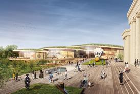
Earlier in the summer I sat listening to an architect teaching urban design in one of our architecture schools. He started promisingly by showing a site which I recognised as being one of ours. However he ruined it almost immediately by then imposing a caricature of a plan (not ours) over the site and saying: “This is conventional urban design. It is not what we do in this department.” He then showed a short film clip of one of the small squares in Manhattan, teaming with people, buskers and a craft stalls before announcing that this was the sort of urban design that they taught in the department. The next two days were spent looking at student work with beautifully done CGIs and photomontages, looking very much like that square in New York. Except that the people, buskers and craft stalls were Photoshopped rather than being real and many were shown in locations where such urban vitality would just never happen.
The point is that the lively square was that way, at least in part, because of those boring old conventional urban design rules. You need a permeable hierarchy of streets and spaces, you need a certain density and mix of uses, you need some sense of urban enclosure, you need passive overlooking, active ground floors etc… to generate the people and activity that makes such spaces so successful.
This has been preoccupying me over the summer given that my conventional old urban design company has been invited by Lucy Montague at the Manchester School of Architecture to co-curate an urban design atelier for fifth and sixth years. The problem is that architect schools tend teach their students to design buildings as objects. How many degree shows have you seen where the main project is a building shoehorned into a city street with party walls on either side? You are much more likely to come across buildings as beautiful jewels surrounded by nothing. This presents a problem in teaching urban design in architecture schools because students can’t easily shine in the way that they need to get the best degree within an urban design context.
This is also true of the profession – the architect news-feeds that I get on my computer every day (including BD) are full of buildings as sculptural objects in splendid isolation. Many architects tend to treat urban design in the same way; masterplans that start with the building and work outwards to the plan or sometimes treat the entire masterplan as if it was one enormous piece of architecture. Urban design works in the opposite direction – the plan comes first, then the public realm and the infrastructure, then the lots and plots, each with their rules for how they can be built. So dull!
Nobody likes rules, particularly when you are being creative, and architects are taught quite rightly to question and challenge the rules. They seem to see the rules of urban design like the Palladian rules of classical proportion: something that is interesting but essentially outdated and irrelevant to modern practice. This is not helped by all of those Poundburyesque masterplans with their strange mix of medieval and Georgian design that give the impression that urban design is a profession set on creating a pastiche of the past whether it be Georgian Bath or indeed Manhattan.
But there are rules that architects can’t ignore – the rules of structure and gravity of course (skyhooks aside) but just as important are the characteristics of us as humans. This is why we have the Vitruvian Man or Corbusier’s Modulor. Even the most radical architecture is scaled to our needs as humans to move around, to climb stairs, to live and work in comfort, to have access to light and air… The rules of urban design are no different, except they relate to our behaviour collectively. How we move around, how we react to each other as friends or strangers, how we live as communities while maintaining our privacy, our need for constant stimulation, the scale of spaces in which we feel comfortable, the distance at which we can recognise people. This is the point that Jan Gehl has been making for most of his career. The point is that the rules are hard-wired into us as a species. They are not stylistic or reactionary. If you ignore them you will end up with dull, lifeless places however many people you Photoshop into the drawing.
4 Readers' comments